TrustedPlace – Helping a leading underwriter make the leap from B2B to B2C

If it plugs in, if it turns on, it’s covered

Bringing equipment insurance direct to homeowners

A great logo does more than catch the eye. It communicates, too.

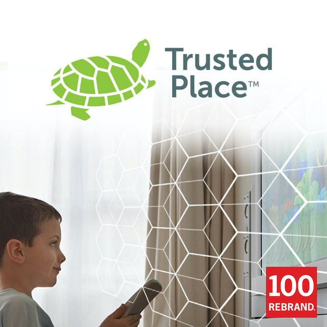
The right image captures the idea at the heart of a brand, leaving a timeless, indelible impression. That’s what Tenet’s logo design did for TrustedPlace, a specialty insurer that, like the turtle’s shell, provides all-encompassing coverage wherever people go.

When a venerable and respected name in the B2B space branches out to the consumer public for the first time, its existing brand might not be the best way to gain attention. A different identity can help the company stand out and create a new niche for itself. That’s how Tenet Partners helped the company behind TrustedPlace, with an evocative, suggestive logo and supporting collateral system that marked a clean break and a fresh start.

Creating a new concept in homeowner protection

Equipment breakdown insurance is well known in the commercial world, protecting businesses when industrial equipment or critical systems fail. Creating viable coverage takes deep expertise, something that few underwriters have.

Several years ago, a leader in this highly specialized insurance category began to explore a new market by extending the concept to homeowners. Its expertise in equipment breakdown underwriting gave it an advantage in covering what’s in every home: valuable appliances, home systems like heating and cooling—even utility lines, mobile electronics and the data they contain.

Seizing an opportunity to reach consumers directly

Initially, the company’s home systems protection coverage was sold as a “white label” offering through existing homeowner insurance companies. The product was clearly superior to the so-called “extended warranty” plans that are limited in scope and tend to have a poor reputation among consumer groups and the public.

Despite good consumer demand, sales through the insurance company channels was slow. Seeing a growth opportunity, company leaders decided to market through new channels as well. In addition to the existing relationships, the coverage would be sold direct, as well as through agents and high-profile alliance partners—well-known national organizations that typically offer perks such as insurance and travel discounts to members.

Keeping the parent brand at arm’s length

With a long and proud history, the underwriter had earned a great reputation in the industrial/B2B marketplace. Its brand had strong equity with that audience, but was unknown in the consumer space. In addition, the name and logo had a decidedly “retro” feel that honored the company’s legacy, but didn’t align with the new offering or its audience.

A consumer-oriented approach was called for. Management wanted to start with a clean slate: a go-to-market brand called TrustedPlace with its own identity, clearly separating the current and all future direct-to-consumer products from the parent’s industrial offerings.

Renewing a successful partnership

The underwriter had prior experience with Tenet Partners, having worked with us on brand positioning and integration when the company was acquired several years ago. Tenet’s knowledge of the company’s personal lines strategy, along with its creative capabilities, made it the partner of choice for the new visual identity project.

Goals set with the long view in mind

TrustedPlace marketers understood that in the consumer world, a carefully crafted name and logo carry much of the messaging associated with a brand by setting the tone and delivering an all-important first impression. This is especially true when entering a new market, where the brand identity can help define the category itself.

The TrustedPlace team was looking for a logo that would be simple, memorable, timeless, versatile and appropriate for the category. The company wanted to make sure that the idea behind the brand could be understood in an instant. At the same time, it was important to leave the door open to future innovation.

It’s all about protection

A critical aspect of the TrustedPlace strategy is its future vision. The initial offering is around home systems protection including utilities. However, in a world that’s increasingly mobile and digital, the company recognized the opportunity to link the brand to more than what’s directly associated with a house. Potential offerings could include identity theft, cyber protection, mobile devices, automobile equipment and other specialty coverages that protect people and what they rely on every day.

The new logo evolved from the thinking that protection is something that should be all-encompassing and stay with you wherever you go. And that led directly to the turtle: A strong, protective shell that moves with its owner captured the brand’s idea and resonated strongly with the client.

When the final work was presented, it met with an enthusiastic response from the client and consumers. The turtle gave TrustedPlace exactly the kind of versatile, timeless personality the team was looking for.

“We developed a number of really good logos that captured key attributes like security and confidence, but felt there was enormous potential to capture consumer empathy by coming up with a friendly, character-based concept. Turns out our client was absolutely amazed by the turtle and called it a home run.”
– James Cerruti, Senior Partner, Tenet

Having successful client conversations with Conduent

Advancing client conversations every day

Conduent sales people connect with clients through refreshed conversation decks

In 2016, Xerox spun-off of its Xerox Business Services division and rebranded the new company as Conduent. The new entity would continue to operate as the world’s largest provider of diversified business process services dedicated to helping businesses and governments deliver quality services to their constituents. Whether providing digital payments, claims processing, benefit administration, automated tolling, regulatory compliance or distributed learning, Conduent’s clients include the majority of Fortune 100 companies and over 500 government entities around the world.

Conduent needed to demonstrate their knowledge of their clients’ businesses and the solutions they could deliver.

Conduent knows their customers, inside and out

Because Conduent’s goal was to optimize and modernize the interactions between their clients and their constituents, the sales pitch decks that Conduent’s sales force use to solicit new business had to reflect their specific point of view: putting the client’s end-user first. That simple fact was a huge differentiator for Conduent’s business. As expert practitioners, they deeply understand their client’s business from multiple perspectives. In many cases, Conduent takes on the persona of their clients in customer care call centers. And Conduent’s solutions are decidedly constituent-centric.

A new approach for presentations

With the new brand in place after the spinoff, Conduent needed to have consistent messaging, as well as a new look and feel for its pitch decks that were used as client conversation starters in the sales process. Conduent came to Tenet Partners with the task of taking their legacy Xerox PowerPoint decks and re-thinking their structure, as well as design. Sharper and more focused messages were needed across all 15 lines of Conduent’s businesses, as well as a visual identity that reflected the new brand.

A deeper understanding of customer needs

Tenet created a templated process that would enable us to rapidly capture information then be able to write and design each of the 15 different business line presentations. For the entire redesign process to be successful, we knew we had to get a quick, yet deep, understanding of the different Conduent businesses, and the unique needs of clients in each category. With a tight deadline for the upcoming sales season, Tenet needed to act fast.

Interviewing Conduent’s Subject Matter Experts (SMEs) was the first step. To efficiently speak with each business unit, the Tenet team developed a uniform interview guide that would uncover an overview of the current business landscape, assess Conduent’s strengths and differentiators, define the customer’s considerations and give shape to the client conversation deck.

Saying more with less

We also set a goal to create a modular customizable approach to give each sales team the option to construct a presentation that best fit their personal presentation style, as well as show a deep understanding of the client’s needs.

To maximize the potential for conversation and minimize the dullness of presentation, we limited the number of pages in the decks and de-cluttered the slide contents. With less copy, and more images and icons, Conduent sales presenters could move quickly from a snapshot of Conduent’s global credentials to an understanding of the client’s challenges to top-line solutions that demonstrated Conduent’s experience and expertise in putting the constituent’s customer first. The use of large photographs depicting the client’s constituents further demonstrated Conduent’s focus on serving their needs. Tenet also made the PowerPoint Client Conversation decks more user-friendly by including Speakers Notes that enabled Conduent presenters to customize the decks to support their meetings and personal presentation style.

Advancing the Conduent solution

By the end of the assignment, Tenet had produced 15 Client Conversation decks for Conduent—each one customized for the specific line of business, yet visually and verbally aligned with the Conduent brand voice and brand standards. The Conduent sales force were able to hit their markets with a fresh look that reflected the new brand and spoke to the strengths of Conduent in meeting their client’s challenges.

Larry Oakner, Senior Partner, Tenet
“Gaining the knowledge from the subject matter experts helped us shape content that was right on the money.”

Andrew Douglas, Director, Editorial Services
This was a great opportunity to change the sales dynamic. The conversation with clients now becomes “How can we help you can reach your goals?”

Allyson Burroughs, Vice President, Marketing Commercial Industries, Conduent
“We got one big vote of confidence with the comment “I am in love with this presentation!”

Xerox – Managing an iconic brand on a global scale

Managing an iconic brand on a global scale:

How Xerox tamed the process

Xerox is in many ways the epitome of a global brand. The century-old company holds more than 12,000 active patents, operates in 180 countries and has a workforce of more than 140,000 professionals. It’s also ranked as one of the top 100 brands, year after year.

Maintaining that prominent status demands unwavering vigilance, brand stewardship and empowering employees with the right tools. When it’s done right, the company builds brand value and gets its message out clearly and uniformly all around the world.

Understanding Xerox from the inside

Xerox turned to Tenet Partners to help improve the consistency and quality of its brand communications. Our strategists partnered with Xerox to analyze the interaction between employees and the brand team, from creating communications all the way through approval and release.

Every aspect was examined: from how guidelines get created, updated and distributed to where photos are housed and how the review process works. Along the way, the team gained deep insight into Xerox’s culture and goals – knowledge that helped shape Tenet’s technology solution. Our strong, ongoing relationship also enabled Xerox and Tenet to collaboratively strengthen Xerox’s brand management practices.

The team uncovered realities not uncommon in an organization with the size and stature of Xerox: guidelines, templates, photos and illustrations scattered across geographies and systems, and an inefficient approval process. These issues kept the company from achieving the nimbleness to which it aspired.

A platform for seamless content creation

Xerox employees in the field faced a fundamental resource issue when it came to crafting branded communications. There was no single, trusted source of information.

The digital asset manager built into Tenet Brand Ensemble™ gives everyone at Xerox access to a central repository of guidelines, brand assets and images. For the first time, Xerox has one, reliable “version of the truth” for every part of the business, worldwide. When changes are made, updated guidelines are available instantly to everyone, everywhere.

The impact is significant. Consistency and quality are both improved through use of the most up-to-date guidelines and templates. The task of creating top-notch communications is streamlined. Projects are less likely to require rework and are now routinely approved on the first pass.

Simplifying brand governance

In the past, the Xerox brand team relied on email to receive requests and traffic projects, the beginning of a slower review process. Now, users around the world submit work through an easy-to-use online portal built on the Tenet Brand Ensemble Brand Review platform. Each piece is automatically routed to the appropriate reviewer for prompt action, while a simple dashboard shows the project’s status at every step. The result: an approval and revision process that’s more transparent, efficient and collaborative than ever before.

Xerox is also able to use insights from the tool to manage the brand program proactively. Comprehensive reports identify top issues preventing quick approval, average turnaround time, number of revisions and much more. Trends are identified and training provided to correct – and prevent – problems.

The mark of success: ongoing improvement

Thousands of users visit The Xerox brand center every month – a great indicator of its effectiveness. When people find a resource useful and easy to work with, they’ll keep coming back, time and again.

The bottom line: Xerox is now able to get its message out faster, at lower cost, and with the quality for which this major enterprise is well known.

CIEE – Opening the door to the world

Opening the door to the world

How CIEE pursues its mission of changing the world through international education

Changing the world, one life at the time, is by all measures no small task, one that requires vision and commitment. It is the journey that CIEE: Council for International Educational Exchange started in 1947. And one that continues today.

The times, they are a changing

Where once upon a time, studying abroad was seen as a luxury for those with the means to go out into the world, today’s interconnected marketplace demands graduates with global perspective and awareness of other cultures.

With an alumni network of over 300,000 participants, CIEE is going strong. But with the proliferation of for-profit study and work abroad vendors, the organization needs to raise its profile and foster a better understanding of the value it brings to students worldwide if it is to compete. This is further complicated by the fact that CIEE serves a broad set of constituents with a portfolio that sometimes lacks homogeneity and dynamic businesses that often go to market alone.

The new CEO, Jim Pellow, has a mission, one that will position CIEE as the uncontested leader in experiential education with whom students, faculty, employers all want to associate.

In support of a vision

CIEE needed a partner who could help bring cohesion to their rich portfolio, infusing strength into the brand by unifying the business behind a shared expression.

Enter Tenet Partners and our multi-disciplinary team of designers, content experts and digital specialists. To anchor our strategy properly, we started with a comprehensive tour of the organization, talking to all business units to understand the common ground, as well as the nuances of the individual programs.

Inspired by the passion and commitment of everyone at CIEE, our team went to work creating the building blocks of an identity that would support the promise of quality that CIEE makes to every one of its participants: impactful design that brings the experience to life, clarity of messaging to promote the transformative benefits of international exchange, and a digital execution to reach students in the manner in which they want to be engaged.

The devil is in the execution

Leaving nothing to chance or personal interpretation, CIEE decided to educate its worldwide base of employees and asked Tenet to develop a series of brand training workshops and a brand center that could constantly evolve to stay in step with the brand as it matured. A series of tools, including guidelines and easy-to-use templates, were created and housed in the brand center to ensure across-the-board adoption and the brand consistency that had been missing.

No physical touchpoint was left unattended – marketing materials, conference themes, posters, holiday gifts, conference signage, etc. At the same time, everyone knew that, to ensure success, it was essential to extend the new brand where the target audience lives, learns and interacts: the digital world.

The social power of technology

Tenet worked closely with the CIEE digital team to bring the brand expression to the digital environment with the same discipline and consistency as was happening elsewhere in the ecosystem of communications. Mindful of the limited budgets and resources typical of non-profit organizations, we helped develop templates that could be implemented across the 29 CIEE websites. The same singular approach was adopted for emails, promoting consistency and efficiency.

While CIEE businesses were already active in social media, there was a clear lack of strategy to harness the power of social media and support the CIEE mission of bringing life-changing experiences to more people. Together, CIEE and Tenet explored best practices both in the industry and also of leading companies focused on the same audiences. The outcome was a set of foundational guidelines and a clear understanding of the fact that social media is no longer an elective but rather an imperative to win the hearts and minds of millenials and Gen Zers.

Fast-forward to the future

Today, CIEE’s brand is stronger than ever, disciplined yet flexible enough to make room for sub-brands to target specific markets. Confident in its leadership role, CIEE is setting its sight on the future. Its mission: to help bring the experience of study abroad to 600,000 students by 2020. Double what the number is today. With their unwavering commitment, there is little doubt on the success of this mission.

How Paramount Citrus sweetened its appeal in the marketplace

Cultivating a new brand experience

How Paramount Citrus sweetened its appeal in the marketplace

Paramount Citrus is North America’s largest grower, packer and distributor of oranges, lemons, limes and grapefruit. For years, Paramount was the largest member of the Sunkist marketing cooperative. Their contribution to the food chain went unrecognized as the produce from their orchards went to market under the Sunkist label.

In 2006, Paramount left the cooperative to market its citrus under its own brand. For the move to be a success and the company to be able to capitalize on growth opportunities, it was important that Paramount be seen as making a clean break from Sunkist and carve out its own distinct niche.

Bringing the sunshine in

Having previously operated “under the radar,” the company now had to make a memorable first impression to grab the attention of retailers and consumers. Paramount reached out to the LA office of Tenet Partners and our team of design strategists. This collaboration gave birth to a logo that brings together everything positive associated with citrus: freshness, the outdoors and the sun.

To complement the new logo, Tenet injected humor and humanity into the design of the launch packaging. Consumers were treated to portraits of Paramount employees enjoying and reacting to the flavor of the citrus (sweet oranges, tart lemons). This established a clear and genuine link to the consumer experience.

Strengthening the ties that bind

Tenet’s designers gave Paramount a new graphic language with which to create continuity across the company’s full line of products. The system could be extended to everything from “fancy fruit” labels, to “choice” citrus, to redesigned export packaging for product lines that have been around for decades.

Today, Paramount Citrus can be found across the world, as the company continues to grow and make its way to more and more retailers and homes.

Matrix – Getting ahead of the energy boom

Getting ahead of the energy boom

How Matrix Service Company assumed the leadership to drive stellar growth

Every day, millions of us see vitally important things to which we seldom give a second thought – storage tanks, power plants, refineries, industrial plants, mining operations. Enormous investments are being made in these critical parts of North America’s infrastructure. This is reshaping the entire U.S. energy sector and having a profound effect on the economy, all adding up to creating enormous opportunity for those positioned to take advantage.

Planning for powerful growth

When this mid-sized construction and servicing firm brought in a new CEO, the die was cast: Matrix would pursue an aggressive growth strategy, aiming to double the business over five years. Timing couldn’t have been better for this new strategic vision, coinciding with the beginning of the energy boom that’s made the United States one of the world’s leading producers of oil and natural gas.

The company’s leadership saw opportunity in cross-selling among its diverse businesses, acquiring new customers and making strategic acquisitions. But Matrix knew it would have to change the way it goes to market if it was to take share from larger, more entrenched competitors and attract the new talent needed to achieve its goals. Tenet Partners was tapped to help Matrix transform its vision into reality.

Matrix owns numerous businesses across North America that serve a wide array of customers – diverse businesses, diverse market needs, and diverse workforce, both unionized and non-union (or “merit”) labor. With its origins in the oil and gas industry and aboveground storage tanks, the company, over time, branched out into areas as diverse as engineering services, utilities, industrial infrastructure and mining. The result was a portfolio of strong and proud, but separate, brands.

A unified, yet diverse, enterprise

Tenet Partners, utilizing our integrated approach to brand development, quickly created a strategic brand platform that highlighted the strengths shared by all Matrix businesses: outstanding client relationship management, a strong culture of safety, quality of service and the flexibility that comes from being “right-sized” for its clients.

The other side of the strategic coin was a consolidated brand architecture that simplified and unified the company, without diluting the distinct value of its separate businesses. Tenet strategists found a way to communicate Matrix’s ability to serve both union and merit markets across the continent, retain existing brand equity and elevate its high-quality engineering competencies.

Putting people at the center of the strategy

Tenet’s team of strategists, content marketers, designers and digital experts came together to guide the Matrix brand expression in a new direction.

The team encouraged Matrix leaders to embrace a bold new visual and verbal language, crafted to highlight Matrix strengths. The dated logo was replaced with a strong, stylized mark that unifies the brand, while using color to differentiate the various businesses. The human element and strong relationships for which Matrix is known are communicated through people-focused imagery and a confident, emotive editorial voice.

In parallel, our digital team developed a comprehensive, user-focused digital strategy designed to take Matrix into the future by facilitating mobile access and interaction, for both clients and potential employees. We created an innovative responsive design, providing a seamless experience across desktop, tablet and mobile phones.

Setting course for the future

To be effective, a major brand transition like this one has to be rolled out with care. To ensure successful buy-in across the board, Tenet Partners and Matrix worked closely together to frame and execute a comprehensive launch program. Everyone touched by the new brand were part of the launch – executives, managers, general employees, sales and marketing teams, clients, union halls, partners and the investment community. A new value creation story was crafted for shareholders, existing customers were assured of continuity and Matrix team members were given an inspiring new flag and brand story around which to rally.

The results? Today, Matrix is well on its way to meeting its ambitious growth targets, with a new brand that will serve it well for many years to come.

Catalent Pharma Solutions – The right medicine for success

A healthy brand feeds pharmaceutical and biotechnology development

Developing a brand for Catalent Pharma Solutions in short time, without sacrificing a strategy for long-term growth

When The Blackstone Group, a premier global investment and advisory firm, announced the acquisition of Cardinal Health’s Pharmaceutical Technology & Services (PTS) division in January 2007, the newly acquired company had only four months to stop using the Cardinal brand. Starting out with nearly $2 billion in revenue and more than 10,000 employees around the world, the company needed a global brand to represent a “new” company with its substantial history of innovation and achievement.

To get to the core idea that could unify and motivate everyone in the organization, brand strategists at Tenet Partners talked to both internal and external stakeholders around the world – from the president to the technicians in the lab. But with the compressed timeline to develop a new brand, we needed to re-think our typical process. Strategy, naming and identity development happened in a dynamic and co-creative environment, with our staff working closely with the new company’s launch team to nail the foundation for the new company. The brand platform Tenet created expressed the company’s commitment to unlocking the potential of medicines. The new name and logo were inspired by Catalent’s pride in their role as catalyst for their customers’ success and advances in pharmaceutical and biotechnology development.

Within seven years after launch, Catalent’s customer-focused strategy helped them become the world’s number one drug development, delivery and supply partner for pharmaceutical, biologics and consumer health products. In July of 2014, just seven years later, Catalent successfully launched an $871 million IPO. That’s good medicine.

Legrand – United by design

United by design

How Legrand supercharged growth across its North American business portfolio

Legrand, a leading French supplier of electrical components and networking solutions, had acquired, over time, seven businesses in North America. Each one a storied commercial brand – names like Pass & Seymour, Wiremold and Ortronics. The seven units were discrete, not clearly tied to the Legrand parent.

While the company had achieved good returns on its investments, the CEO, John Selldorff, wanted to take the company Legrand to a new level. His vision: to improve its market position and fuel growth across multiple business units and product lines.

Centering on the customer

The journey, however, was a challenging one. Legrand faced structural issues in its brand portfolio, channels and sales. The Legrand brand itself was relatively weak in the North American market. From the outside, the various businesses looked and operated like different companies. The customer experience across channels was disjointed.

Tenet Partners was brought on board to help the company pursue its mission of building a new, customer-focused brand platform. That would involve optimizing the brand portfolio in the context of customer experience, positioning Legrand for the future and articulating new value propositions to sales channel partners, influencers and end customers.

Using a brand-led approach for framing Legrand’s business strategy and activating organizational change, our team of strategists acted as a catalyst to lead the transformation.

A 360° view of the brand

To uncover innovation opportunities, Tenet conducted extensive qualitative and quantitative research with external audiences. Our teams met with distributors, contractors, specifiers and end customers in commercial and retail markets. The goal: to fully understand perceptions, customer experiences and identify unmet needs. This provided a solid grasp of the brand.

The external research was paired with several months of internal collaboration. A series of co-creation workshops offered the opportunity to dive deep with Legrand teams, spanning all areas and levels of the company. These workshops helped craft and evaluate options, frame recommendations and define future projects.

The outcome was a simple but powerful strategic approach:

  • The company would unite under the Legrand master brand.
  • Five of the seven existing companies were de-branded and their names applied to their product lines.
  • The remaining two brands were retained as separate business units to address discrete specialty markets and customer segments.

Capturing the essence – and promise – of Legrand

Realigning the brand portfolio was a huge step forward for Legrand. Finding a way to telegraph its importance was next on the list.

A new brand promise, Designed to be better, served as the internal rallying cry and codified the value that employees deliver in all their efforts. This differentiated brand promise and Legrand’s emphasis on customer experience underscored how success was going to be achieved.

For customers, the promise encapsulated the value of Legrand products and solutions into a single expression. The company is positioned as the provider of highly functional technology and aesthetically pleasing design treatments for the office and home.

Success comes from clarity of purpose

Legrand’s customer experience-focused repositioning program illustrates how brand serves as a powerful leadership tool. It’s been lauded by management as instrumental to their remarkable accomplishments in the years following the launch.

Since the program went live, Legrand has taken significant market share in the commercial and residential construction markets. It has also gained the confidence to open up new markets focused on technology.

Being clear about who you are, what your company promises and guiding everyone towards a shared vision is what helped Legrand create competitive advantage, connect with customers and drive growth.

Mastercard® PayPass™ – Branding a simpler way to pay

Mastercard PayPass™

Branding a simpler way to pay

Arms full of groceries and goods, a shopper steps up in the checkout line with a Mastercard card in hand. But rather than swiping the card to pay for purchases, the shopper taps his card on a point-of-sale terminal reader. In 2003, this contactless payment represented a huge advance in payment technology. American Express and Visa were already in the market with their versions. Mastercard needed an identifier for their version of new contactless payment with an identity for its feature that provides cardholders with a simpler way to pay. By tapping the payment card on a point-of-sale reader rather than swiping or inserting the card, Mastercard was improving the overall shopping experience.

First and foremost, the identity had to say what the technology did. One way to do that was to use a globally understood icon: the four-line broadcasting wave that could indicate their payment card works as contactless, able to be read by simply waving it near a terminal with a matching symbol. Mastercard was not satisfied with simply fitting in the category. It wanted to stand out from the others.

The new identity also needed to work within the Mastercard Brand Architecture system. With Mastercard’s global reach, the company turned to Tenet Partners to develop tools for managing and implementing the new product brand.

Working with Mastercard management, Tenet successfully developed an identity for Mastercard PayPass that was thoroughly tested and launched in the summer of 2005. Testament to its success, the program is still in use today.

The number of merchants accepting and financial institutions participating in the Mastercard PayPass program has grown at a rapid pace. Through our Brand Center management, Mastercard can efficiently supply its partners with artwork and usage standards for the proper implementation and management of the Mastercard PayPass identity. The results: the power for Mastercard to maximize its visual presence to its targeted audiences.

Rockwell Collins – Soaring to new markets

Soaring to new markets

Rockwell Collins honors its heritage while looking to the future

Innovation marks a company’s ability to sustain competitive advantage and market leadership. Without question, Rockwell Collins enjoys a reputation as one of the most future-focused companies in the world. More precisely, Rockwell Collins is known for innovation that performs in the most demanding applications without fail. From its participation in the space program in the 1960s to designing the most advanced avionics and communication systems in use today, Rockwell Collins is the brand that customers charged with delivering critical missions count on.

Defining independence

While its history is worthy of celebration, it also presented an interesting dilemma for Rockwell Collins as it sought to clarify and strengthen its identity after spinning out of the conglomerate, Rockwell International. The Rockwell and Collins names are deeply embedded in the history of America’s aerospace and communications equipment industries – each with a powerful legacy and a source of great individual pride. Unfortunately, these strong brand names kept the combined Rockwell Collins from seeing itself as one entity.

When heritage meets innovation for the benefit of customers

Starting with a deep look at the business and research with customers, investors, employees and other key audiences, the Tenet team guided management as they made the choice to keep the name for the company, embark on a new strategic positioning and innovate its brand to achieve future growth ambitions.

Tenet reaffirmed and articulated the Rockwell Collins brand attributes: a heritage founded on reliability, a continuous drive toward innovation and a relentless commitment to building strong customer relationships. The brand promise, Building trust every day, conveyed a clear sense of purpose. Together with a bold new word-mark, dynamic visual and verbal identity, website, and brand engagement programs, the stage was set for a reinvigorated culture and market momentum.

With confidence and revitalized energy, Rockwell Collins was ready to move forward. That’s reflected by its rapid ascent as one of the most admired and best performing companies in America.

Preparing for the 2017 Paris Air Show

The bi-yearly Paris Air Show provides the biggest audience of OEM and manufacturers of commercial and military systems. In 2017, the show offered a prime opportunity to position Rockwell Collins as the leading provider of solutions that span the entire aircraft, given their recent acquisition of B/E Aerospace. It was an important venue to show the full cockpit-to- cabin expertise of Rockwell Collins, and to position the company as innovative and forward-thinking.

Tenet Partners created a common theme for all media surrounding the Paris Air Show that captured the spirit of innovation from Rockwell Collins: “See the future from here.”

To maximize the power of a consistent message, Tenet mapped visitors’ journey along the path of their potential media exposure bought by Rockwell Collins. Next, we produced digital ads to cover wraps and ads in aircraft industry magazines, air show billboards and ultimately the entire Rockwell Collins chalet, from inside video to outside signage. Rockwell Collins’ signature color identity and evocative skyscape imagery were used across all visuals.

Kelly Ortberg, CEO of Rockwell Collins, said, “It’s the best Rockwell Collins has ever looked.”

Headquarters 11 West 42nd Street
Penthouse Floors 31/32
New York, NY 10036
212 329-3030

Boston
Columbus
Kansas City
San Francisco

A hexagon-shaped badge from Clutch, with the text 'Top Branding Company' on top and '2024' on the bottom