If it plugs in, if it turns on, it’s covered
Bringing equipment insurance direct to homeowners
A great logo does more than catch the eye. It communicates, too.
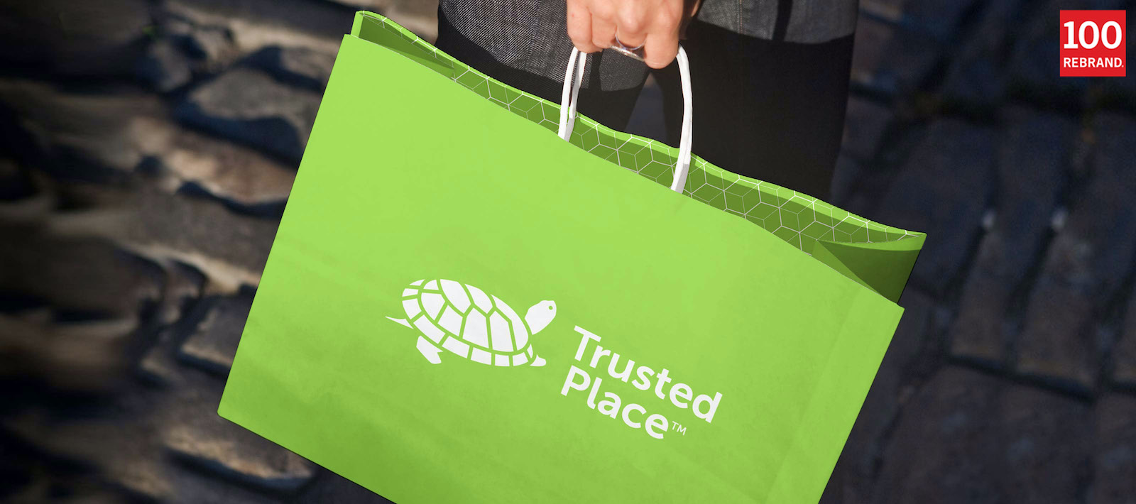
The right image captures the idea at the heart of a brand, leaving a timeless, indelible impression. That’s what Tenet’s logo design did for TrustedPlace, a specialty insurer that, like the turtle’s shell, provides all-encompassing coverage wherever people go.
When a venerable and respected name in the B2B space branches out to the consumer public for the first time, its existing brand might not be the best way to gain attention. A different identity can help the company stand out and create a new niche for itself. That’s how Tenet Partners helped the company behind TrustedPlace, with an evocative, suggestive logo and supporting collateral system that marked a clean break and a fresh start.
Creating a new concept in homeowner protection
Equipment breakdown insurance is well known in the commercial world, protecting businesses when industrial equipment or critical systems fail. Creating viable coverage takes deep expertise, something that few underwriters have.
Several years ago, a leader in this highly specialized insurance category began to explore a new market by extending the concept to homeowners. Its expertise in equipment breakdown underwriting gave it an advantage in covering what’s in every home: valuable appliances, home systems like heating and cooling—even utility lines, mobile electronics and the data they contain.
Seizing an opportunity to reach consumers directly
Initially, the company’s home systems protection coverage was sold as a “white label” offering through existing homeowner insurance companies. The product was clearly superior to the so-called “extended warranty” plans that are limited in scope and tend to have a poor reputation among consumer groups and the public.
Despite good consumer demand, sales through the insurance company channels was slow. Seeing a growth opportunity, company leaders decided to market through new channels as well. In addition to the existing relationships, the coverage would be sold direct, as well as through agents and high-profile alliance partners—well-known national organizations that typically offer perks such as insurance and travel discounts to members.
Keeping the parent brand at arm’s length
With a long and proud history, the underwriter had earned a great reputation in the industrial/B2B marketplace. Its brand had strong equity with that audience, but was unknown in the consumer space. In addition, the name and logo had a decidedly “retro” feel that honored the company’s legacy, but didn’t align with the new offering or its audience.
A consumer-oriented approach was called for. Management wanted to start with a clean slate: a go-to-market brand called TrustedPlace with its own identity, clearly separating the current and all future direct-to-consumer products from the parent’s industrial offerings.
Renewing a successful partnership
The underwriter had prior experience with Tenet Partners, having worked with us on brand positioning and integration when the company was acquired several years ago. Tenet’s knowledge of the company’s personal lines strategy, along with its creative capabilities, made it the partner of choice for the new visual identity project.
Goals set with the long view in mind
TrustedPlace marketers understood that in the consumer world, a carefully crafted name and logo carry much of the messaging associated with a brand by setting the tone and delivering an all-important first impression. This is especially true when entering a new market, where the brand identity can help define the category itself.
The TrustedPlace team was looking for a logo that would be simple, memorable, timeless, versatile and appropriate for the category. The company wanted to make sure that the idea behind the brand could be understood in an instant. At the same time, it was important to leave the door open to future innovation.
It’s all about protection
A critical aspect of the TrustedPlace strategy is its future vision. The initial offering is around home systems protection including utilities. However, in a world that’s increasingly mobile and digital, the company recognized the opportunity to link the brand to more than what’s directly associated with a house. Potential offerings could include identity theft, cyber protection, mobile devices, automobile equipment and other specialty coverages that protect people and what they rely on every day.
The new logo evolved from the thinking that protection is something that should be all-encompassing and stay with you wherever you go. And that led directly to the turtle: A strong, protective shell that moves with its owner captured the brand’s idea and resonated strongly with the client.
When the final work was presented, it met with an enthusiastic response from the client and consumers. The turtle gave TrustedPlace exactly the kind of versatile, timeless personality the team was looking for.
“We developed a number of really good logos that captured key attributes like security and confidence, but felt there was enormous potential to capture consumer empathy by coming up with a friendly, character-based concept. Turns out our client was absolutely amazed by the turtle and called it a home run.”
– James Cerruti, Senior Partner, Tenet
