Canon Medical

Canon Medical Systems USA

Canon Medical Systems USA faced intense competition from long-established global medical imaging vendors. With the competition mainly focused on technology, Canon Medical saw an opportunity to leverage its emphasis on expertise, relationships and the positive impact it has on customers and patients as a way to stand out.

Canon Medical’s visual identity was taken from the global Canon brand, which limited its ability to tell a distinctive story tailored for its target market. The critical challenge was to respect that link to the power of the global brand while enabling Canon Medical to stand out as a preferred partner for the medical community.

Tenet’s approach to developing the visual system was highly collaborative, combining an extensive competitive audit and image review with work done by Tenet brand strategists and input from the client to visually represent key elements of the refreshed brand. In this way, the visual system was firmly grounded in brand strategy.

Strategic elements included themes of meaningful innovation, alignment with Canon corporate brand values, its tagline of “Made For Life” and Canon Medical’s new positioning theme: “With you all the way.”

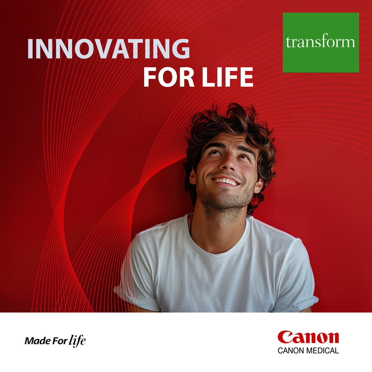
Picking up on the themes of human expertise and partnership, the photo style emphasizes humans engaging with one another, with the viewer and with technology to complement images of equipment.

The new visual identity links to the global Canon brand in subtle, yet compelling ways, making good use of the corporate red along with gradients and geometric shapes. The system’s graphical underlay is a transformation of the highly recognizable letter C shape that’s part of the Canon wordmark, replicated and rotated to provide a rich texture that suggests technology without overwhelming the more human elements of imagery.

Canon Medical’s new visual identity and Tenet’s accompanying strategic brand work has been greeted very positively by the organization’s leadership, providing a solid foundation for continued growth and differentiation in the medical imaging market. A few months after the updated brand launch, Canon Medical saw a 45% increase in engagement with its PR and social media content.

Fairtrade

Fairtrade International

Fairtrade International is a non-governmental organization spearheading a global movement to change the way trade works through better prices, decent working conditions and a fairer deal for farmers and workers in developing countries.

Fairtrade promotes its agenda through a system of certification marks on product packaging help brands signal that they are part of a more sustainable, responsible worldwide economy, giving consumers assurance that they are making ethical purchase decisions. It was felt that this multifaceted system was too complex and difficult to understand.

The organization saw the need to make the scheme more clear, but wanted to make sure any changes were driven by research and a sound brand strategy. Fairtrade came to Tenet Partners for help with streamlining its certification architecture to better communicate with the market.

Building on extensive research, the Tenet team recommended a simplified approach based on use cases. The new system is straightforward, easily understood and modular, with a single certification mark that combines the two legacy marks and supplemental visual elements that can be added or removed based on the use case.

The new approach makes identification of Fairtrade-certified products easier, while still allowing for the inclusion of relevant information. It also sparked valuable discussion and consensus-building within the organization.

With clarity around adoption of the new architecture achieved, Fairtrade International is poised to move forward with a clean, flexible system that allows qualified businesses to better communicate with their customers—and for the organization itself to advance its vision.

APTA

American Physical Therapy Association

The American Physical Therapy Association (APTA) is a professional organization that represents more than 100,000 member-physical therapists, physical therapist assistants and students of physical therapy nationwide.  

While developing its 5-year strategic plan, APTA leadership determined that the association’s brand was not serving the needs of its membership. This was proved out as the 71 specialty sections, state chapters and major programs that comprise APTA were using their own branding, creating a highly fragmented face to the organization.  

While national leadership desired a more consistent identity, it was concerned that developing a cohesion might also create friction—with most chapters wanting to maintain their individual identities.  

Tenet research confirmed that the national association was underappreciated by its members, who were more connected with their local chapter or specialized member group than they were to the broader organization. 

In parallel with visual identity work, Tenet strategists engaged APTA national and chapter leadership in collaborative exercises designed to build consensus around an evolved brand architecture that would establish a more prominent connection between the chapters and the association.  

That process helped to shift the views of leaders and members, who agreed that a more cohesive branding approach would go a long way towards increasing the stature of the association, and of physical therapists in healthcare and among the public at large.  

A new logo and visual system were also developed to express the end benefit physical therapists provide their patients: a notion of fluid activity and freedom of motion, driving forward and upward. The refreshed visual identity provides both consistency and flexibility, allowing APTA to build a cohesive brand while giving the 71 disparate groups the freedom to customize their own identity by choosing from a range of pre-designed options.  

In a further endeavor toward consistency, Tenet also developed a messaging playbook—a key resource that APTA’s national staff had never had before—along with comprehensive brand guidelines, launch strategy and communications. 

The national brand launch was timed to coincide with the association’s centennial celebration, featuring prominently in APTA’s new headquarters. By tying the launch to a major event, the refreshed brand generated considerable excitement and buy-in. With a solid architecture established, the individual member groups now have the tools to roll out their own refreshed brands.  

The new brand approach quickly proved its worth. A prominent APTA group that had separately undertaken its own brand refresh hired Tenet to design its new brand. We demonstrated how the architecture solution, new identity and visual system could be used to create a powerful brand expression at all levels of the organization.

Broadview Federal Credit Union

Broadview Federal Credit Union

Following the merger of two New York capital region credit unions—SEFCU and CapCom—to form the Broadview Federal Credit union, creating a unified digital presence was a top priority. Tenet Partners led the creation of the Broadview brand, and then the organization turned to us once again to create a cohesive website that would fully embody the new brand identity.

Proven best practices developed over years of comparable engagements served as the basis of Tenet’s comprehensive, strategic approach to the assignment. This was more than a simple redesign of an existing site—it needed to fully support Broadview’s business strategy and make the most of the credit union’s new brand.

Digital strategy: Our team began by crafting a robust digital strategy that aligned with Broadview’s brand vision and business goals. This strategy provided a clear roadmap to the harmonization of the two legacy websites with unique navigation, content and customer experiences, ensuring consistency and alignment across all digital touchpoints.

Information architecture and content analysis: We meticulously structured the website’s information architecture to enhance navigation and the user experience. Thorough content analysis was conducted to ensure relevance, clarity and consistency in messaging.

Wireframes and component library: Wireframes were designed to help visualize the layout and functionality of key pages, while a digital component library was developed to maintain design consistency and facilitate efficient updates.

Visual and experience design: Our visual design team created a modern and engaging aesthetic that reflects the distinctive Broadview identity. Working concurrently, the experience design team focused on user-centric principles, ensuring intuitive and seamless interactions.

Content development and integration assistance: Using the verbal platform that was part of the Broadview rebrand as a starting point, the team crafted compelling content that would resonate with Broadview’s diverse audience. Additionally, we provided integration assistance to ensure smooth implementation of new content, UX features and functionalities.

Page-level design and project management: Each page was carefully designed to ensure a cohesive look and feel. Throughout the project, our dedicated project management team ensured timely delivery, quality assurance for content and seamless coordination among stakeholders.

The new Broadview website is a testament to the power of strategic UX design and execution. By integrating SEFCU and CapCom’s strengths into a single, unified platform that fully expresses the brand, we created a digital experience that not only reflects Broadview’s new identity but also enhances member engagement and satisfaction. At the same time, we created the tools, resources and knowledge needed to carry the site into the future, empowering Broadview to evolve its online presence going forward.

By tapping into our development, visual, verbal and strategic strengths, this project exemplifies Tenet Partners’ expertise in delivering comprehensive digital solutions that drive success.

EMC Insurance

EMC Insurance

EMC Insurance is an Iowa-based carrier primarily focused on risk solutions for business. As a mutual company that relies heavily on independent agents, local presence and close relationships with communities and businesses, it has a powerful story to tell.

EMC leaders knew they had a strong presence in the market, but felt that there was an opportunity to amplify the brand to better reflect the company’s strengths and distinct character.

Starting with extensive internal and external research, Tenet strategists zeroed in on what makes EMC special: that at its core, it is a very human company.

That ethos was captured in a revised brand platform as a foundational element: “The national carrier with a local heart.” This laddered up to a new brand promise: “Keeping insurance human.” In keeping with this, the platform and brand voice shifted away from a product-first approach to larger themes of partnership and prosperity.

EMC’s existing look—hard-edged and dark, typical of the industry—felt dated and was not ideally suited to the company’s focus on working with agency partners to help policyholders and communities thrive. Tenet designers created a warmer, more engaging visual identity, using an in-person workshop to help the EMC team get up close with the creative process.

As the amplified EMC brand was being prepared to launch externally, leadership understood that connecting with the internal audience was critically important, as they are the ones embodying the brand promise across all touchpoints.

The Tenet team knew that the employee training program would be most effective if delivered by the employees themselves. A Tenet-crafted “Brand Ambassador” train-the-trainer program tapped 60 uniquely qualified individuals across various geographies and areas of expertise to be the faces and voices of employee engagement throughout the organization.

It all came together at One EMC, an historic event at EMC headquarters. Through unique and memorable employee experiences, the team generated excitement, teamwork and a greater understanding of the amplified EMC brand.

The new brand identity, Brand Ambassador program and One EMC event were hugely successful and popular with employees, serving to bring clarity about the company’s path forward and build genuine enthusiasm about EMC’s future.

“The collaborative partnership we had with the Tenet team resulted in a highly creative and impactful visual identity that further enhanced our broad strategy,” said EMC’s vice president of customer experience & marketing.

FIRST

FIRST

For Inspiration and Recognition of Science and Technology

A global nonprofit organization founded by well-known inventor Dean Kamen, FIRST is dedicated to improving education and interest in science. The company touches the lives of nearly 700,000 kids globally through its robotics programs. Kamen, holder of more than 1000 patents and founder of DEKA Research and Development, set a vision for the organization to “create a world where science and technology are celebrated…where young people dream of becoming science and technology heroes.”

The identity of FIRST is an excellent example of a grass-roots creation that takes a life of its own through its application. Unlike regimented corporate programs, the company’s symbol is applied freely to just about everything imaginable inside and outside event venues – by FIRST staff, by the thousands of teams and fans, and by the many corporate sponsors and partners contributing time and resources.

Tenet Partners donated its services and talents to helping FIRST create a new logo and signature system that updates its image, solves a range of application issues, and clarifies the structure of the growing nonprofit’s numerous offerings.

DTS

DTS

Reimagining technology as a lifestyle brand

OVERVIEW

A longtime leader in digital audio, DTS brings the sound of countless movies to life and plays a role in the performance of most audio brands. Yet, despite its behind-the-scenes prominence, the company was relatively unknown. It needed to gain traction with key audiences, from consumers and equipment manufacturers to music and film producers.

CHALLENGE

The company’s name reflects its origins in the film industry—it was originally called Digital Theater Systems—and it was time to change that mindset by finding the best way to speak directly to end users, so they could better understand the presence and value of DTS technology in their lives.

HOW WE HELPED

Tenet took a two-pronged approach to helping DTS advance its brand. First, our strategists worked with DTS to explore positioning opportunities in new application areas such as car audio, personal computers and other related entertainment businesses. Second, we enabled the company to enhance its visual presence by bringing DTS technology to the forefront—a key element of becoming more consumer-focused.

The “technology inside” approach to visual branding is well established, having been used successfully by DTS competitor Dolby among many others in related industries. Tenet strategists expanded on this by recommending a more personal positioning, using the tagline “Surround Yourself” to emphasize the high-quality experience that DTS provides.

Tenet’s creative team developed a new graphic identity and launch campaign to raise excitement for the brand. We also helped redesign and fine-tune the DTS and DTS-HD logos. The new design and brand architecture made the identity more prominent and easier to use on audio equipment, in software and in expanding digital communications channels. This provided the company with a clear presence in the lives of consumers—a subtle reminder of DTS as part of their entertainment experience.

OUTCOME

Thanks to more effective positioning against its competitors, DTS has been able to maintain the value and price of its technology as well as differentiate itself from arch-rival Dolby Labs. Today, DTS technology is built into hundreds of millions of electronic devices worldwide, unlocking theater-quality audio for consumers everywhere.

Digital Living Network Alliance

Digital Living Network Alliance

Highlighting the real-world value of industry standards

OVERVIEW

The Digital Living Network Alliance (DLNA) is an industry-led consortium of consumer electronics, telecommunications, computing and mobile device companies focused on creating seamless interoperability and connectivity for consumers. Looking to drive membership and consumer engagement, the organization brought in Tenet Partners to help.

CHALLENGE

DLNA was having difficulty gaining consumer awareness and visibility. With little articulation of the organization’s vision and value in evidence, an important opportunity to help the industry grow was going largely untapped.

HOW WE HELPED

Given the natural complexities of a member-driven standards group, DLNA’s Board needed help setting a clear course for advancement of the brand and mission. Through a series of facilitated workshops, Tenet unearthed a critical gap in brand positioning, and at the same time established a series of strategic imperatives for brand development including clarification of the DLNA value proposition and helping manufacturers leverage the brand in helping consumers understand the value of interoperability and its impact on the products they buy.

Tenet conducted field work including visits to trade shows and retail stores, along with one-on-one interviews with consumers and industry professionals. We observed pockets of interest in DLNA, but not broad-based enthusiasm among many of the key participants. Explicit support for DLNA was evident in select manufacturers’ communications—LG and Samsung, for example—but by no means all. While other member companies acknowledged support for DLNA, most had little visible presence of the certification in their communications. And the largest challenge was that few people could articulate DLNA’s benefits clearly.

Diving deeper into the challenge, Tenet conducted a global quantitative research study that focused on understanding the issues consumers had expressed during the qualitative interviews. Part of the study tested visual and verbal concepts and assessed the brand equity of the DLNA Certified mark. Building on the resulting insights, Tenet then led a collaborative process to articulate a clear brand strategy, messaging and design approach, and to build consensus with the DLNA membership.

OUTCOME

The program helped DLNA regain momentum as a vehicle for achieving a common objective in delivering a better consumer experience. Key to that success was a deeper level of engagement with all stakeholders to embrace and support the organization and its mission.  By June 2015 the organization claimed membership of more than 200 companies, and over 25,000 device models had obtained “DLNA Certified” status.

Cadence Bank

Cadence Bank

From rich history to bright future

OVERVIEW

After BancorpSouth and Cadence Bank – both leading financial institutions serving the southern United States – completed their merger in late 2021, a new corporate brand was needed to unify the company internally and signal the arrival of a new and stronger organization to customers and communities across the region.

CHALLENGE

The challenge for the new Cadence Bank brand was to communicate a value proposition that would capture the experience that made the organization stand out as something different.

The brand also had to unify the organization while retaining the strong equity of both legacy brands in terms of visual identity, service and culture—and provide a springboard for the future.

HOW WE HELPED

Research quickly revealed common strengths across the two legacy organizations that differentiated them: deep expertise, a focus on listening first, personal service and strong relationships with customers, among employees and within communities. Taken together, these attributes helped both organizations provide guidance in the way that’s most meaningful and helpful to their customers.

Tenet saw a warm, personal approach distinct from that of many larger financial services companies: an urge to meet people where they are on their financial journeys, develop and sustain long-term relationships, and provide the flexibility required to meet individual customer needs. It is not uncommon, for example, for customers to be greeted by name when they go to a branch.

This shared culture and the personality attributes that shape it led to a new brand promise: “Ease your day. And your mind.” The concept of ease was central to positioning as well, providing a way to tell a rich and nuanced story that goes beyond “we make banking easy.” At Cadence, ease is as much a mindset as an operating principle. It’s as much about creating convenience as it is about putting customers’ minds at ease.

The visual, sonic and verbal brand identity stands out in the marketplace as something fresh and new while being rooted in the proud history of both companies—showing how two leaders have joined under the new Cadence brand. Together, these elements evoke a strong sense of people and community that complements all aspects of the customer experience. It puts weight and credibility behind the new tagline: “Helping opportunity take shape.”

Notably, Tenet designers found a way to echo the highly recognizable BancorpSouth gumtree logo with a completely new take on the iconic symbol. Since the Cadence name was retained, it was important for BancorpSouth employees and customers to see themselves reflected in the new logo. By evoking the gumtree through color and perfectly balanced shapes working in harmony to complement the name, the logo provides a clear link to the past while moving the brand forward.

The brand rollout was supported by an extensive communications and employee engagement program, including regular communications on a dedicated internal microsite and the company intranet. Tenet and the Cadence team also implemented a “train the trainer” program for Cadence Bank brand ambassadors—selected individuals who went on to immerse thousands of employees in the new brand, focusing attention on the Cadence Bank culture and values, and the part that employees play in the customer experience.

OUTCOME

The resulting brand is a clear reflection of the very best of legacy BancorpSouth and Cadence, coming together to create a new, modern and human-centric financial services organization. According to the client, the brand has generated an overwhelmingly positive response from thousands of employees and customers, and has won awards for the bank.

“One of the aspects we’ve liked most about Tenet Partners’ approach is their ability to effectively balance art and science when developing our new brand. They are exceptionally strong in both areas, which is rare for a branding agency.”
– Jackie Hooper, SVP, Chief Marketing Officer, Cadence Bank

Dow

Dow

Showing a commitment to sustainability 

OVERVIEW

When Dow decided to incorporate sustainability into its brand strategy as a key competitive element, it turned to Tenet Partners for help. In a project that grew in scope over time, the Tenet and Dow teams collaborated to develop a robust framework to support what Dow is doing today as well as its ongoing sustainability evolution. The result is a fully-evolved set of brands  that bring the framework to life.

CHALLENGE

Dow’s sustainability branding strategy went far deeper than putting a sustainability spin on its existing portfolio. Dow chose to tangibly demonstrate its long-term commitment to environmental sustainability by creating a brand architecture around the idea of “Sustainability Science.”

While a vitally important global initiative, this was not to be an overhaul of the existing Dow architecture and identity. The key challenge was to both fit within and complement the existing Dow enterprise brand; the sustainability brands had to be unmistakably “Dow” while also being distinctive.

HOW WE HELPED

The multifaceted project started with brand architecture. In a highly collaborative engagement, the Tenet strategy team took Dow’s ideas as a starting point and developed the concept of “sustainability pillars” under an overarching Sustainability Science umbrella that encompasses all sustainability activities at Dow. Each pillar is dedicated to a specific area of focus: carbon reduction, bio-based materials, recycled content, circular design, biodegradable materials and resource efficiency.

With Dow being a large, matrixed organization, consensus building was crucial. Working closely with Dow, the Tenet team developed a complete sustainability brand architecture, brand platform, pillar descriptors and brand names, messaging, logos and a visual system along with governance planning and implementation, including employee training.

All work was based on qualitative research as well as an extensive verbal and visual audit of Dow and its competitors, including Dow’s corporate sustainability initiatives and reporting around its 2025 and 2050 sustainability goals.

Using these insights along with the existing Dow brand guidelines, Tenet focused on key strategic, verbal and visual opportunities that would enable Sustainability Science to fit seamlessly into the overarching Dow brand while having a life of its own. The nomenclature, messaging, logos and flexible, scalable visual system are consistent with Dow brand guidelines while referencing sustainability benefits.

By uniquely expressing elements already present in the Dow brand such as color, the new system conveys a nature-inspired feel that separates the sustainability brands from Dow’s corporate identity while dovetailing with it – a system within a system. As a result, Sustainability Science enables Dow to both retain the integrity of its core enterprise brand while opening up new pathways for the future.

OUTCOME

With a strong and distinctive sustainability-focused branding approach that is unmistakably “Dow” while carving out its own distinctive niche, Dow is clearly communicating its commitment to the future both verbally and visually. The company is now introducing its sustainability brand and governance across all business units, communication functions and with partner agencies globally in preparation for a global rollout.

Headquarters 11 West 42nd Street
Penthouse Floors 31/32
New York, NY 10036
212 329-3030

Boston
Columbus
Kansas City
San Francisco

A hexagon-shaped badge from Clutch, with the text 'Top Branding Company' on top and '2024' on the bottom