CIEE – swelling study abroad enrollment through digital marketing

Bringing a world of experiences to the connected generation

CIEE swells study abroad enrollment through digital marketing

CIEE: Council for International Education Exchange has an ambitious goal: improve international relations through cultural exchange. Each year, this leading nonprofit helps thousands of young people travel abroad to study. For those willing to get on board, it’s a life-changing cultural exchange experience that opens their eyes and minds.

To reach adventure-hungry students and deliver on its promises, CIEE has to rise above a crowded marketplace. With a well-deserved reputation for quality and support, CIEE has a powerful selling proposition. Getting the message out to promote the benefits of study abroad, and present CIEE as the best choice, takes sustained marketing efforts. The question is, what’s the most effective way?

Busy college students, the organization’s key constituents, can be challenging. This is a generation that lives its life online – the digital space is where they socialize, gather information, make up their minds and shape others’ opinions. It’s where marketers need to be, if they’re going to make valuable connections.

Testing the digital waters

Long reliant on more traditional marketing on campus, CIEE knew it had to expand its direct-to-student digital efforts. The organization found the perfect testing ground to try some new strategies: six universities in California, where CIEE programs were undersubscribed.

Selecting a specific market was a smart move because it took advantage of digital marketing’s greatest strengths: tight targeting, customization and precise measurement. If a way could be found to increase student applications from those six universities, CIEE would have a proven approach that could be rolled out nationwide.

CIEE called on Tenet Partners to craft and execute a new digital strategy. Tenet’s digital marketing expertise, combined with insight derived from a long and deep relationship with CIEE, helped to guide the team in selecting the most effective channels and marketing methods.

Targeted, relevant, persistent – and effective

The test campaign was designed to reach out to students in places they’re likely to visit on the web – Facebook and LinkedIn – with banner ads triggered complemented by Google searches on key words like “study abroad.” The campaign was also restricted by “geofencing:” ads would appear only if the student was on or near the campus. Limiting the ads to display when viewers were in an academic setting made them more relevant, while giving CIEE better data on effectiveness.

And thus the customer journey began… from banner ad, to customized landing page and call to action, to a request for information that triggered an intelligent email “drip” campaign. It was a carefully crafted sequence of events designed to strengthen the engagement and lead to final buy-in.

CIEE built meaningful relationships with students by keeping messages relevant, useful and actionable.

The campaign strategy allowed CIEE to readily determine which search terms were most effective, which channels resulted in the most leads, and exactly where those leads were coming from. With instant feedback, CIEE was able to nimbly fine-tune the campaign to improve results. For example, CIEE soon found that ads on Facebook were generating relatively few responses and reassigned more resources to LinkedIn.

The test was a great success and results were better than expected, with a lead generation rate of more than 17 percent. That gave CIEE the confidence to expand its digital marketing push, and take it in new directions.

Turning up the volume with a nationwide campaign

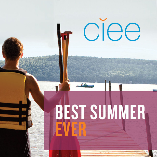
Building on the success of the California test campaign, CIEE launched its “Best Summer Ever” campaign nationwide. With summer study programs worldwide, CIEE wanted to showcase a key differentiator – the breadth of its offerings. The ad campaign led students to one of 19 customized, destination-specific landing pages.

This additional customization allowed CIEE to boost response by tapping into another strength of digital – intent-driven marketing. Search words are an indicator of intent. For example, a student searching for “summer study Spain” is closer to signing up for that destination. By giving the student exactly what they are looking for, a Spain-specific ad will result in higher rate of engagement than a general ad. It worked. The targeted ads and landing pages generated response rates far higher than the industry norm.

The lessons learned were put to good use. Remarketing (the placement of banner ads) was done at a more granular level, contact forms were shortened, coverage was expanded to Pinterest and Google+, and the keyword list was optimized to make the best use of marketing investments.

The results? The numbers speak for themselves. More than 11 percent of clickthroughs resulted in active leads – several times higher than industry norms. Far more impressive was CIEE’s ability to convert those leads into actual program applications. One out every two leads resulted in a student signing up for a summer program.

The way of the future

The CIEE Best Summer Ever campaign was a successful tour de force that showcased the unique ability of digital marketing to reach, engage, convince and compel to action. For CIEE, it demonstrated how digital engagement can drive results, and pointed towards a future of closer, more relevant relationships with its customers.

With CIEE’s assertive move into a new realm of marketing, the organization has a solid digital foundation to build on. Since 1947, CIEE has dedicated itself to bringing the benefits of international education and exchange to students. Now, it is poised to deliver those experiences to more young people than ever before.

Mastercard Brand Center – Managing the assets of a global brand

Mastercard Brand Center

Brand management: Managing the assets of a global brand

Look at the window in store virtually anywhere in the world, and you’re likely to see the Mastercard acceptance sticker. Open a wallet and theres the Mastercard card. See an ad on TV, or a logo on a digital shopping site and there’s the familiar Mastercard logo. Managing the visual and verbal assets of the Mastercard brand on a global scale is a huge responsibility. And it’s one we know well through our work on Mastercard’s Brand Center.

Our work with Mastercard spans strategy to execution. Over the years, we have helped refine the organization’s brand architecture, branded important products such as Mastercard® PayPass and MasterPass, and developed innovative brand management tools to give employees, issuers and merchants global access to one of the organization’s most valuable assets—its brands.

Mastercard asked us to enhance the content and usability of their existing Brand Center so that users can quickly and easily find and download brand-related information — including logo artwork, guidelines, templates and FAQs. The web-based Brand Center had to be functional and practical for users of all technical levels, and serve as a one-stop shop for different user groups: employees, merchants, issuers and vendors. Updates would have to be fast and easy to ensure accurate information is always readily available.

Before beginning any development work, we collaborated with Mastercard to spell out clear goals and objectives for the website. This enabled us to better organize content and determine site functionality, architecture and navigation. We simplified and rewrote online (and offline) guidelines and redesigned screens to improve information clarity and ease-of-use. Downloader tools were designed to incorporate both “expert” and “guided” functionality, giving first-time users more guidance and instruction.

The comprehensive, fully-functional online management tool was launched with great success worldwide, demonstrating the importance of the Mastercard family of brands through consistent use and application. Day-to-day requests for logo artwork, general brand questions and information, have dramatically decreased and users find what they need online. The success prompted Mastercard Japan, Mastercard Germany, Mastercard Brazil, and Mastercard LAC to develop regional Brand Centers in their local language.

Unifying a leader in indirect supply

Unifying a leader in indirect supply

Two industrial supply leaders, uniting under a single brand

Keeping manufacturers and similar enterprises running smoothly is a multi-billion-dollar industry. The myriad products used every day as part of normal operations – everything from gloves, cutting tools and safety equipment to abrasives and lubricants – must be available when and where they’re needed. It’s a complex business, where efficiency, productivity and strong supplier relationships are critical.

To gain a premier position in this market, Sonepar, a privately held $25 billion global electrical supplier, purchased Hagemeyer North America and IDG. The opportunity lay in combining the two well-established and respected companies to create a single, North American supply solutions leader with unmatched geographic scope, scale and manufacturer partnerships. In 2014, that’s what Sonepar did.

Creating a new brand identity

Hagemeyer / IDG had been operating under its two existing brands while working to integrate the company through operations, personnel and finance. But to demonstrate their intention of having one company to their customers—and send a message to associates of both companies—what was needed was a single defining name. Searching through the Sonepar portfolio, the company opted to use a name they already owned, a name that had strong recognition and reputation. The two companies now had the start of their brand identity and would be called Vallen.

Discovering the power of unity

Leveraging earlier internal work to frame a brand platform for the combined companies, Tenet quickly became an integral part of the rebranding process. Tenet operated as a valued extension of the company’s internal resources, with the skills needed to fully develop and launch the new brand. Working with Vallen’s team, Tenet launched a robust, multi-front program that spanned everything from brand strategy extension and articulation, to customer journey mapping, service principles, brand personality, tagline development, brand launch planning and support, sales enablement and employee engagement. Many of these activities ran on parallel paths to get the brand launched on an aggressive timeline.

The process was highly collaborative, with multidisciplinary teams working closely together. This allowed findings and experiences to be shared and new ideas to be validated, which proved critical in creating a cohesive brand expression.

The common goal was to bring dimension and meaning to Vallen, both internally and externally. Tenet researchers engaged extensively with customers and executives spanning both legacy companies, in one-on-one interviews and workshops.

What the team found were areas of competitive advantage, a powerful set of emerging personality attributes and a core set of values in common. In addition, a deep understanding of customers based on listening and collaboration, an innovative, flexible, solutions-oriented approach, and an unmatched commitment to customer success marked the organization.

Innovating to build integration

One of the most important – and impactful – parts of the entire project was building employee engagement and excitement in the run-up to brand launch. This was seen as vitally important, because the rebranding project had been in the works for some time and Vallen associates were eager to see it completed.

To help educate and engage with all associates, Tenet worked closely with the management team to lead a spirit of unity in supporting the brand training. Tenet helped create a “train the trainer” approach, with live workshop training of a select cadre of Vallen associates who would then go on to train their colleagues. They were exposed to the personality attributes and asked to express how those attributes unfold as brand behaviors – making the training very “real” for each person’s job.

Those same attributes were the basis of a powerful set of service principles that also became part of the training and served as a guide for all Vallen associates going forward. To reinforce the brand behaviors and service principles – and thereby build the strength of the brand over time – there are plans to incorporate them into recognition and reward programs that will keep an ongoing focus on the brand into the future.

Revealing the new brand

Heralding the new brand in a dramatic announcement was made a bit difficult because the name had to be revealed well beforehand for legal reasons. That required careful coordination of brand communications, including informing the press, associates and suppliers of the new name without exposing the brand strategy and identity. The name announcement in August 2016 put a stake in the ground with an announcement from the CEO: “We are now Vallen.” With that, everyone knew the rebranding was finally real, and was coming soon.

This created a unique opportunity to build momentum. Learning the name and receiving brand training on the brand values and attributes were peeks behind the curtain, with the anticipation of much more to come.

To capture that sense of excitement and make it grow, Tenet created the Vallen Launchpad – an internal website that, week by week, unveiled more and more of the brand, with a clock counting down to the October 11, 2016 launch day.

The Launchpad featured interactive games, brand education, and communications from management. It also revealed, step-by-step, the vibrant and contemporary Vallen visual system, culminating in the logo, tagline and wordmark on launch day, all brought to life with a powerful corporate video and supported by well-orchestrated local events involving all associates and a National Leadership Conference addressing company managers and major suppliers.

The new logo symbolizes several key Vallen characteristics. It is multi-faceted, representing breadth of products and solutions. The precision of the shapes speaks to being a perfect fit for our customers, and the creative way the shapes come to life in communications supports Vallen’s flexible and adaptable approach to tackling customers’ challenges.

Throughout the entire rebranding process, Tenet supported senior management’s wish to respectfully retire the legacy brands of Hagemeyer and IDG, so that all associates and management could move forward under the unified Vallen name. They became one company, one brand, moving forward together.

Partnering for the future

With a successful brand launch behind them, Vallen continues to partner with Tenet. We’re developing sales collateral that uses an approach not seen before to highlight the company’s unique approach to value, honing sales tools, building a messaging platform and exploring new opportunities to reinforce brand behaviors and empower Vallen’s sales force.

Smithsonian Libraries – Raising the profile of a national treasure

Raising the profile of a national treasure

Smithsonian Libraries stands on its own merits

At the heart of every Smithsonian Institution museum and research center is a library. Each one is truly a world-class place of learning where experts come to both test and expand their ideas – and a place where we can all turn for answers. Collectively, the Smithsonian Libraries form one of America’s most precious scientific and cultural treasures. Thanks to the Libraries’ expanding online presence and digitalization initiatives, more and more people, from across the country and the world, are able to access their vast resources.

As information technologies compound the ability and need to share knowledge, the demands on this unique and valuable source of knowledge are constantly growing. The challenge in front of the Libraries is to find the way to meet these needs with financial resources increasingly constrained.

With federal budget allocations covering less and less of its expenses, it is imperative for the Libraries to find new sources of funding. To support those efforts, the Libraries needed to raise its public profile. At the same time, it needed to create differentiation from the larger Smithsonian Institution and its system-wide fundraising initiative – the Smithsonian Campaign.

Weighing all the benefits, the Libraries decided to adopt a separate, yet related, brand for the organization. Working closely with the advisory board, executive team and staff, Tenet Partners led the strategic and design creation of the new Smithsonian Libraries’ brand, extending it to the Libraries website, social media and physical assets.

Travelers – Putting the umbrella back where it belongs

Putting the umbrella back where it belongs

Travelers Insurance recaptures the essence of a beloved symbol

A simple red umbrella is one of the most recognizable and iconic images in the world. For decades, it has personified Travelers Insurance, a company with a rich history and more than 30,000 employees. A Travelers executive, quoted in the New York Times in 1964, said it best: “It illustrates the concept of protection, it is friendly, it is warm, and it is very merchandisable.”

Hard to believe, then, that for several years Travelers was unable to use the symbol so closely linked to the firm. A saga of mergers and spinoffs left Travelers in this awkward position. In the late 1990s, Citicorp and Travelers merged and continued to use the red umbrella. Just a few years later, Citi and Travelers went their separate ways – with Citi getting the iconic umbrella in the “separation agreement”.

What followed was a nine-year odyssey that ended when Travelers repurchased its beloved symbol. The price was never disclosed, but it was worth it. Market research showed that even after all that time, the red umbrella was still associated with Travelers – such was its enduring power. For marketers, this is a powerful lesson in how brand serves as a tool to create recall and association with consumers.

Using the umbrella to reclaim Travelers’ heritage

Travelers understood the umbrella’s importance and its potential to revitalize the company’s presence in the market. With the help of Tenet Partners, Travelers seized the opportunity to make a splash and infuse the evocative shape throughout its brand. From the digital space to signs and printed pieces, the gentle arc of the umbrella reminds people that Travelers is always by their side, at every turn.

The new visual system offers great creative range. That is important for a company like Travelers with a broad range of businesses reaching out to varied audiences. Travelers now has a connected way to touch everyone… from everyday drivers looking for auto insurance to global enterprises in need of a risk management partner.

Maintaining the integrity of the Travelers brand

For a company as old and well-respected as Travelers, it is vitally important to represent the brand consistently at every touch point. With tens of thousands of employees and operations that span international borders, that can be a challenge.

Travelers took advantage of Tenet Partners Brand Ensemble to help its employees deploy the new visual system and bring the brand to life, as well as maintain high standards of quality across the company. Brand Ensemble gave Travelers a gathering place for all things brand-related: guidelines, images and templates. It is now easier than ever to keep the Travelers umbrella where it belongs – at top-of-mind for consumers and investors, everywhere.

Modernizing a brand to break out from the competition

A pioneer prepares for next stage of growth

Prior to 2010, the government agency that would become NJPA was a service cooperative providing financial and buying support for educational and non-profit entities in five rural counties in Minnesota. But a change in Minnesota statutes in 2010 opened up a new opportunity for the government agency to transform itself and become one of the nation’s largest government purchasing cooperatives. It could now offer innovative cooperative purchasing agreements to 50,000 members across the U.S. including governments, educational and non-profit entities.

To signify its reach to broader national audiences, the Minnesota municipal agency changed its name to NJPA, which stood for National Joint Powers Alliance. Once word of the member savings began to spread across other government entities, NJPA’s purchasing volume more than doubled in just five years to more than $3 billion dollars in national contract volume.

Breaking out from the pack

However, concurrent with NJPA’s growth, a multitude of new competitors had entered the field, many with similar acronym names and stars-and-stripes brand identities. NJPA’s leadership recognized the difficulty of differentiating its brand in the crowded cooperative purchasing marketplace. What’s more, the new national name and identity was causing confusion among its long-standing regional business that provided educational services and community support in Minnesota’s rural Region 5.

To help resolve the branding issues, NJPA turned to Tenet Partners to conduct a brand assessment that would determine the best path forward to position the organization for future success in both national cooperative purchasing and its Minnesota regional services.

Tenet conducted research with NJPA’s membership, vendor partners and senior leadership to gain sharper views of its national and regional audiences. While the two different units of the agency operated separately and provided different services to each of their memberships, NJPA was excited to learn there was more that united, than divided, its two divisions. They recognized and embraced the opportunity for a new brand and name that could be a platform for growth, uniting and inspiring its entire employee base around one purpose-driven brand promise.

Creating a powerful brand expression

Tenet led a highly collaborative process with a large NJPA task force of marketers, business leaders, sales force and Board members. The goal? Explore new territory for an aspirational name and brand promise built on the common threads of the business units and reflecting leadership’s vision for the future.

We developed a new name that was distinct and meaningful across businesses and could support future anticipated areas of growth. NJPA would become Sourcewell. The name speaks to both what the agency does—sourcing—and offers a double-entendre with the word “well,” alluding to both the expertise of how well the agency worked and the wise choice of its members for “sourcing well” through the agency.

The new logo and dynamic visual system graphically represented an abstract interpretation of a map of the diverse towns, cities and municipalities that Sourcewell serves, as well as the unique ability of the organization to drive tangible and positive change in those communities.

Bold, energetic and modern, the brand expression extended across the entire organization, uniting the two divisions and paving the way for future growth opportunities. Wildly differentiating in the category, the new brand received rave reviews from associates, partners and vendors alike.

A brand launch consistent with Sourcewell’s brand values

During the brand development process, NJPA provided periodic updates on the project to its entire employee base through regular town hall meetings. Before rolling out the new brand to the public, a special brand celebration for employees revealed the new name and identity, while providing training on how employees could embody the brand through their job responsibilities on a daily basis. “In terms of employee engagement, the transformation has been phenomenal. Employees loved our old image, but our organization is behind us, and they’re excited about the new brand.” Sarah Speer, Sourcewell Marketing & PR Manager.

In the spirit of partnership, NJPA’s national sales team kept their vendor council apprised of the progress and timeline, managing their expectations at every turn. NJPA’s vendor partners, including top brands such as Staples and John Deere, welcomed the change and recognized the positive impact a new brand would have for NJPA and, by extension, for their businesses as well. Vendors recognized that NJPA went out of its way to provide information and tools, such as new logo artwork, approved contract seal artwork and co-branding guidance, to ensure a seamless transition for its vendors with no disruption to their business.

Mastercard Labs – A gathering place for innovators

A gathering place for innovators

Opening the envelope for Mastercard Labs

When you’re the global leader in payments and you need a place to conceptualize, test and help bring to market powerful new payments systems to make it easier for customer transactions, where do you go?

If you’re Mastercard, you head down the hall to Mastercard Labs.

With a history of innovative products like Mastercard® PayPass, MasterPass and Mastercard In Control, Mastercard has demonstrated its consumer-led mission to drive brand affection and preference by creating solutions that meet the needs of consumers, merchants, issuers and government.

Mastercard Labs was created in 2010 to focus solely on global research and development, dedicated to bringing innovation to market with greater speed than ever before.

As a new initiative for the organization, Mastercard Labs’ charter was to concentrate on the front-end user experience. One senior executive described Mastercard Labs as “a playground where we can let things happen in a standalone environment, test them quickly and bring them to market quickly.”

So when Mastercard asked our team to create a visual identity for Mastercard Labs, we knew it had to be as innovative as the group it represented. The optimal identity strategy for this “futurist” R&D team of payment experts and technologists had to position the group’s mission as a distinct strategic pillar supporting the overall Mastercard value proposition: creating, exploring and developing ideas; turning ideas into something that works.

Our first explorations hewed close to the existing Mastercard brand architecture, but we quickly realized that we had to push the envelope. Mastercard Labs needed a logo that stood apart from what was already in place and signaled the unlimited potential and breakthrough spirit of the group.

After exploring and evaluating a wide range of concepts, the idea came to us like the embodiment of an idea in a cartoon: the classic thought bubble. The new Mastercard Labs logo evokes all the thought and imagination that lead to the excitement of the “Eureka” moment. But it also maintains the corporate typeface and recognizable red and yellow brand colors that establishes the right level of connection to the corporate identity, strengthening the parent brand’s reputation for innovation.

CFA Institute – Setting the standard for ethics in the world of finance

Setting the standard for ethics in the world of finance

How CFA Institute™ empowers the people behind the numbers

CFA Institute is the largest association of investment professionals in the world, well known for its Chartered Financial Analyst credential. It’s also deeply involved in professional standards development, reporting, student mentoring and education. The organization plays an important role through its focus on shaping policies that strengthen investor confidence and market integrity.

Today, more than 120,000 financial professionals in 150 countries from Mongolia to Mauritius have passed the CFA Program rigorous exams, proudly adding the most respected and recognized investment distinction in the world to their names. That pride is justified. Being a CFA charterholder is a position of real responsibility, setting the standard for integrity in their profession.

Stakeholders for CFA Institute are, undeniably, a varied group: professionals seeking knowledge, students entering the world of finance, regulators, investors and corporations. CFA Institute needs to clearly communicate its principles, vision and thought leadership in a way that resonates with everyone.

Connections that matter

For a membership organization, getting the message out means being relevant to the needs of the audience. Like most professionals, regardless of sectors and geographies, CFA Institute stakeholders have come to expect to get their information online and, increasingly, through mobile devices. CFA Institute saw a real opportunity to raise its profile through digital communication.

Working with the team of brand specialists at Tenet Partners, CFA Institute successfully made the transition from a paper-based culture to one that more closely aligns with the needs of its members. The result: an online annual report and uniquely user-friendly way of presenting its financial statements. The team has been working together ever since, steadily raising the bar with dynamic, responsive-design reports that make the most of mobile devices.

CFA Institute now has the means to better engage with its stakeholders and deliver on its mission – highlight the importance of financial standards and ethics.

Putting a human face on finance

The world of finance is often thought of as impersonal – facts and figures, rules and regulations. The human side sometimes gets overlooked. As the CFA Institute 50th anniversary approached, Tenet saw an opportunity to make the landmark celebration something memorable and focus on what makes the organization truly special: the charterholders.

CFA Institute worked closely with our multi-disciplinary team of brand experts – strategists, designers, digital specialists, content developers – to tell a quintessentially human story. Making full use of the web as a great virtual meeting place, the soul of the organization came to life through 50 curated stories about individual CFA Institute members. More than just bios, these stories came to life in video, audio, letters and articles.

Using videos, recordings, personal letters and much more, this unique story-telling gave a glimpse of the person behind the professional: what motivates them, their life aspirations, their toil and successes and, most of all, the sense of integrity they bring to their work.

A demonstration of its worldwide presence, Tenet helped CFA Institute mark the milestone anniversary by becoming the only organization to date to have members and staff mark their respective stock exchange’s opening or closing literally around the world in one 24-hour period.

Strength and clarity through consistency

With regional offices in Hong Kong, Brazil, London and the U.S. to manage its Americas, EMEA and Asia Pacific communications, it is critical for CFA Institute to ensure consistency in the expression of its global brand. The same clear message of integrity and excellence needs to carry through across languages and cultures.

The online brand center for CFA Institute uses Tenet’s proprietary content management system, Brand Ensemble™, to provide unprecedented flexibility in managing brand assets and communicating its guidelines around the world. CFA Institute is now equipped with the right tools to enable everyone, across the organization, to play their role in building the brand with the same discipline their members bring to their work.

ICE – Taking the seat at the head of the culinary table

Taking the seat at the head of the culinary table

How ICE appeals to those looking for their culinary “voice.”

The Institute of Culinary Education (ICE) alumni are award-winning executive chefs, personal chefs and restaurant owners, the world around. They are running test kitchens. They are food writers. They are professionals who have taken their rightful place in the culinary world.

One of the oldest cooking schools in America, ICE has earned one of the best reputations among industry leaders. It appeared, however, that its reputation did not carry over to prospective students. Led by their passionate founder/owner, Rick Smilow, the school decided that it was time to give the School a brand that reflected its stature and mission and that better aligned with the needs and aspirations of the new student demographics.

Unfazed by stiff competition, a leader moves forward

Like most things in New York, the culinary education landscape is a crowded field with major league players like International Culinary Center (formerly known as The French Culinary Institute) and the Culinary Institute of America a few miles north of the city. It was important to build differentiation that would be ownable, believable and compelling. After extensive research with alumni, students and industry partners, carried out by the team of brand strategists at Tenet Partners, it became evident that ICE’s vision for culinary education – combining rigorous study with a more flexible, creative approach to learning – made it truly different from its peers.

Injecting new ingredients into the brand

The outcome of our strategy work was a clear focus on the customer. Everything at ICE is about the students: their aspirations, their needs, their life schedules, their future. With Tenet’s guidance, ICE has repositioned itself around a bold promise: Find your culinary voice. The tagline Tenet created is a clear signal of the Institute’s unique relevance to students.

The new positioning comes to life with an engaging brand identity that focuses on the inner workings of today’s modern kitchens. The visual identity uses weaving strands of color that recall the fresh ingredients that go into quality culinary art, along with black and white photography that mirrors state-of-the-art, stainless steel kitchens.

Benefitting from Tenet’s full suite of brand services, ICE worked with our team of strategists to communicate its value proposition to target audiences where they live and interact…the digital space. The website we built has become the go-to-place for students and employers alike, extending ICE’s reach into the marketplace.

The transformation continues

The new brand continues to fuel the business forward. ICE is poised for great things ahead as it serves up a whole menu of learning experiences in their new state-of-the-art facilities. According to ICE: “This exciting and extraordinary investment in culinary education is an opportunity for thousands of future students to learn in a world-class, vibrant culinary facility – an invitation to find their own, individual culinary voice.”

Green Street Advisors – Capturing the distinctive brand promise and personality of a leader in the real estate investment sector

From “California cool” to a global presence in real estate

Green Street Advisors creates a customer experience that delivers on its reputation for insight

Real estate investors are always looking for an edge – a way to get into the market at the right time, with the right strategy. That takes real skill, as demonstrated by Green Street Advisors. Founded in 1985, this pioneering firm has earned a reputation for delivering results. The unmatched depth and quality of Green Street’s perspective on the U.S. real estate market and the objectivity of their insights and analysis has made them the dominant voice in the industry.

From inward confidence to customer-centered value

The company had a confident, “California cool” personality that served it well as it grew. But with ambitions to capture a bigger share of the growing global market for in-depth research, Green Street knew it had to offer a customer experience that delivers the well-established quality of the company’s information and insights.

So began the brand-building process that involved key stakeholders across the organization and Green Street’s customer base. Tenet Partners conducted intensive research to gain a full understanding of the company’s vision and values. That informed recommendations for a new brand strategy that emphasizes how clients rely on Green Street’s expertise to make smarter investment choices. That brand promise is captured in the tagline that shows what customers are able to accomplish by working with Green Street: Enabling better decisions through better research. This acknowledged what Green Street was known for, while making a subtle shift from internal focus (better research) to customer value (better decisions).

Adding value to the customer experience

Tenet designers captured the new brand promise and personality in a logo and design system that evokes precision and accuracy, coupled with enterprising drive. It was a departure from the previous “cool” image that communicated forward-looking change – a clear movement onto the world stage.

The next step was to recraft the customer experience itself. Working together with Green Street’s analysts and IT group, Tenet’s strategy, design and digital teams created a new user experience for the firm’s clients that drove the core idea of the brand through to product and information design.

The company delivers research to analysis to its clients through emailed reports and an online portal. These are the heart of the customer experience, and they needed to pay off on the concept of decision enablement like never before. That meant a redesign that was more than skin-deep: it had to create a direct, clear path to Green Street’s actionable insight. The combined team revisited the architecture, navigation and format for the research portal and electronic report templates. This made it easier for clients to find, view and compare different kinds of information.

Entering the world stage

Green Street’s new positioning, identity and customer experience gave the firm what it was looking for: a launching point for strategic entry onto the world stage. Green Street wanted to make a splash with its first foray into Europe, and it did. The firm opened its new London trading desk on the same day that the brand was launched.

Since that day in 2008, Green Street has thrived, successfully weathering the real estate crisis. Today, it’s the preeminent independent research, analytics, trading and consulting firm to the commercial real estate market in North America and Europe.

The proof of performance

2015 marks Green Street’s 30th anniversary and the numbers show just how successful its strategy has been. Over the last decade Green Street’s recommendations generated annualized total returns of 25%. A high rate of return by any measure, and doubly impressive given that the overall real estate investment trust market achieved just over 11%.*

* Returns based on the FTSE NAREIT All Equity index. Source: REITs and Real Estate: Complementary through good times and bad. TIAA-CREF Asset Management, Fall 2014.

Headquarters 11 West 42nd Street
Penthouse Floors 31/32
New York, NY 10036
212 329-3030

Boston
Columbus
Kansas City
San Francisco

A hexagon-shaped badge from Clutch, with the text 'Top Branding Company' on top and '2024' on the bottom