A global nonprofit organization founded by well-known inventor Dean Kamen, For Inspiration and Recognition of Science and Technology (FIRST) is dedicated to improving education and interest in science. The company touches the lives of nearly 700,000 kids globally through its robotics programs. Kamen, holder of more than 1000 patents and founder of DEKA Research and Development, set a vision for the organization to “create a world where science and technology are celebrated…where young people dream of becoming science and technology heroes.”
The identity of FIRST is an excellent example of a grass-roots creation that takes a life of its own through its application. Unlike regimented corporate programs, the company’s symbol is applied freely to just about everything imaginable inside and outside event venues – by FIRST staff, by the thousands of teams and fans, and by the many corporate sponsors and partners contributing time and resources.
Tenet Partners donated its services and talents to helping FIRST create a new logo and signature system that updates its image, solves a range of application issues, and clarifies the structure of the growing nonprofit’s numerous offerings.
A longtime leader in digital audio, DTS brings the sound of countless movies to life and plays a role in the performance of most audio brands. Yet, despite its behind-the-scenes prominence, the company was relatively unknown. It needed to gain traction with key audiences, from consumers and equipment manufacturers to music and film producers.
CHALLENGE
The company’s name reflects its origins in the film industry—it was originally called Digital Theater Systems—and it was time to change that mindset by finding the best way to speak directly to end users, so they could better understand the presence and value of DTS technology in their lives.
HOW WE HELPED
Tenet took a two-pronged approach to helping DTS advance its brand. First, our strategists worked with DTS to explore positioning opportunities in new application areas such as car audio, personal computers and other related entertainment businesses. Second, we enabled the company to enhance its visual presence by bringing DTS technology to the forefront—a key element of becoming more consumer-focused.
The “technology inside” approach to visual branding is well established, having been used successfully by DTS competitor Dolby among many others in related industries. Tenet strategists expanded on this by recommending a more personal positioning, using the tagline “Surround Yourself” to emphasize the high-quality experience that DTS provides.
Tenet’s creative team developed a new graphic identity and launch campaign to raise excitement for the brand. We also helped redesign and fine-tune the DTS and DTS-HD logos. The new design and brand architecture made the identity more prominent and easier to use on audio equipment, in software and in expanding digital communications channels. This provided the company with a clear presence in the lives of consumers—a subtle reminder of DTS as part of their entertainment experience.
OUTCOME
Thanks to more effective positioning against its competitors, DTS has been able to maintain the value and price of its technology as well as differentiate itself from arch-rival Dolby Labs. Today, DTS technology is built into hundreds of millions of electronic devices worldwide, unlocking theater-quality audio for consumers everywhere.
After BancorpSouth and Cadence Bank – both leading financial institutions serving the southern United States – completed their merger in late 2021, a new corporate brand was needed to unify the company internally and signal the arrival of a new and stronger organization to customers and communities across the region.
CHALLENGE
The challenge for the new Cadence Bank brand was to communicate a value proposition that would capture the experience that made the organization stand out as something different.
The brand also had to unify the organization while retaining the strong equity of both legacy brands in terms of visual identity, service and culture—and provide a springboard for the future.
HOW WE HELPED
Research quickly revealed common strengths across the two legacy organizations that differentiated them: deep expertise, a focus on listening first, personal service and strong relationships with customers, among employees and within communities. Taken together, these attributes helped both organizations provide guidance in the way that’s most meaningful and helpful to their customers.
Tenet saw a warm, personal approach distinct from that of many larger financial services companies: an urge to meet people where they are on their financial journeys, develop and sustain long-term relationships, and provide the flexibility required to meet individual customer needs. It is not uncommon, for example, for customers to be greeted by name when they go to a branch.
This shared culture and the personality attributes that shape it led to a new brand promise: “Ease your day. And your mind.” The concept of ease was central to positioning as well, providing a way to tell a rich and nuanced story that goes beyond “we make banking easy.” At Cadence, ease is as much a mindset as an operating principle. It’s as much about creating convenience as it is about putting customers’ minds at ease.
The visual, sonic and verbal brand identity stands out in the marketplace as something fresh and new while being rooted in the proud history of both companies—showing how two leaders have joined under the new Cadence brand. Together, these elements evoke a strong sense of people and community that complements all aspects of the customer experience. It puts weight and credibility behind the new tagline: “Helping opportunity take shape.”
Notably, Tenet designers found a way to echo the highly recognizable BancorpSouth gumtree logo with a completely new take on the iconic symbol. Since the Cadence name was retained, it was important for BancorpSouth employees and customers to see themselves reflected in the new logo. By evoking the gumtree through color and perfectly balanced shapes working in harmony to complement the name, the logo provides a clear link to the past while moving the brand forward.
The brand rollout was supported by an extensive communications and employee engagement program, including regular communications on a dedicated internal microsite and the company intranet. Tenet and the Cadence team also implemented a “train the trainer” program for Cadence Bank brand ambassadors—selected individuals who went on to immerse thousands of employees in the new brand, focusing attention on the Cadence Bank culture and values, and the part that employees play in the customer experience.
OUTCOME
The resulting brand is a clear reflection of the very best of legacy BancorpSouth and Cadence, coming together to create a new, modern and human-centric financial services organization. According to the client, the brand has generated an overwhelmingly positive response from thousands of employees and customers, and has won awards for the bank.
“One of the aspects we’ve liked most about Tenet Partners’ approach is their ability to effectively balance art and science when developing our new brand. They are exceptionally strong in both areas, which is rare for a branding agency.” – Jackie Hooper, SVP, Chief Marketing Officer, Cadence Bank
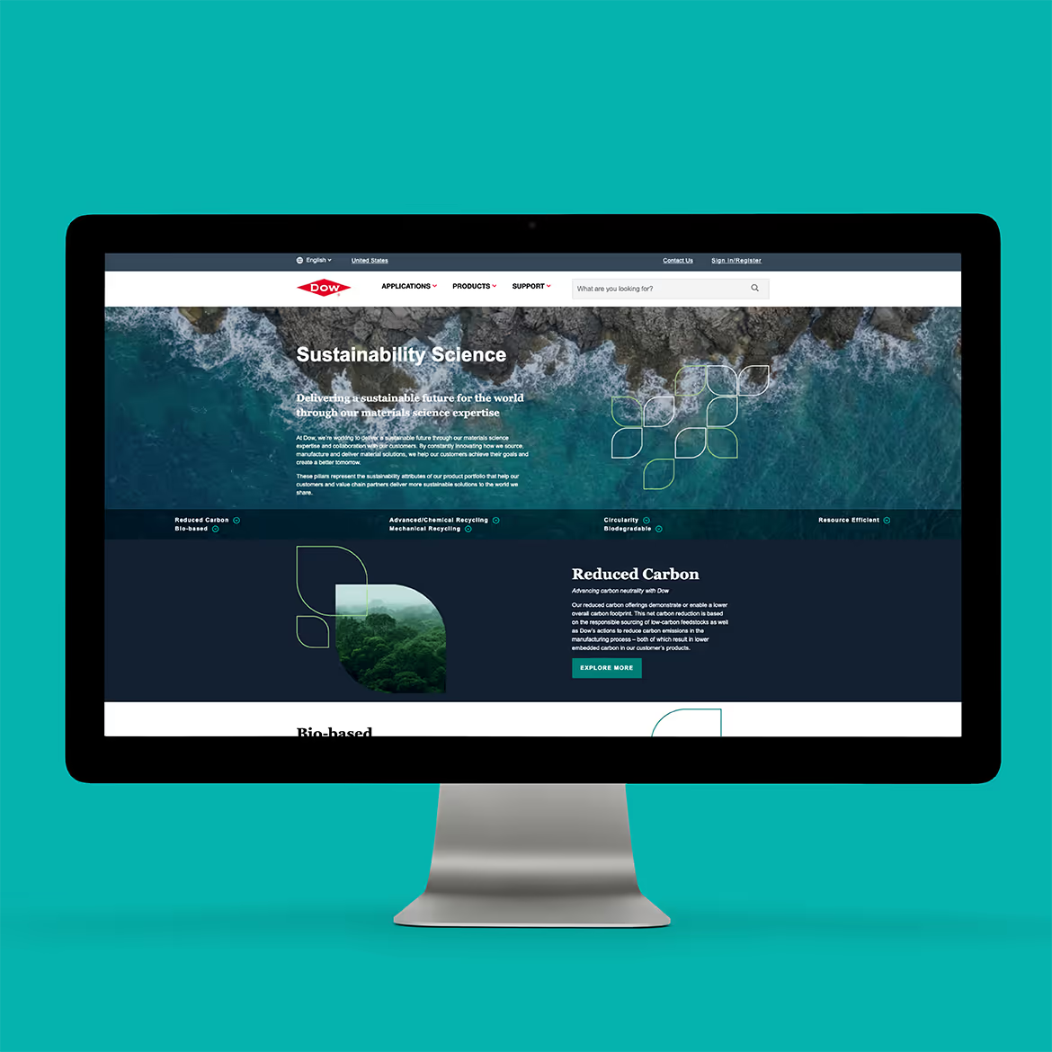
Sustainability is about much more than being “green.” It’s become a vitally important part of business strategy for enterprises like Dow, one of the world’s most prominent materials science companies.
Dow has long been a trendsetter in environmental, social and governance (ESG), the core tenets of sustainable business practices. The company worked with Tenet Partners to turn that leadership into market advantage, through a comprehensive sustainability-driven product brand framework and award-winning visual design system.
Going deep on impact establishes credibility
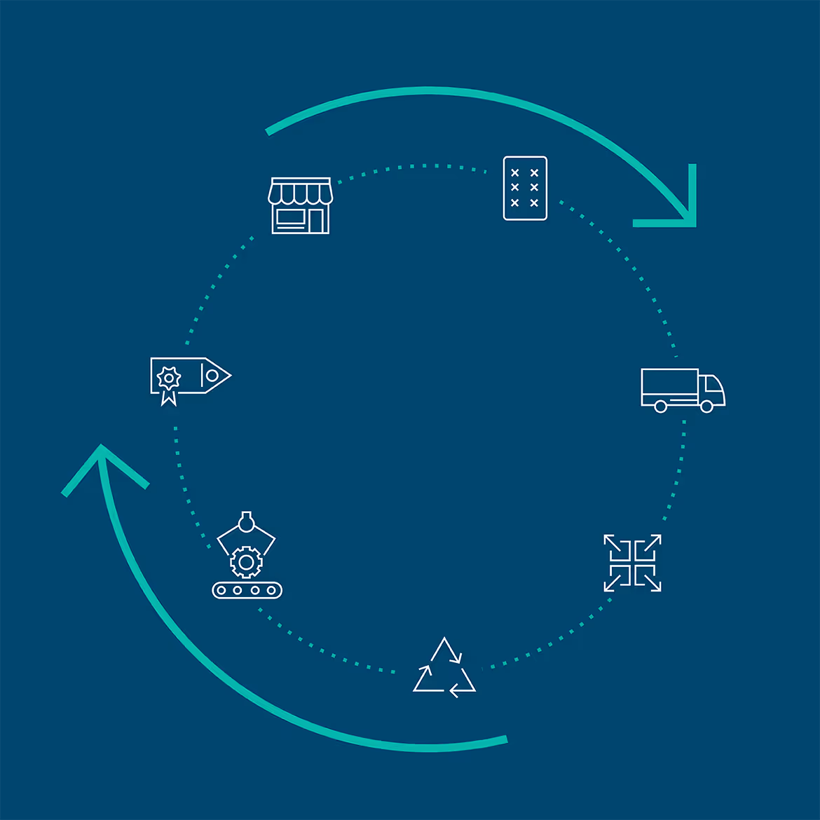
The practice of “greenwashing”—making sustainability claims without backing them up—has done more harm than good for many industrial brands. Dow knew it had to do more than put a sustainability spin on its existing portfolio. The company had to demonstrate impact: how its products contribute to sustainability for its customers and in turn, their customers.
Brand expression that looks to the future
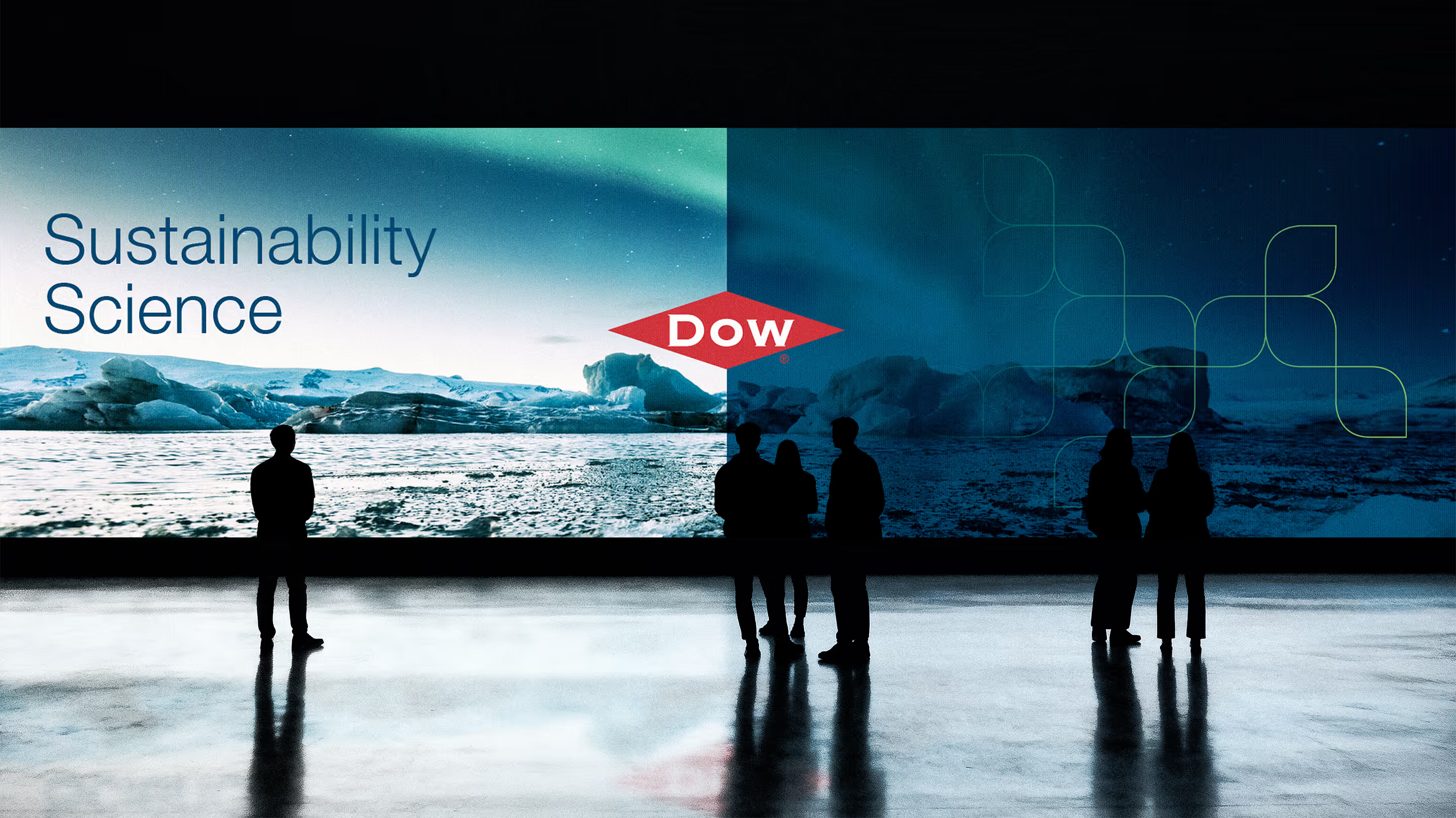
Dow needed to telegraph its future direction, but there was an inherent tension: not all Dow products can be thought of as sustainable, and those that are don’t stand out. The solution was to give Dow’s sustainable brands a distinct identity, with a “Sustainability Science”-focused product brand architecture driven by key impact attributes such as carbon reduction and reduced resource use.
Giving Dow’s sustainability brands a life of their own
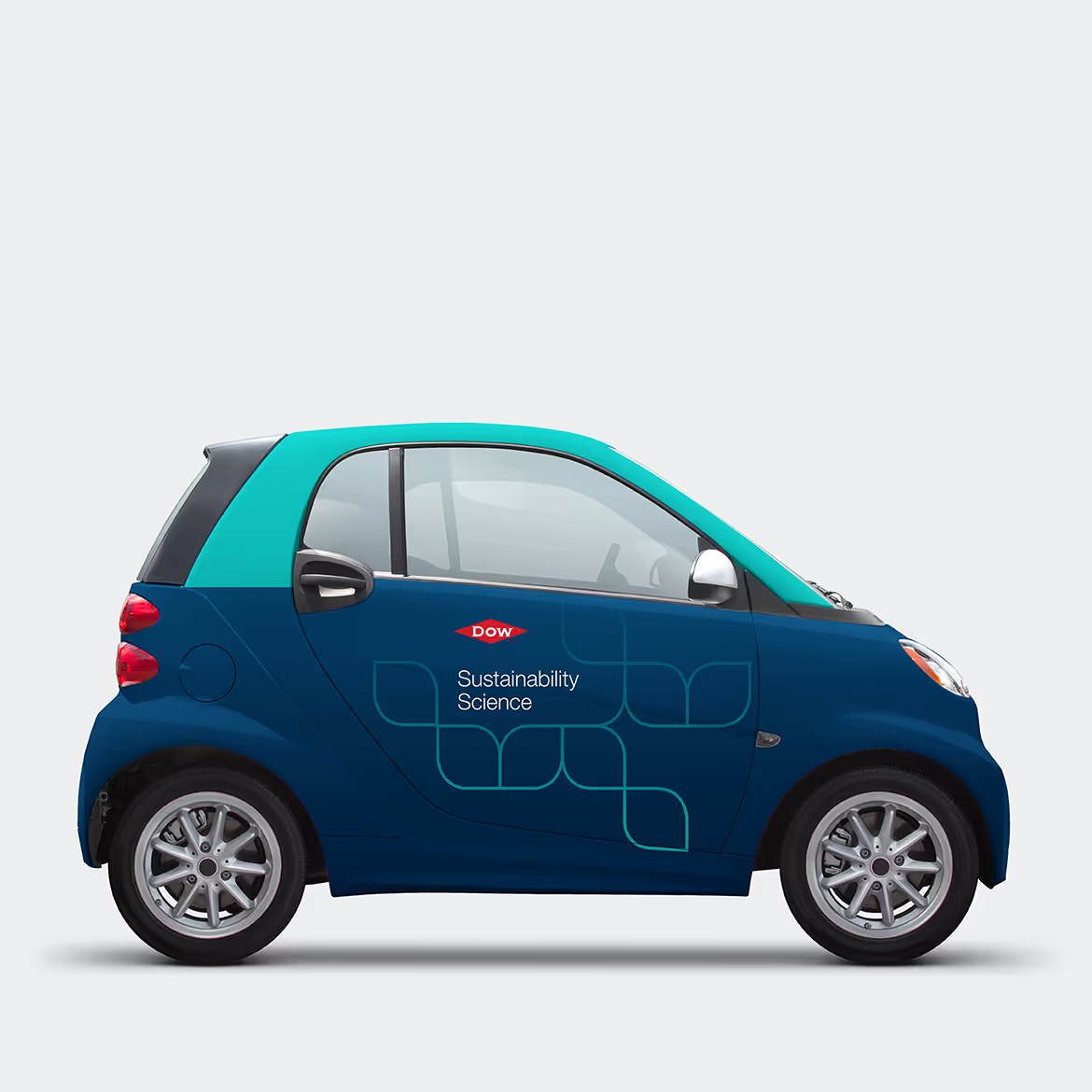
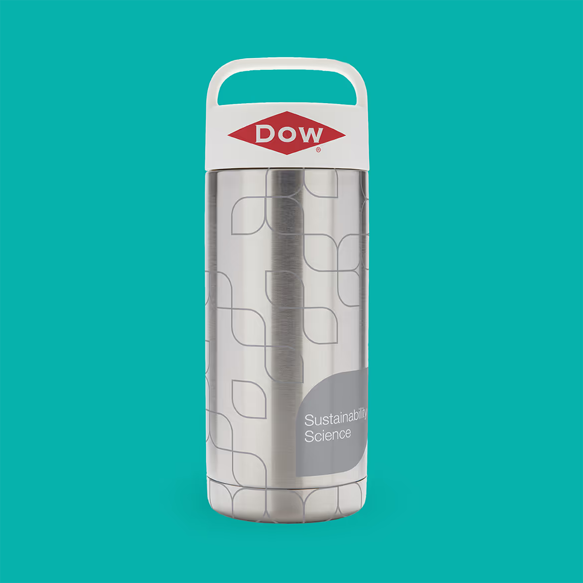
The new sustainability brands had to both fit within and complement the overall Dow brand: to be unmistakably “Dow” while having their own unique identity. Tenet designers solved the challenge by focusing on easily recognizable elements already present in Dow’s brand expression, such as color and shapes—creating a visual system-within-a-system that left the overall brand identity untouched.
More than sustainable products—a sustainable direction
By thoughtfully crafting a cohesive sustainability brand framework and bringing it to life while complementing the master Dow brand, the enterprise has the tools it needs to carry its focus on Sustainability Science into the future, without interfering with the core business.
Tenet’s visual system work for Dow won Bronze in the 2023 Transform Awards, for best visual design in Dow’s sector—a reflection of well-crafted brand strategy made tangible.
Meeting people where they are, and where they’re going
Financial services that put people first
Credit unions have a special place in the world of financial services. As mission-driven not-for-profit organizations, they answer to their members rather than shareholders. That inherent sense of purpose and service to individuals and local communities became the centerpiece of a bold new brand, ground-up digital strategy and marketing campaigns that Tenet created for the New York capital region’s largest financial institution.
Starting from a position of strength
What is now Broadview Federal Credit Union was created in 2022, when two upstate New York credit unions joined forces to form a major financial force in the region, with more than $8 billion in assets and hundreds of thousands of members spanning a territory from Albany west to Buffalo.
The match had strong synergy. The two organizations—the State Employees Federal Credit Union (SEFCU) and the Capital Communications Federal Credit Union (CAP COM)—had complementary offerings and footprints. But neither brand fully described the combined credit union, its membership or its strategic direction. It was time for a fresh start.
Pivoting to a future-focused brand
Tenet’s brand strategy team used interviews, competitive market research and AI tools to uncover what would become the foundation of the new institution’s brand platform: a shared ethos of putting members’ interests ahead of the organization was on display at every level, from service to interest rates.
This combination of mission-driven culture, fairness, giving, future-focused high-touch service and anticipating what’s to come came together in a new brand promise: “Meeting people where they are and where they’re going.”
A bold expression makes a big impact
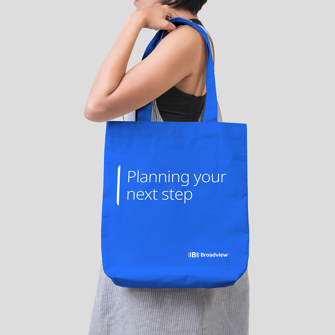
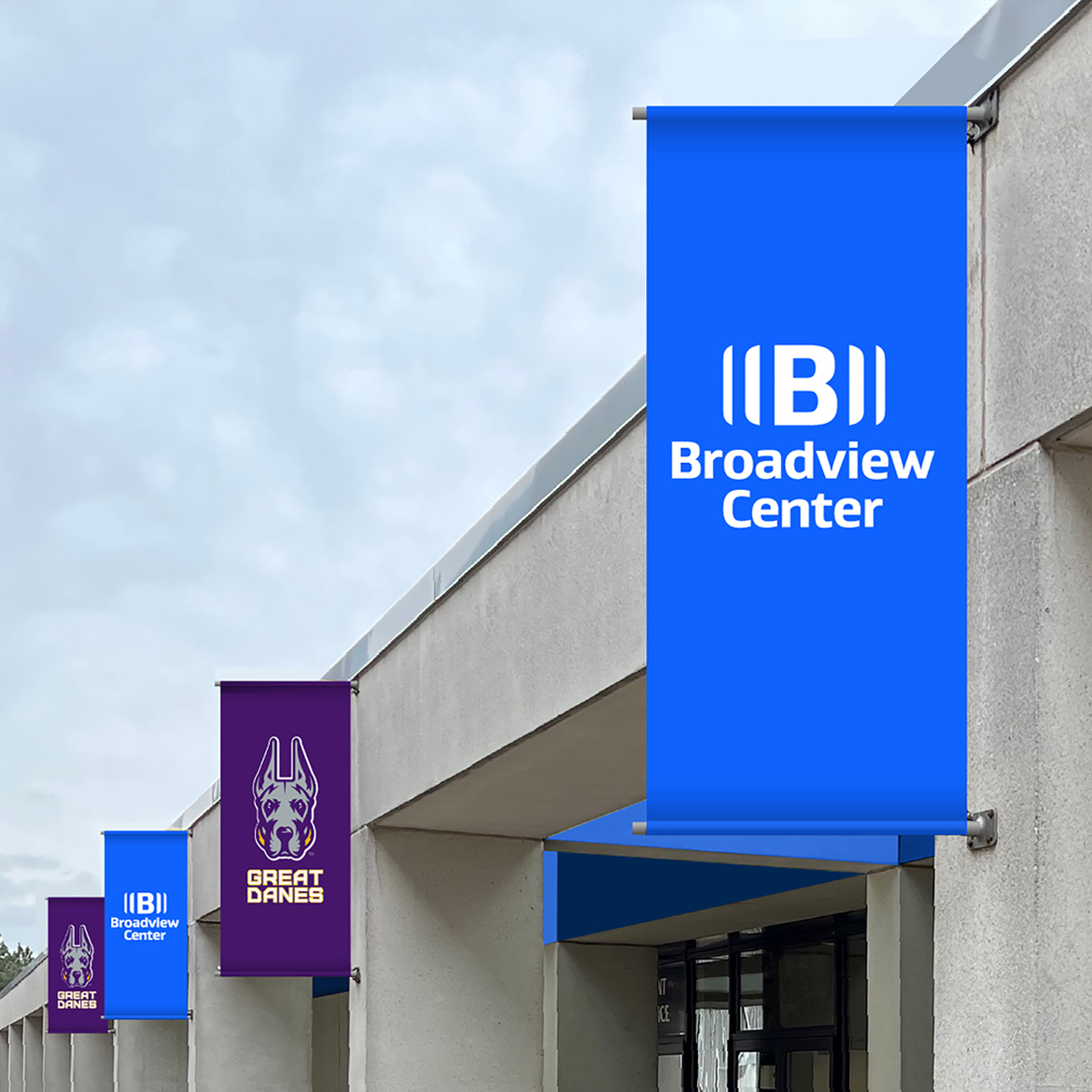
The Tenet creative team took the new name and brand platform and ran with it, creating a dynamic, versatile visual system and clear messaging that took Broadview in a new direction. The brand is very human-focused, capturing Broadview’s dedication to understanding the needs of its members and helping them achieve financial success, its community involvement and an optimistic focus on the future.
Digging deeper into the world of Broadview
Following the successful launch of the new Broadview, Tenet helped extend the brand to elevate, position and market Broadview Wealth Management, a key business unit and part of Broadview’s growth strategy. The core themes of the master brand were translated and honed to reach a higher net-worth audience, demonstrating the depth of Broadview’s capabilities.
A new view of what credit unions can be
The entire organization has welcomed the rebrand with enthusiasm, embracing and investing in the new identity by promoting it across all touchpoints from transformed branches and corporate environments to digital channels, marketing campaigns and sponsorships. The members, too, responded positively, with 100% customer retention and growth in deposits and transactions.
Atlanticus fills an important niche in financial services by serving people who have been held back by their credit scores, and who find that most of the solutions they can obtain don’t serve their needs. The company was seeking to grow by introducing the Imagine® Visa® targeted at a new, younger demographic and needed a brand that would stand out and draw attention.
CHALLENGE
Atlanticus needed to appeal to a young, tech-savvy audience by clearly distinguishing the Imagine® Visa® brand from competitors with similar offerings. In a marketplace where it can be very difficult to differentiate based on product features, this was a significant challenge.
The brand also had to complement Atlanticus’ existing offerings while being flexible and adaptable, to enable Atlanticus to offer other Imagine® financial services in the future.
HOW WE HELPED
The client highlighted the importance of Tenet’s ability to get up to speed quickly. “The team’s attention to detail and industry knowledge were valuable to us. We didn’t have to educate them on how the market works and what we do – they already had an appreciation for how our niche worked within the financial services space.”
Tenet’s research uncovered opportunities to set Imagine® apart by expressing forward-looking optimism and empowerment, with a strong, youthful identity that connects with the life journeys of those looking to make a fresh start and build for the future.
Crucially, the team recognized that the brand must rely heavily on personality and visuals. While Atlanticus had important advantages including a strong technology platform, an extended financial services ecosystem and the ability to encourage credit-building behavior through incentives, these were not enough on their own.
The brand personality and positioning were based on attributes rooted in humanity and the aspirations of Imagine® cardholders: responsible, caring, confident and fresh. Imagine® is positioned as an empowering stepping stone to financial wellness that is more than access to affordable credit.
The visual expression employs a wide, panoramic viewpoint that suggests a connection to the customer’s whole life, using kaleidoscopic shapes, a full color spectrum and photography that is more expansive and vibrant than competitors. The instantly recognizable angled, interleaved graphic shapes provide flexibility and scalability while creating a strong link to the brand.
OUTCOME
Imagine® Visa® launched in early 2023 with a direct marketing campaign, a website – imaginecredit.com – and the Imagine Financial Center app. The strength and uniqueness of the visual identity is immediately apparent when users see it – something truly different in the financial services industry.
Bringing clarity to a household name in innovative materials science
From the seeming miracle of outdoor fabrics that are waterproof yet breathable to advanced materials that have transformed electronics, aerospace, telecommunications and medicine, the innovations of Gore have touched many millions of lives. In the years since it was founded in 1959, Gore has built a legacy not only as an innovator, but as an organization that innovates with purpose—solving complex challenges through the application of advanced materials.
Gore is an enterprise unlike any other. Those who work at Gore are Associates who collaborate within a non-hierarchical “lattice” organizational structure and distinctive culture that values the creativity, inventiveness and freedom of the individual. Everything they do is underpinned by strong sustained beliefs and values established by the Gore family.
Perhaps the best-known of Gore’s products is GORE-TEX Fabric, the breakthrough performance fabric found in everything from shoes to outdoor shelters. It’s well-known around the world, but awareness of all that Gore does and what it stands for were not as widespread.
With a milestone 60th anniversary approaching, Gore saw an opportunity to build on its heritage to shape its future legacy. The anniversary would celebrate a renewed commitment to operating as a purpose-driven organization, crystallizing what Gore stands for in the minds of Associates and customers around the world. A fresh, clear approach to the brand, from its underlying framework to its visual and verbal identity, would be one of the key elements.
Finding what unifies Gore and empowers people
Gore has always been seen as a market leader and innovator. However, over time interactions with customers tended to focus on products and transactions. This, along with the relative independence of the organization’s three divisions—Fabrics, Medical, and Performance Solutions—had diluted awareness of Gore’s original purpose-driven intention.
It was time to step back and identify what was true to the Enterprise, meaningful to its customers and distinctive from competitors. This was a new look at the “hidden secret” of how Gore contributes to society every day, through its products and its people. Ultimately, this reassessment led to a natural brand promise—“Together, improving life”—that unifies Gore’s purpose, products and customers.
Building an identity that clarifies and unifies the master brand
Qualitative and quantitative research to understand brand perceptions and associations had revealed a deep hunger, both internally and externally, for a cohesive master brand. Gore called on Tenet Partners to build on the revised brand framework and help unify the enterprise under “One Gore” through robust visual and verbal identity systems.
Recognizing the equity and heritage in the existing GORE Logo that Bill and Vieve Gore had a hand in developing, Tenet used its angular “alar” shape and red-and-black palette as the launch pad for a redesign of the corporate visual identity system. Incorporating the logo’s signature triangle and angled shapes was a way to reflect the innovation so vital to Gore while also making the identity more modern and forward-looking. The bold palette with Gore’s red at its core, communicates the company’s passion and serves as a metaphor for improving life.
Tenet also developed new nomenclature, a messaging framework and brand voice firmly grounded in the brand framework to communicate the One Gore concept and revised brand attributes. In support of the new branding program, Tenet designed a new brand center and strategic communications to Gore Associates, partners and customers.
It all comes together in a unified Gore master brand
Thanks to the strength of Gore’s brand framework, the input of dozens of Gore Associates across all divisions and regions as well as more than 1,200 external stakeholders, and a close-knit, collaborative working relationship, Tenet delivered what Gore needed: a unified master brand with new focus that’s empowering and inspiring Gore Associates around the world, every day.
The interest surrounding digital security in the payments industry is intense. Hardly a day goes by without another story about identity theft. The rising threat has brought a vigorous response, leading to a complex and crowded security marketplace with overlapping security protocols and competing payment platforms. Rising above the noise and gaining differentiation poses a real challenge, even for the most innovative of new offerings.
In December of 2019, Mastercard embarked on tests of a groundbreaking digital service that has the potential to verify a person’s identity immediately, safely and securely in both the digital and the physical world. Mastercard’s unique model embodies privacy-by-design and does not aggregate identity data. It enables digital interactions to occur with minimal data exchanged and only when needed, and safeguards data and the use of data effectively such that the users are in control.
Standing apart while fitting in with the Mastercard family To create a powerful brand and identity for the project, Mastercard turned to Tenet Partners. Working with the product development team, Tenet first needed to fully understand the capabilities of the product, how it differed from related offerings in the market and what role it would play in Mastercard’s global portfolio.
We discovered that the brand needed to balance a certain amount of autonomy with the right amount of Mastercard connection. The new brand had to stand out and deliver an instant connection to digital security, specifically identity protection. It also had to complement the Mastercard brand, providing a subtle link to the parent while simultaneously remaining entirely separate.
Respecting the masterbrand while pushing the envelope The Tenet team grounded its work in the Mastercard design system while also exploring its limits. The name was straightforward and simple: “ID.” To reflect the unique nature of the product, the logo, visual system and UX components evoked the safety and privacy of the offering, visually representing the “mosaic” of data points that make up an individuals’ identity and the ability to only supply the necessary data required per interaction. Working with the Mastercard UX team, we co-developed user flows and guidelines regarding the vital relationships with trust providers and relying partners.
Industrial pipe fittings, valves, hangers and supports are all part of the infrastructure that allows the modern world to function. Supplying these critical components had been the domain of two leaders in the space, Anvil International and Smith-Cooper International. Their products are used everywhere from oil fields and powerplants to industrial facilities, stadiums and commercial buildings.
CHALLENGE
The companies operated in the same markets but were largely complementary rather than being direct competitors across the board. This created an important opportunity and in 2019, the two joined forces.
While the merger created a single company on paper, legacy operations remained largely discrete. The organization had different technology systems and disconnected facilities. It was using the legacy corporate logos and names side-by-side and the workforce still identified with the company they had been working for prior to the merger. There was a clear need to bring the organization together under one brand that would signal the arrival of a new industry leader.
HOW WE HELPED
Tenet Partners was called in to help build a new masterbrand that would help to increase the value of the company. The brand had to unify the organization while encompassing its full portfolio of legacy product brands. There was strong equity in those brands, so a key consideration was finding a way to embrace their distinctiveness while also integrating them with the new corporate identity.
With the project gaining momentum just as the global COVID-19 pandemic hit, it became necessary to rethink the traditional brand development and implementation approach, which relied on face-to-face collaboration and engagement. The Tenet and client teams both rose to the occasion and established highly effective ways to collaborate virtually.
Uncovering shared strengths
The Tenet strategy team conducted extensive research, interviewing and surveying executives, employees and customers. Smith-Cooper was known for its internationally sourced products, global supply chain and high-touch service, while Anvil International offered leading U.S.-produced brands and deep knowledge driven by experience, along with distribution locations close to key markets. These characteristics complemented one another, pointing to a compelling combined value proposition.
The companies also shared a devotion to quality and service excellence. This common ground proved to be an important unifying brand attribute. It demonstrated that the new brand was the best of Anvil and Smith-Cooper, coming together.
Positioning as a solutions provider
Another central theme of the new brand was an emphasis on solutions. For the company’s leaders, the word “solution” had a specific meaning: a solution is the answer to a customer challenge, whatever that may be. It’s not something that the customer buys. Rather, it’s the sum total of how the company serves the customer, from quality products to support, expertise and service. This idea was deemed so important that it became part of the new name.
Unifying the companies, visually and verbally
Ensuring that neither company was seen as dominant was essential. The name ASC Engineered Solutions achieved this by bringing forward the equity of both legacy names. The Engineered Solutions identifier also elevated the brand to its desired status as a solutions provider that emphasizes engineering excellence. The tagline, “Building connections that last,” also carries multiple meanings. It refers to the company’s quality products as well as the strong, long-lasting relationships it creates, both inside the company and with customers.
The crisp, contemporary logo and design system reinforced those messages, with a graphic depiction of both precision and connectedness: a clear departure from the past and a visual presence that stands out among competitors. The flexible design system also lent itself to visual refreshes of ASC’s extensive product brand portfolio while maintaining the equity generated over many years.
Building up to the brand
An extensive employee engagement campaign prepared the workforce for the upcoming brand launch. This included an internal countdown microsite with weekly updates about the importance of brands, what to expect and answers to common questions. Tenet also put together a comprehensive “train the trainer” program to prepare selected ASC brand ambassadors to go on and train employees throughout the organization.
This broad range of internal launch-related communications helped prime employees for the arrival of the new brand, which was carefully planned to expose key parts of the brand platform including positioning, messaging and visual expression without fully revealing the brand itself. This helped draw attention while saving the high-impact reveal of the logo and name for launch day.
A carefully coordinated launch
With operations spread across a wide geographical footprint and many employees working remotely due the pandemic, coordinating the brand launch was going to be difficult. Since there was no way to make all employees available for a live launch event, a multipronged approach was taken. Tenet provided a scripted town hall presentation for brand launch, along with associated employee communications. The town hall was prerecorded and made available online, as well as being delivered live for those employees who could attend. This ensured that every ASC employee was exposed to the new brand on launch day.
For customers, an updated website encapsulated the new brand and featured specific details about the company – what had changed, why and what could be expected moving forward. Additional external communications included a digital and print advertising campaign, media outreach, a new corporate brochure and customer emails beginning on launch day and continuing well beyond.
OUTCOME
The arrival of the ASC Engineered Solutions brand helped to reinforce the organization’s industry-leading position. No single competitor was able to match ASC in every category, giving the company a unique standing in the marketplace.
Going forward, the company is continuing to integrate its portfolio and technology capabilities to make it simpler and easier to do business. As one organization under a single banner, ASC stands ready to achieve its ambitious goals for growth.
From blank slate to luxury brand at lightning speed
In 2017, Tenet CEO and Managing Partner Hampton Bridwell came upon a rare opportunity: The chance to put all of Tenet’s skills—and the firm’s philosophy—to the test by creating a brand for a category innovator, entirely from the ground up.
“Storylines started as an intriguing idea,” Bridwell says. “Take a lifestyle experience once available only to the very wealthy – a life of cruising the ocean full-time, actually living aboard ship as owner of a ‘cabin condo’ – and make it accessible to a new population. But that’s all there was: an innovative but untried entrepreneurial concept in a field with no true competitors. Starting from zero is unusual in our industry and a golden opportunity to prove the value of our approach. So we decided to take an equity interest and really showcase what we can do.”
Storyline founders Alister Punton and Shannon Lee recognized Tenet’s potential right away. “Launching a new endeavor like this is very fluid and fast-paced,” Punton says. “We’re in startup mode the whole time, thinking on our feet so we can get to launch day in the shortest time possible. We don’t have the luxury to sit back and ruminate, and we can’t afford any missteps or wasted effort. We have to get everything absolutely right the first time because we really have only one shot at it. When we looked at Tenet, we saw a world view that dovetails nicely with our own thinking.”
Like minds help shape a startup
What captured Bridwell’s attention was how closely aligned the concept was to Tenet’s own point of view about innovation, user experience and the interaction between brands and business strategy. “This is a prime example of market, business model and product innovation creating a new category. Crafting the brand is very much part of that and can make or break the whole effort. And one of the central themes that really appealed to me on the innovation front is that they’re creating value where it once was being destroyed.”
What’s unique about Storylines?
Traditional cruise lines depend on a steady flow of ever-newer, larger and more extreme ship designs. Because of intense competition, a ship is commercially viable for a relatively brief time; many years less than its actual useful service life. Ships that are no longer marketable typically go to the breakers to be sold for scrap.
Through Storylines, those ships can embark on a new life. After a full refit to the latest standards and transformation into vessels designed for comfortable full-time occupancy, they set sail on a continuous world journey. The pace is relaxed and the port stays leisurely. Cabin-condo owners can come and go as they please and stay with the ship for as long as they like, renting out their cabins when they’re not on board.
From the Storylines side, Punton and Lee understood the importance of brand in launching a startup. “We’ve been involved in a number of startup ventures,” Lee notes. “We’ve seen first-hand how important it is to send the right message immediately. It’s our opportunity to set the tone and course for the whole company – for investors, business partners, employees and our prospective customers. We think very much as Hampton does; brand strategy must go hand-in-hand with business and engagement strategy.”
A solid starting point sets the stage
Tenet rallied resources from across the firm, building a team of business and web strategists, engagement specialists, editorial resources, designers and developers.
“The elements of a terrific brand story were all there,” Larry Oakner, Tenet’s Senior Partner for Engagement, says. “A whole new experience built around an innovative, life-changing offering. The elegance of ocean travel. A chance to embark on a whole new, adventurous life as an affordable alternative to traditional real estate and retirement offerings. We knew we could make something really special out of this.”
To make the idea work, it would have to be introduced and positioned correctly. The team ran an initial test of the affordable cabin-condo product concept under the name My Home At Sea, and got a very encouraging response. That set the stage for developing a richer brand story.
“We focused initially on the luxury real-estate alternative aspect,” Lee says. “Our customers will have access to a lot of lifestyle amenities not available to the cruising public. A private helicopter, for example, and a yacht accompanying the ship that can be booked for excursions or private parties. But working with Tenet, we concluded that a ‘super luxury’ image might not send the right message. We’re looking to make a life of comfort accessible. A premium lifestyle, yes, but it’s not about champagne and caviar every day.”
Board advisor Jon Bond set the tone by crafting core principles for the brand that firmly established it as something new and different: a community of like-minded world citizens on a shared journey, discovering and taking part.
Bond also came up with the Storylines name. “Storylines really struck a chord,” says Tenet Editorial Director Andrew Douglas. “It’s such a resonant and evocative idea around which to build a brand’s narrative. Life is a story we all write, day by day. Living at sea, traveling the world aboard an ocean liner, experiencing new cultures… what a terrific opportunity for people to create that story for themselves.”
Balancing the visual with the verbal
“This was a delicate balancing act performed at high speed,” says Andrew Bogucki, Tenet Senior Partner for Design. “Because we were moving very fast and developing the visual identity in parallel with everything else, we had to do a lot of iteration and internal collaboration to make sure everything worked well together.”
With the brand strategy, tone of voice and even naming in flux, the direction was shifting quickly. “Our first deliverables were developed around the My Home At Sea name, using images of places like Monte Carlo,” says Tenet Partner for Design Courtney Grier. “As changes came along, we had to think and adapt fast. We were rapid prototyping, throwing out ideas to see what would stick with the team. It was a process of continuous improvement.”
As development proceeded, work fell into a collaborative rhythm with new content helping guide image selection and system design, and vice versa.
Tone of voice shapes the brand experience
A critical shift came about with the shift in brand narrative from centering on a luxury real estate investment alternative to an enriching lifestyle. “My Home At Sea worked very well to validate the affordable cabin-condo concept but it didn’t quite align with the brand story that was being developed,” says engagement specialist Larry Oakner. “It was very much about a real estate transaction. Storylines is a larger and more powerful story about how people live their lives.”
To retain the concept of ownership the team elected to create a lifestyle narrative around Storylines, but within that framework talk about My Home At Sea as a branded experience that includes cabin-condo ownership in addition to the services provided. “This addressed some issues for us,” says Storylines’ Shannon Lee. “Since our initial successful outreach was branded My Home At Sea, we wanted to maintain continuity. We might have lost that, and also diluted the ownership idea, if we abandoned it. By positioning it as an experience that Storylines offers, we could clearly position it within the broader Storylines narrative.”
A critical shift came about with the shift in brand narrative from centering on a luxury real estate investment alternative to an enriching lifestyle.
Service design proves its worth in the digital realm
Because Storylines was defining a new category, a lot of education had to happen, which could have been problematic. “It was essential to make engagement simple so as not to confuse potential customers and investors,” says Larry Roth, Tenet’s Senior Partner for Digital. “But we also needed to support a sales process that could be complex, without making it feel difficult.”
That meant creating a website that made discovery easy, with a resilient information architecture to accommodate the rapid pace of change. “The digital team came at this from a process and outcome standpoint, using our established service design principles. We mapped out customer journeys and tailored our strategy accordingly, while always recognizing that the business strategy might be changing. That proved to be the right approach, because we didn’t have to alter our original design much to accommodate new directions. And because of our flexibility, we were able to readily make needed changes.”
Reaching the finish line, with results beyond expectation
The entire process of creating and launching the brand took less than four months, and in that time Storylines had built a database of thousands of leads. “Given that when we started, absolutely everything – even the business model – was not yet developed, that’s extraordinary,” says Tenet CEO Hampton Bridwell. “And things like cabin layouts were changing right up to the last minute. The team did fantastic work, showing how powerful a shared collaborative mindset can be when innovating. I really think the results speak for themselves.”
Storylines co-founder Shannon Lee says, “In just a few weeks we have created a global brand that will engage hearts and minds and powerfully tell our story. Storylines has come alive and we are all very pleased with what we have created in the last few weeks. We are now in a stronger position to get our first citizens of the sea on board!”
Within just two weeks that began to happen, with strong initial sales including deals for not just one, but two premier level ($1M plus) cabin-condos aboard the first Storylines ship. Storylines also made a splash in earned media coverage, with the novel concept grabbing the attention of a number of major news and specialty media outlets.