2008 marked an important year in the growth of Citrix Systems. Having just broken the $1 billion revenue mark and completed numerous successful acquisitions, Citrix had earned its seat at the “big table” as a contender for leadership in desktop virtualization and cloud infrastructure solutions. Global companies, like Microsoft, were knocking at the door and looking for partnership opportunities. It quickly became obvious that something had to be done to give the brand the stature it deserved and to create the brand experience clients were looking for.
Now a strategic partner with Microsoft and a key competitor to big-league players like Cisco and Oracle, Citrix had to shed the ad-hoc branding practices of its days as a scrappy tech startup. Citrix reached out to Tenet Partners for help. Starting with a re-tuning of the brand positioning from functional-based (access) to a broader, benefit-driven strategy (infrastructure), Tenet’s team of strategists and designers worked together to translate the new direction into a brand identity that expressed openness, transparency and scale.
Now that it was playing in a decidedly different league and appealing to a much broader market, meaningful connections with their customers were going to be key for success for Citrix. To that end, it was vital to create a more robust and clearly defined partnership and ingredient branding program. Tenet helped rationalize, structure and communicate the expanded program. The program was recently voted one of the best channel programs in the market.
Citrix continues its growth trajectory, doubling their revenue to just under $3 billion in six years. When customer experience and business strategy align, the sky’s the limit.
Opening express lanes to quality mobile video experience
Vantrix brings its vision and commitment to multi-screen content distribution
Looking beyond the challenge to the opportunity that laid ahead, Vantrix, a company born out of the alliance of two leading Canadian industry innovators in optimization technologies, saw how the customer experience in the mobile video arena was falling short of its full potential. Technology hurdles stood in the way of optimized content – mobile TV, video on demand, multimedia alerts and messaging, user-generated content and video share – being delivered in a seamless fashion to audiences everywhere and on every mobile devices.
Vantrix’s vision: change the paradigm by developing software that would enable content owners and service operators to optimize their media processing operations and give their customers the highest-quality media experiences on any device, at the lowest possible cost. Major corporations including ABC News, Orange, T-Mobile and The Weather Channel were ready for a solution.
The beginning of a new era in telecom
Vantrix was looking for a powerful way to signal its arrival and express the transformative nature of what the company was bringing the marketplace. Working with the executive leadership team and the organization’s investors, Tenet Partners repositioned Vantrix around its industry-leading technology and its ability to take something complex and reshape it into something simple. And this is where the Vantrix brand idea took root, in a simple yet almost revolutionary phrase: “We make mobile video work.”
A vision for everyone to see
Next, our design strategists explored a number of conceptual directions to support Vantrix’s future-focused strategy. The team quickly narrowed in on the human eye as a metaphor for what Vantrix delivered. The logo represents the impressive structure and function of the human eye. It alludes to both the end-user experience and the integrated, seamless way Vantrix works with its customers.
Launched at the CTIA Wireless Conference in San Francisco, the new brand helped Vantrix capture imaginations and mindshare. It set the stage for them to define how multimedia content should be processed and exchanged over wireless networks. Today, Vantrix’s technology is part of everyday life for millions of mobile content consumers, worldwide, a testament to its ability to continue to “shape how the world experiences media”.
How repositioning a legal services pioneer created new understanding in the marketplace – and inside the company
A pioneer and leader in the legal services and technology solutions space, Epiq recognized that their growing and complex array of business offerings was creating a challenge. After years of strong opportunistic growth, the company found itself presenting a fragmented, product-based image to the marketplace. In effect, the company’s successful expansion strategy had diluted the impact of its brand.
Epiq began taking strategic steps to reposition the company and Tenet Partners was called on to help. The goal: to transition the brand from a technology-based document review company to a value-added service partner known for handling a wide range of highly complex legal challenges for corporations, law firms, financial institutions and government agencies.
A new focus on what makes Epiq unique
We began by refining Epiq’s purpose statement and core values to embody the principles and aspirations of the organization. The values were constructed to be meaningful and actionable across the company.
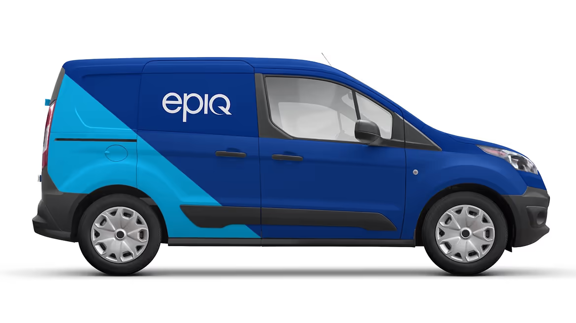
Recasting the company’s purpose and values was key to powering internal change. Complementing that shift and telegraphing it to the marketplace called for a new visual identity, inspired by the differentiating nature of Epiq’s global scale, high-quality staff and service. Tenet contemporized the Epiq logo and developed new design elements, including a color palette, imagery style, typography and distinctive graphic elements, which brought together the company’s many and diverse business lines in a fresh, unique visual expression.
Reconstructing the website to meet the needs of many
Moving the Epiq brand away from its product-based image met a key competitive need. When law firms, corporations, financial institutions and government agencies search for a partner, they are looking for the one who can ease their burden, a partner who understands what they need, has the right expertise and can deliver the outcomes fast. Accordingly, Epiq’s online presence needed to communicate more powerfully.
A central goal of Epiq’s new website was to allow users in different market segments to easily discover information and navigate the company’s complex offerings in a highly efficient and compelling way. To do this, Tenet conducted an interactive work session with managers across all business lines and functions to discover what the site should deliver to visitors. The task was challenging due to audience diversity: law firms and corporations using eDiscovery and document review services, law firms using bankruptcy case management software, and administrative services and trustees managing large-scale class action claims administration.
With this insight in hand, Tenet created an information architecture based on solutions organized to align with user’s needs in different market segments. A library of visual icons was created to help differentiate product and service offerings, helping users to find information at a glance.
Investment in the brand that drives results Epiq’s new positioning, coupled with the visual identity system and website, elevated the brand’s stature and enabled its designers and communicators around the globe to present a cohesive brand expression whether in the U.S., Europe or Asia.
More importantly, the changes provided a strong platform that helped make Epiq an attractive acquisition opportunity for private equity firms. In 2016 Harvest Partners and OMERS took action resulting in the combination of Epiq with DTI Global to create the first billion-dollar global legal process outsourcing company just eleven months after the brand refresh was launched.
In a highly competitive children’s thermometer category, with new and diverse technologies continually expanding the field of play, Microlife sought to better understand the needs and concerns of parents, identify high priority attributes, and create kid friendly product solutions ideal for family use.
Methodology
Working collaboratively with target parents and client stakeholders, our innovation team utilized consumer sessions to empathically surface emotional and functional concerns and wishes. Roleplaying and forced association exercises, among others, inspired the creation of desired attributes and features visualized with live sketching for immediate directional validation and iterative refinement.
Insights
“When they’re sick my kids are cranky and they don’t want to cooperate.”
“Thermometers look serious and can be intimidating.”
“I worry that germs will spread (when shared) and then everyone gets sick!”
“Thermometers are hard to clean…but they need to be sanitary.”
Impact
Licensed by American Red Cross this unique category entry with detachable, washable tips successfully delivered on mitigating the widely held concern about cross-contamination and recontamination through transferring germs from “sick child to well child”. A distinctive and unintimidating soft and friendly design aesthetic was applied to alleviate the stress and tension often experienced between parent and child at temperature taking time.