Category: Case Studies

  • Bluetooth

    Bluetooth

    Bluetooth is like air—invisible, yet essential

    Bluetooth is one of the best-known and most trusted wireless technologies in the world, found in billions of devices and myriad applications. It is everywhere, and an essential part of today’s world.

    The familiar Nordic rune symbol of the Bluetooth logo is instantly recognizable. What’s less well known is the global organization behind the technology—the Bluetooth SIG—working behind the scenes to protect and advance Bluetooth as a universal standard for wireless connectivity.
    Tenet Partners helped put the Bluetooth SIG on a course to change that in 2025, with a multiple award-winning rebrand.
    Protecting the Bluetooth brand while taking it in a new direction

    When one of the world’s most iconic brands needs to go in a new direction, it creates a tough challenge: How to take something of immense value and advance it without losing what makes it great.

    The need to change was driven by new uses for Bluetooth technology. Long associated with consumer devices and audio, Bluetooth technology is now found in unexpected places including building systems, locator tags, medical devices, retail and industrial settings. The world of Bluetooth has changed, and that called for a new story.

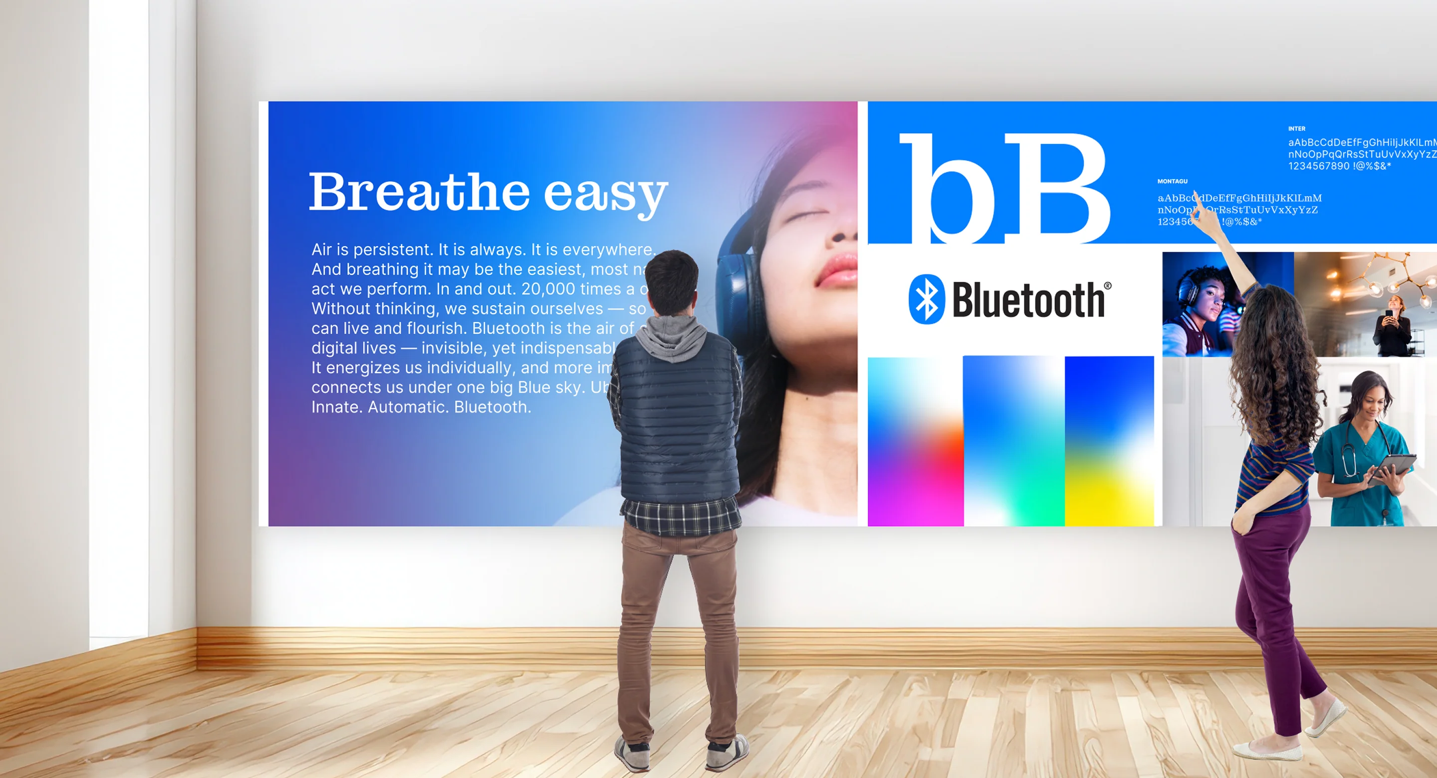
    two people in front of a large wallboard that is highlighting Bluetooth's brand

    Shifting the focus of the Bluetooth brand

    Working in close collaboration with the Bluetooth SIG, Tenet Partners uncovered the true meaning of Bluetooth technology: world-changing impact and empowerment for consumers, commercial users and the thousands of device manufacturers around the world that are members of the Bluetooth SIG. This change from the existing emphasis on technology features and functionality to the experiences that Bluetooth creates gave the familiar Bluetooth name and symbol a new meaning.

    Connection is the Bluetooth brand’s unifying idea

    As the team worked together, resonant ideas rose to the surface. That like air, Bluetooth is everywhere—invisible, yet something that connects and strengthens us all. That through the essential connection that Bluetooth technology provides, the world can be made better.

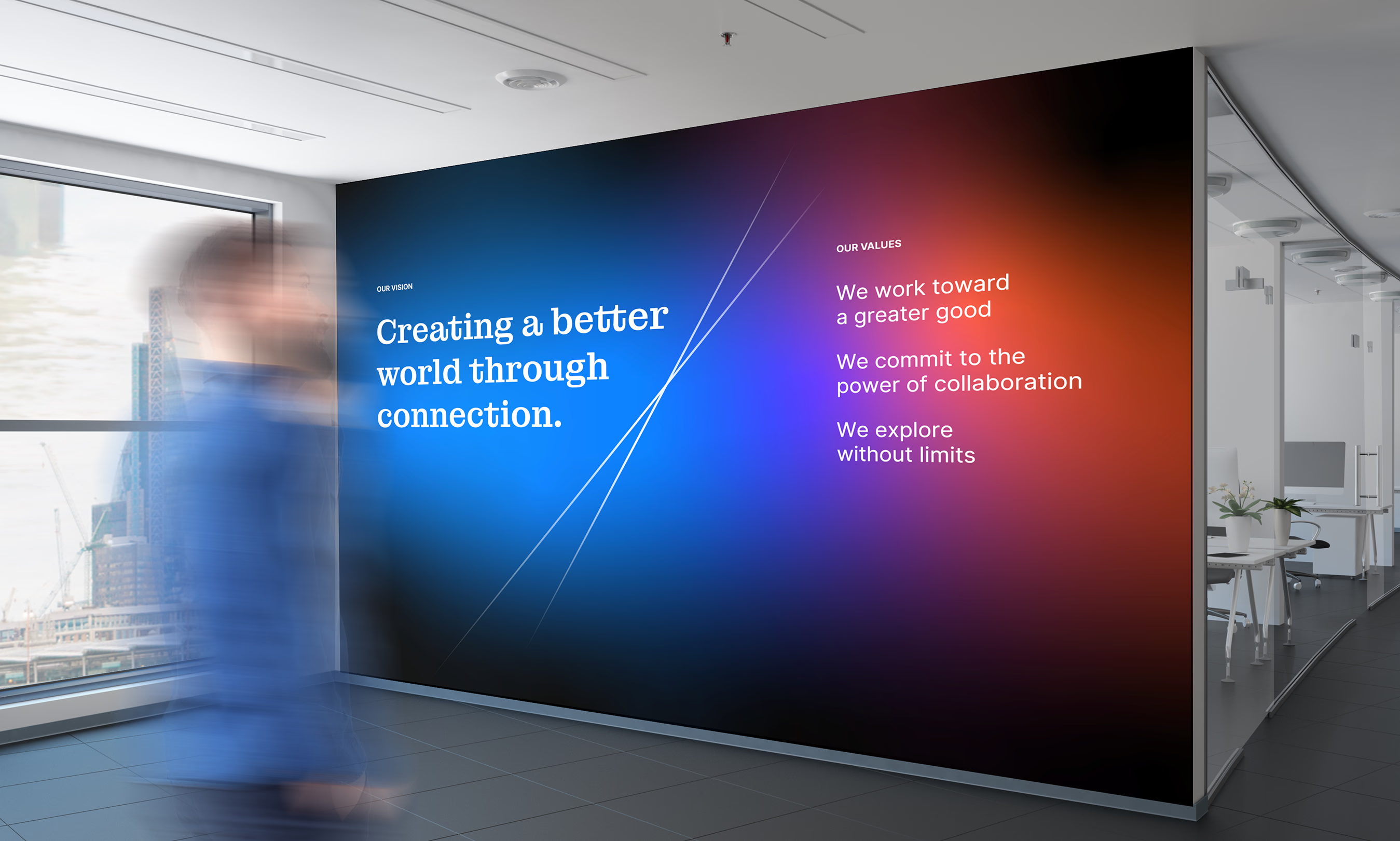
    Our vision
Creating a better world through connection  Our values
We work toward a greater good  We commit to the power of collaboration  We explore without limits

    Creating a new atmosphere for Bluetooth

    These ideas were the inspiration for what was to follow: a powerfully evocative and flexible visual and verbal identity, with atmospheric and connective elements unlike anything Bluetooth had seen before.

    The brand’s feel and tone also shifted, from a functional and engineering-oriented expression towards a higher-order, more experiential one that casts Bluetooth in a whole new light.

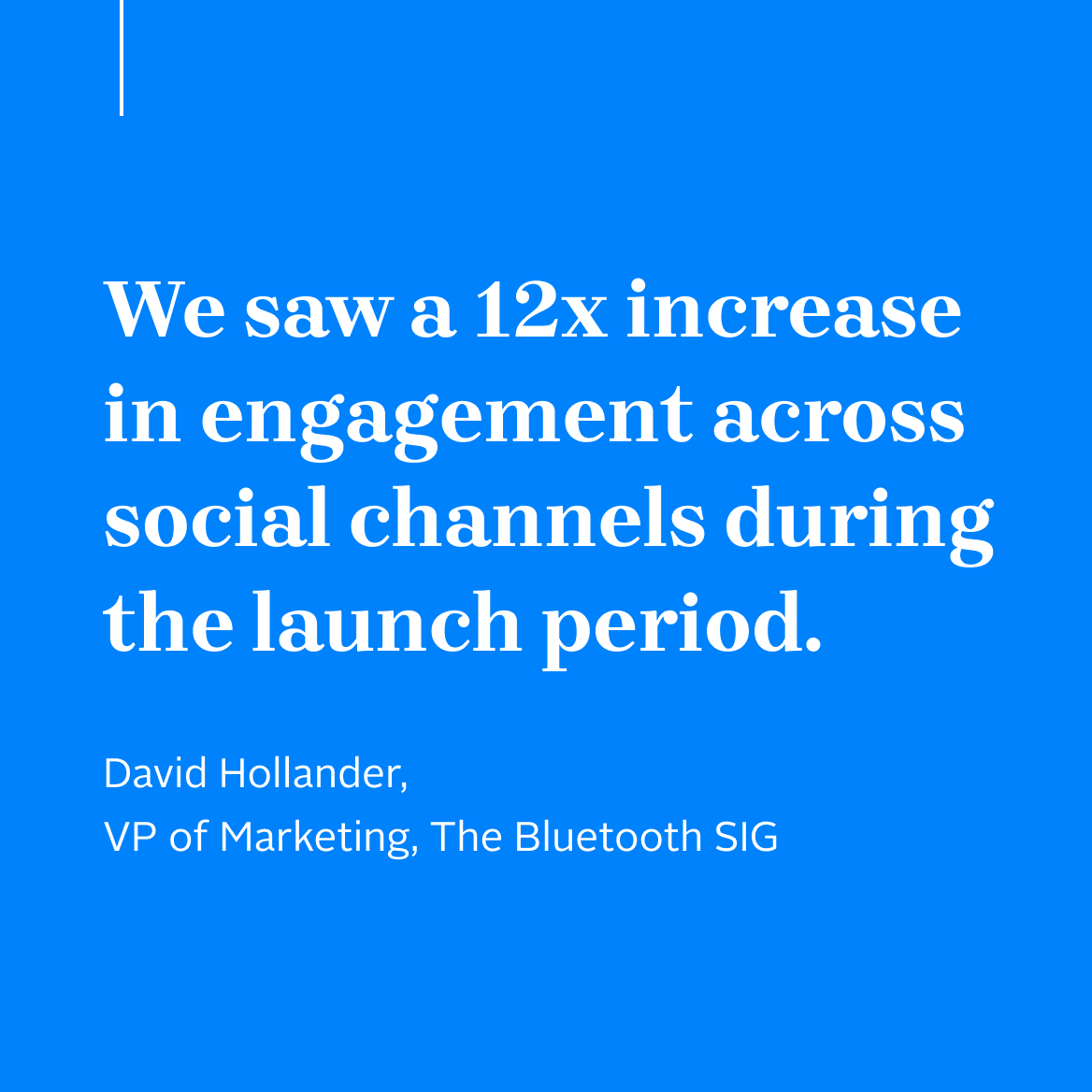
    "We saw a 12x increase in engagement across social channels during the launch period." David Hollander, VP of Marketing, The Bluetooth SIG
    a wristwatch that says: Connected
    Together, we're not just imagining the future, we're building it
    The Ambient IoT: Harvesting the energy that's all around us.
    Bluetooth
  • eFax

    eFax

    From digital fax to enterprise data

    As one of the first to offer a digital alternative to traditional paper fax machines, eFax has always been an innovator and today, it is the world’s most-recognized provider of cloud fax—a technology that remains essential in regulated industries such as healthcare.

    In the more than three decades since its founding, the company has grown to be a leader not just in cloud fax, but also in interoperability and digital transformation solutions—redefining how businesses of all sizes communicate and manage secure data exchange.

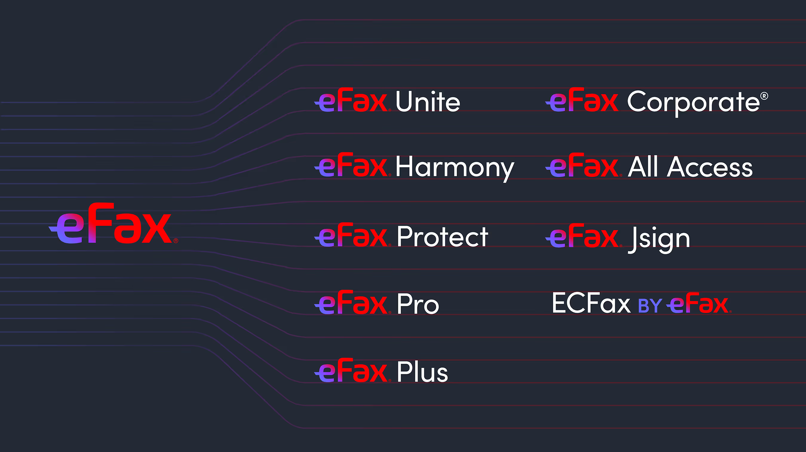
    variations of eFax logos: eFax Unite, eFax Harmony, eFax Protect, eFax Pro, eFax Plus, eFax Corporate, eFax All Access, eFax Jsign, ECFax by eFax

    Embracing the enterprise

    With enterprise customers becoming a critical driver of growth, the company decided to make a strategic pivot from pure-play cloud fax service to enterprise solutions provider.

    Consensus Cloud Solutions, the parent of eFax, was spun off from Ziff-Davis in 2021 to capture the growing need for secure enterprise data communications. Prompted by emerging AI technologies such as machine learning and unstructured data transformation, the company began building out its portfolio of advanced enterprise solutions.

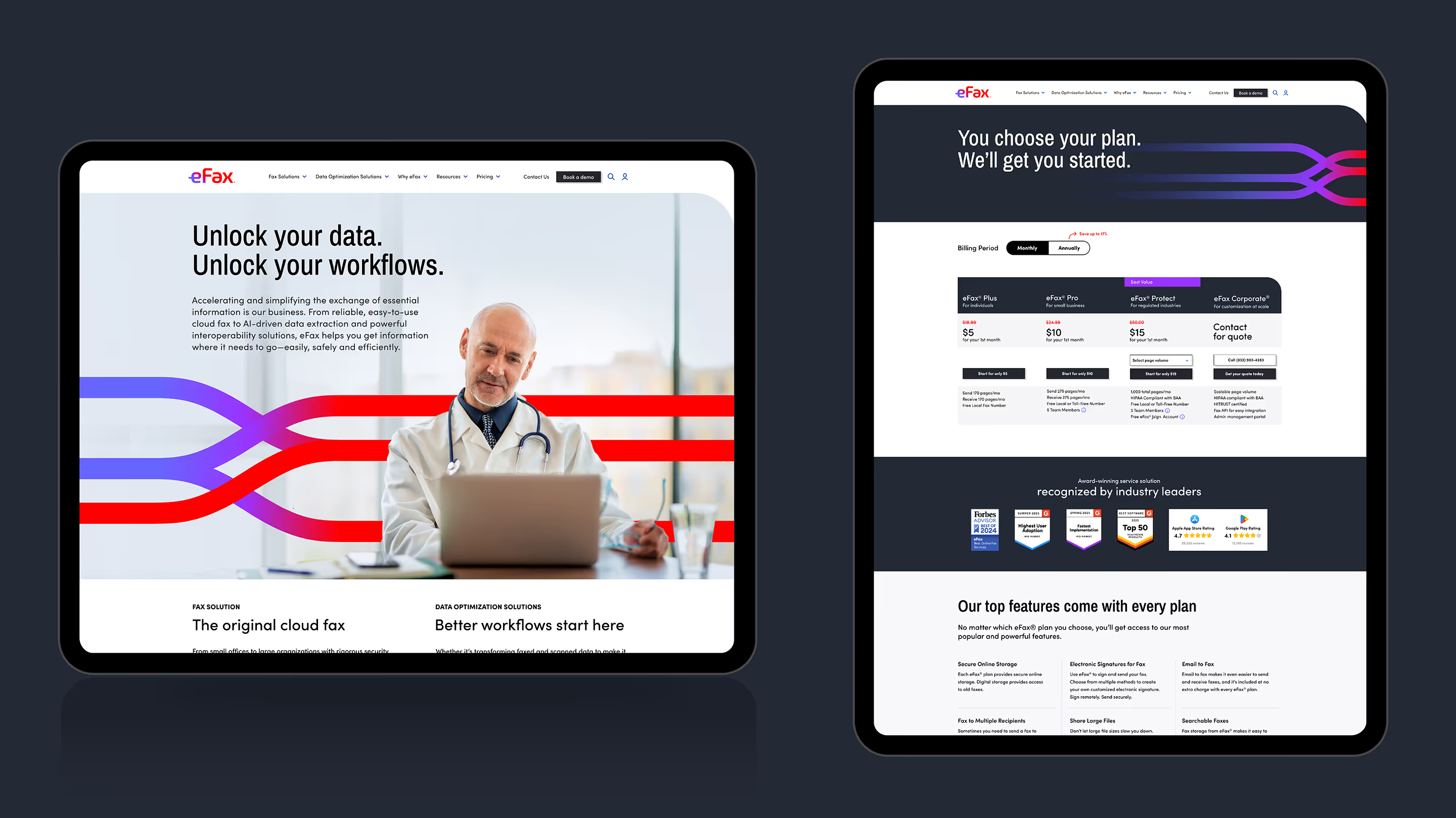
    electronic tablets in horizontal and vertical orientations, left horizontal has an eFax website page that says "Unlock your data. Unlock your workflows." and right vertical says "You choose your plan. We'll get you started."

    Bridging eFax to a new digital future

    It soon became apparent that the existing fax-focused brand no longer aligned with the company’s strategic direction.

    After a thorough exploration of potential paths forward by Tenet’s research and strategy team, the decision was made to leverage the massive equity of the eFax name and build a new brand around it.

    Building on the idea of connection

    The new brand had to show that eFax is about much more than fax, while maintaining its status as the world’s pre-eminent cloud fax service. Threading that needle called for a bold approach to brand transformation.

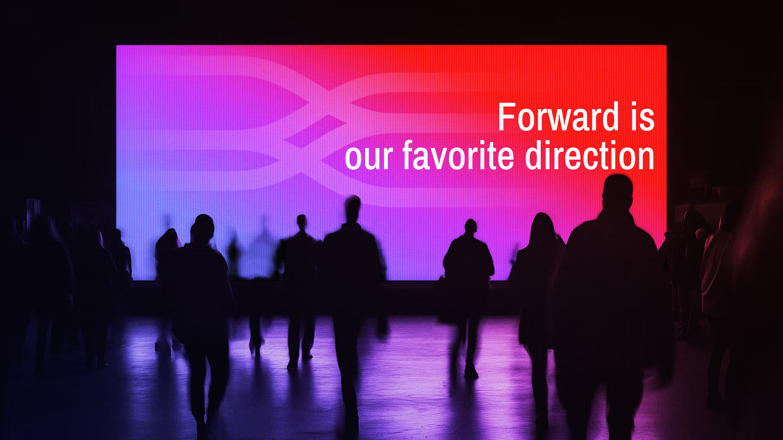
    New eFax positioning, high-level messaging and brand promise all came to life through a dynamic visual representation that suggests connection, data flow and transformation: the threads that tie all that eFax does together.

    Forward is our favorite direction
    “The refreshed brand leverages eFax’s trusted name to unify our advanced solutions.”
Johnny Hecker, CRO and EVP Ops, eFax
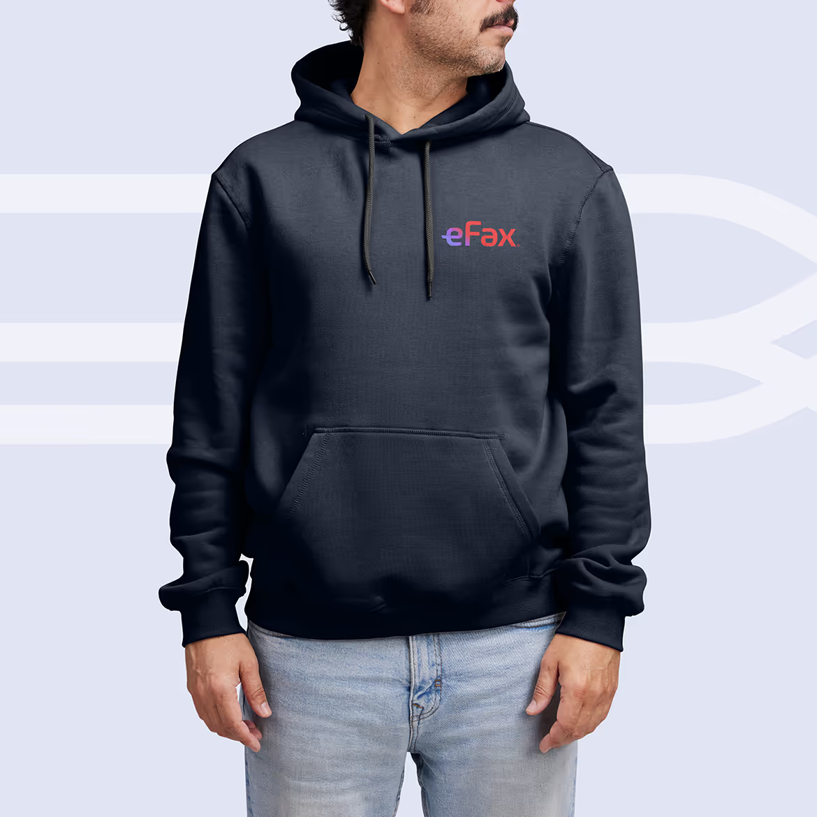
    eFax branded hoodie

    Making it real

    To tie the brand to real business results, Tenet developed a comprehensive go-to-market strategy. Leveraging market insights, the strategy spanned segments, attributes, personas, and sales enablement playbooks including service bundling and refreshed product messaging.

    mobile device showing an app eFax — Receive and Send Fax
    Consensus website tab showing favicon
    Consensus logo on an outdoor sign on a building

    Helping to spark growth

    eFax has a long history of strong financial performance. The brand’s new message drew fresh attention to eFax and its future-forward, technology-driven strategy, helping to fuel powerful acceleration: as of early 2026, the company is seeing positive market trends and meaningful expansion of revenue across its broader portfolio.

    During its Q4 2025 earnings call in February, Consensus executives noted record free cash flow, robust margins, and accelerating corporate momentum as the organization pivots to enterprise sales. Investors have taken note, with the stock price up more than 35% since the beginning of the year.

  • The Bancorp

    The Bancorp

    Helping define the future of banking

    The Bancorp is the engine powering many of the world’s leading fintech brands, from PayPal and Venmo to Chime and Betterment.

    One of the first banks to embrace fintech, The Bancorp is a forward-looking organization with a unique mix of experience, expertise and creativity that give it the ability to help its partners turn compelling ideas into real-world solutions.

    Tenet Partners helped to crystalize what makes The Bancorp stand out, in a wide-ranging brand evolution program that began in 2024.

    Imagining a new future for The Bancorp

    To help lay the foundation for The Bancorp’s future, the Tenet team saw an opportunity to elevate The Bancorp’s expression beyond the focus of its leading payment and lending services and technology—the offerings that had been the focus of the legacy brand.

    Building on an extensive research and discovery effort, Tenet used our collaborative Brand Worlds methodology to explore future directions for The Bancorp. The experiential spaces and narratives helped the team see their brand as the market would, effectively capturing the dynamism and energy of the fast-moving fintech industry.

    A brand built around a simple, powerful idea

    The Bancorp is a leader in fintech and also provides a range of specialized banking services including institutional banking, fleet leasing and real estate bridge lending. Finding a common thread that could tie the entire organization together was crucial.

    That idea became encapsulated in The Bancorp’s new tagline: Bold ideas, realized.™ This single concise statement speaks to what makes the bank different: a depth of experience and relationships that empowers customers to effectively bring their ideas and businesses to life. If a customer can envision it, The Bancorp can make it real.

    A design-forward experience

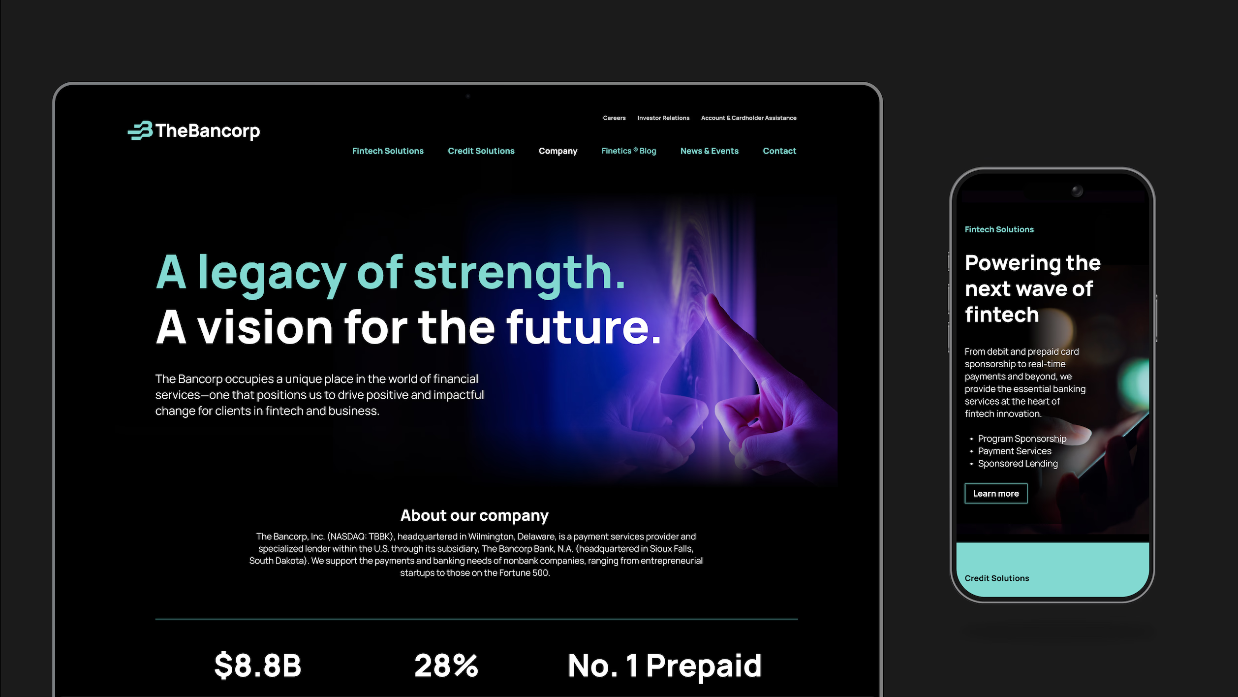
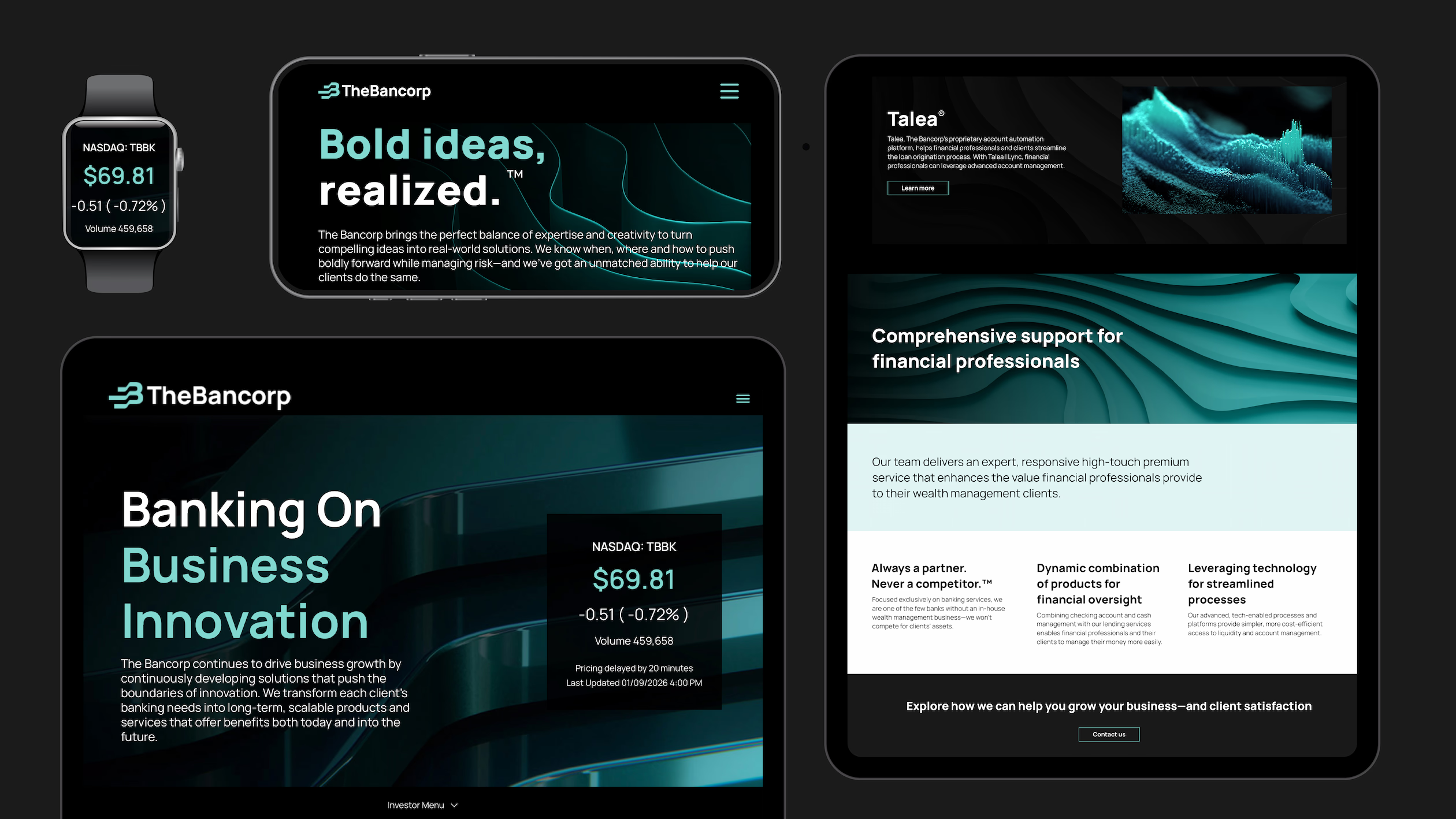
    The refreshed brand came to life in a remarkably powerful way, through bold creative choices across the board from the striking black-and-teal color palette to the energetic sonic, graphic and typographical expression of the launch video.

    The resulting brand identity places The Bancorp’s offerings and the value it brings in an entirely new context—a powerhouse brand for a powerhouse organization.

    A legacy of strength.
A vision for the future.
    various devices showing The Bancorp's brand: watch, phone, and two tablets
    "The Bancorp has evolved, and our brand should reflect that evolution.” - Damian Kozlowski, CEO, The Bancorp
    a mobile phone showing a post from The Bancorp that says: We're shaping the future of banking.
    Sending payment ...
    3 portfolios:
Your vision. Our expertise.
Why run the risk?
Where expertise meets purpose
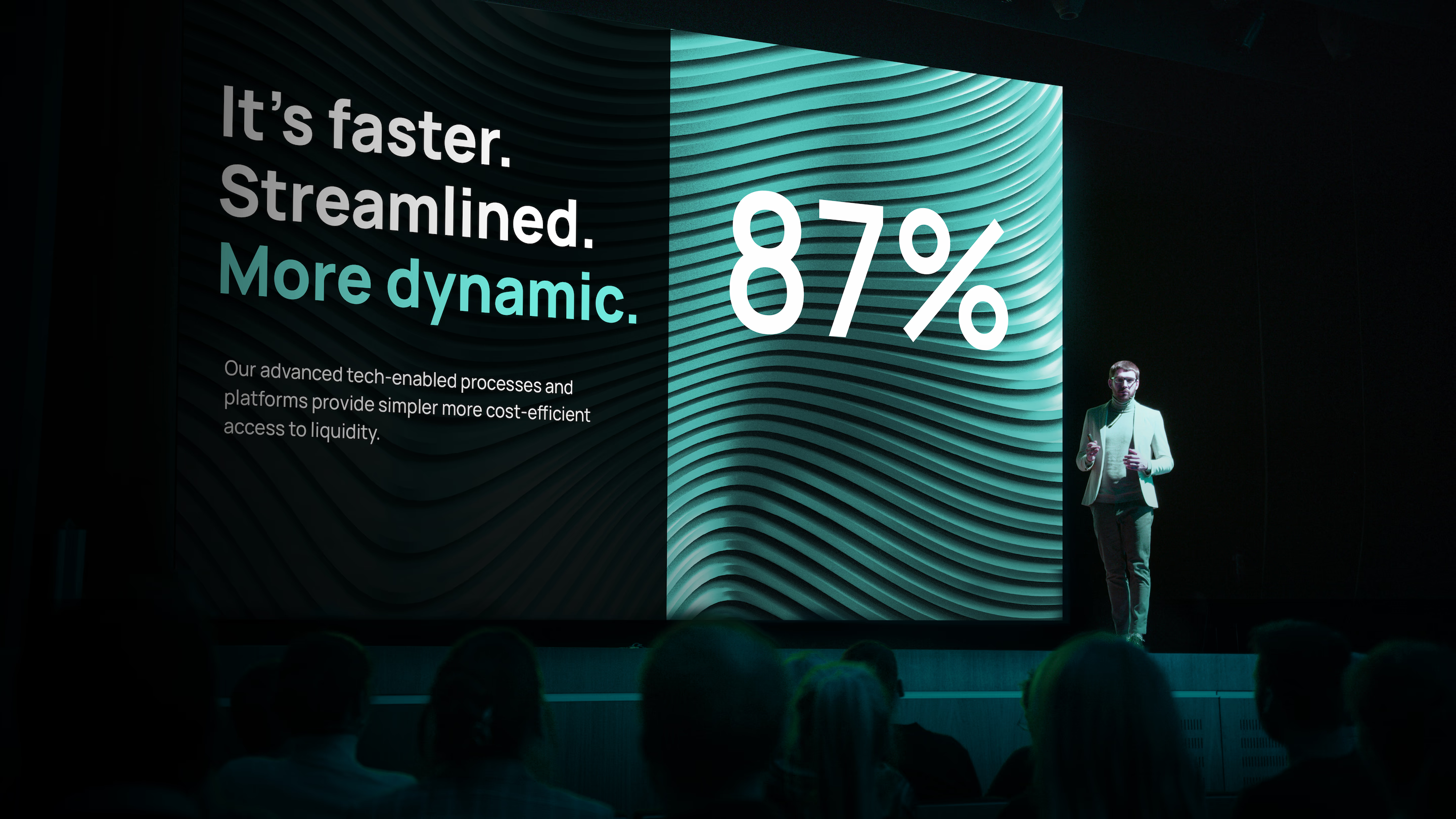
    It's faster. Streamlined. More dynamic.
87%
Our advanced tech-enabled processes and platforms provide simpler more cost-efficient access to liquidity.

    Embracing the future of The Bancorp

    The Bancorp’s revitalized brand has been enthusiastically welcomed across the organization, thanks to a robust employee engagement program and subsequent launch, culminating in ringing the opening bell at the Nasdaq exchange in New York in January 2026.

    Damian Kozlowski, CEO of The Bancorp, had this to say: “In a rapidly changing financial landscape, The Bancorp has evolved, and our brand should reflect that evolution. Our rebrand captures who we are—a technology-forward financial institution with the expertise to see what’s ahead and the commitment to help our partners transform, innovate and grow.”

    Home / Case Studies
  • Sustainability Accounting Standards Board (SASB)

    Sustainability Accounting Standards Board (SASB)

    In the world of capital markets, investors need to understand how a business, regardless of industry, will remain viable and deliver a desired financial return. To make good investment decisions, they need to account for both financial and non-financial issues that are material to a company and its ability to sustain its future.

    The challenge that investors face is access to essential information that goes beyond what’s found in traditional annual reports and financial statements. Today’s enterprises must navigate a complex and dynamic landscape of regulations and resource uncertainty—and they must be able to assess and report on how all of these factors affect their operations and risk exposure, in order to maintain the confidence of investors.

    Facilitating performance reporting around non-financial issues is what the Sustainability Accounting Standards Board (SASB) was created to do. Formed in partnership with Bloomberg, SASB was modeled on the Financial Accounting Standards Board (FASB), which formulates and oversees the benchmarks used for financial reporting.

    Together, SASB and FASB provide a comprehensive and consistent set of standards that give investors a more complete understanding of a company’s current performance and future prospects.

    As a founding member of SASB’s advisory council, Tenet Partners played a critical role in helping Dr. Jean Rogers, its visionary founder, create a brand that would immediately establish the organization’s credibility within the business, capital markets and regulatory community that was equal to any other in the realm of standards-setting organizations.

    In addition to the research, strategy and identity work at the heart of any successful brand, the Tenet team partnered with SASB to create an information architecture designed to make a company’s sustainability metrics more accessible and easier for investors to use.

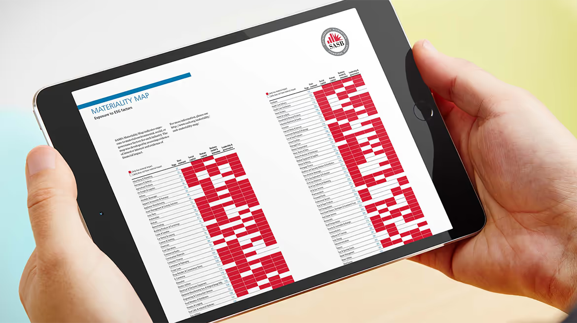
    The result was the highly interactive SASB Materiality Map, which provides an at-a-glance view of materiality scores by industry and issue, allowing click-through access to the data behind the score. By translating a complex data set into something digestible and easy to use, it helps enterprises organize and prioritize the issues that are most important to them—and their investors.

    The launch of SASB established it as an essential enabler of standardized sustainability reporting in the United States. Thanks to this success and widespread adoption of its standards, in 2022, the International Sustainability Standards Board (ISSB) of the IFRS Foundation assumed responsibility for the SASB Standards and moved them to a global approach embraced by capital markets worldwide.

  • Sensient Technologies

    Sensient Technologies

    Vibrant hues. Subtle scents. Flavors that run from sweet to savory and mild to bold. Textures that are pleasing to the touch. Rich sensory experiences are an essential part of being human—and making those experiences better is what Sensient Technologies is all about.

    Sensient ingredients are found in a vast array of products, from food, pharmaceuticals and cosmetics to industrial coatings, cleaners and packaging.

    The highly specialized, technologically sophisticated company now known as Sensient had a surprising start. Its roots go back to 1882, when it was a distillery, and later a producer of yeast. In the 1960s, the company added other commodities and changed its name to Universal Food Products. By the 1990s, the name and brand no longer fit the organization. It had transformed, branching out in new directions as a leading global supplier of colorants, flavors and fragrances. It had become far more than a food company.

    The key to development of a new brand was to find the thread connecting all that the company does—the essential idea behind its entire range of products and capabilities.

    The Tenet team looked beyond what the company does, to what its products enable. That creative approach led to a simple, universal idea: The company is in the business of enhancing sensory experiences.

    The sensory experience notion became the foundation of an entirely new brand encompassing strategy, positioning, architecture, visual and verbal identities. It came to life in several ways, the most visible of which was an evocative new name: Sensient Technologies. The name is powerfully communicative all on its own. In just two words, it telegraphs the promise behind the brand: Enhance SENSory experiences through specialized ingredIENTS, delivered through proprietary TECHNOLOGIES.

    The dramatic rebrand accomplished exactly what the company set out to do: Redefine its position in the market and provide a platform for growth. As a result, Sensient Technologies’ (NYSE: SXT) stock price saw a 20% gain after the new brand was launched.

  • Canon Medical

    Canon Medical

    Canon branded stationery

    Making a difference is in Canon Medical’s DNA

    From MRIs to X-ray equipment, the world of medical imaging is heavily dependent on advanced technology. That’s where many manufacturers concentrate their efforts.

    Canon Medical Systems USA has a different mindset. It’s a company that thinks about access, impact and the good that its solutions do for providers, health systems and patients. For Canon Medical, the outcome matters as much as the product.

    Tenet Partners helped Canon Medical bring that story to life with an award-winning brand refresh that set the company apart while honoring the global Canon brand.

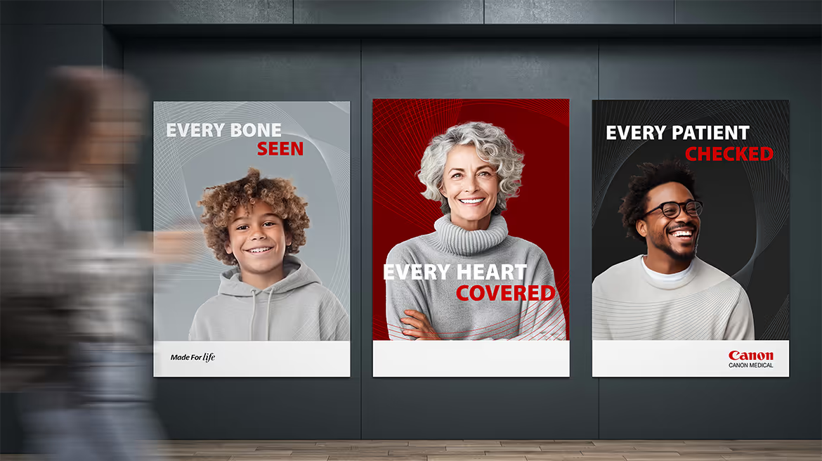
    three portrait Canon medical ads
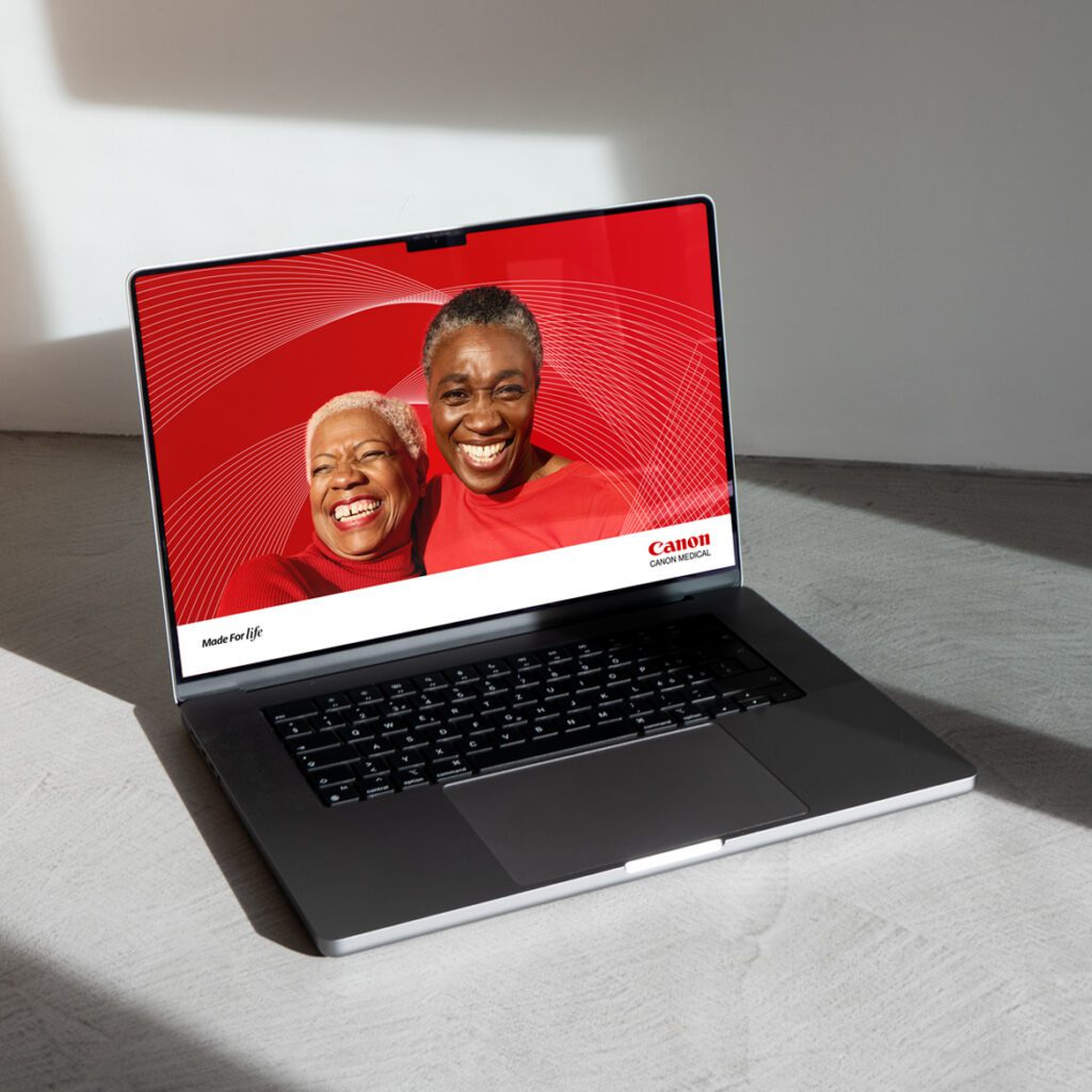
    laptop displaying Canon Medical brand
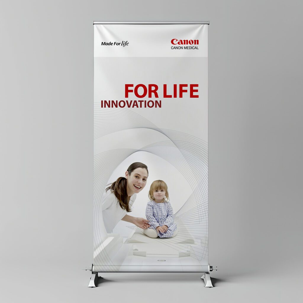
    tradeshow poster showing Canon Medical brand

    Targeting Canon Medical’s distinct advantages

    With the competition mainly focused on technology, Canon Medical saw an opportunity to leverage its emphasis on meaningful innovation, expertise, relationships and the positive impact it has on customers and patients as a way to stand out.

    A new brand promise, positioning and personality set the stage for messaging and tone of voice. The narrative highlighted the company’s humanity and strong customer orientation: Canon Medical is with customers all the way, solving problems, meeting them where they are and setting them up for success. All in the name of delivering what matters: better outcomes.

    Honoring the parent brand while exploring new directions

    The critical challenge for Tenet’s design team was to respect the power and value of the global Canon brand while enabling Canon Medical to stand out as a preferred partner for the medical community. The visual identity had to remain firmly rooted in the parent brand.

    The new design links to the global Canon brand in subtle ways, making good use of the corporate red along with gradients and geometric shapes, including the highly recognizable letter C that’s always been part of the Canon wordmark. The result is a rich texture that suggests technology without overwhelming the more human elements of imagery.

    A refreshed Canon Medical brand grabs attention

    In a crowded market where Canon Medical goes head-to-head against much larger competitors, the refreshed brand has done exactly what the company was looking to accomplish: elevate its profile. A few months after the updated brand launch, Canon Medical saw a 45% increase in engagement with its social media content, and response to PR at conferences tripled.

    The revitalized brand also won Bronze in the 2024 Transform Awards, for best creative strategy—evidence of the difference that collaborative engagement and design that’s firmly grounded in brand strategy can make.

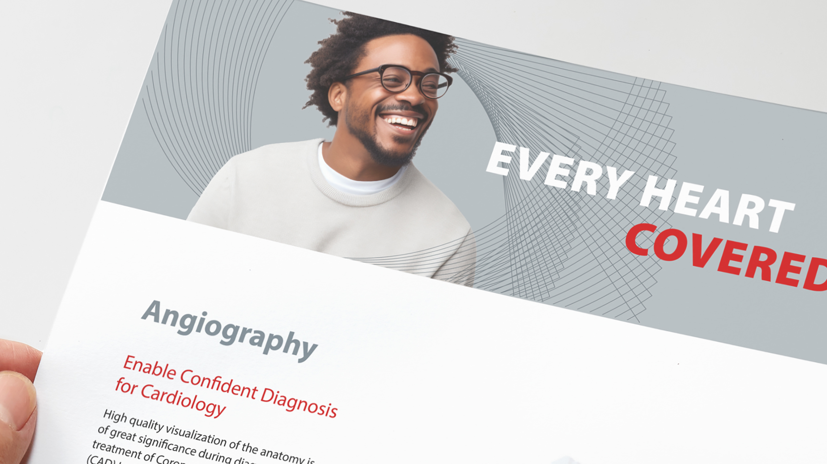
    Canon brochure
    “We’re impressed by Tenet Partners’ ability to listen and understand our business needs.”
Olivia Duarte, Director of Corporate Communications
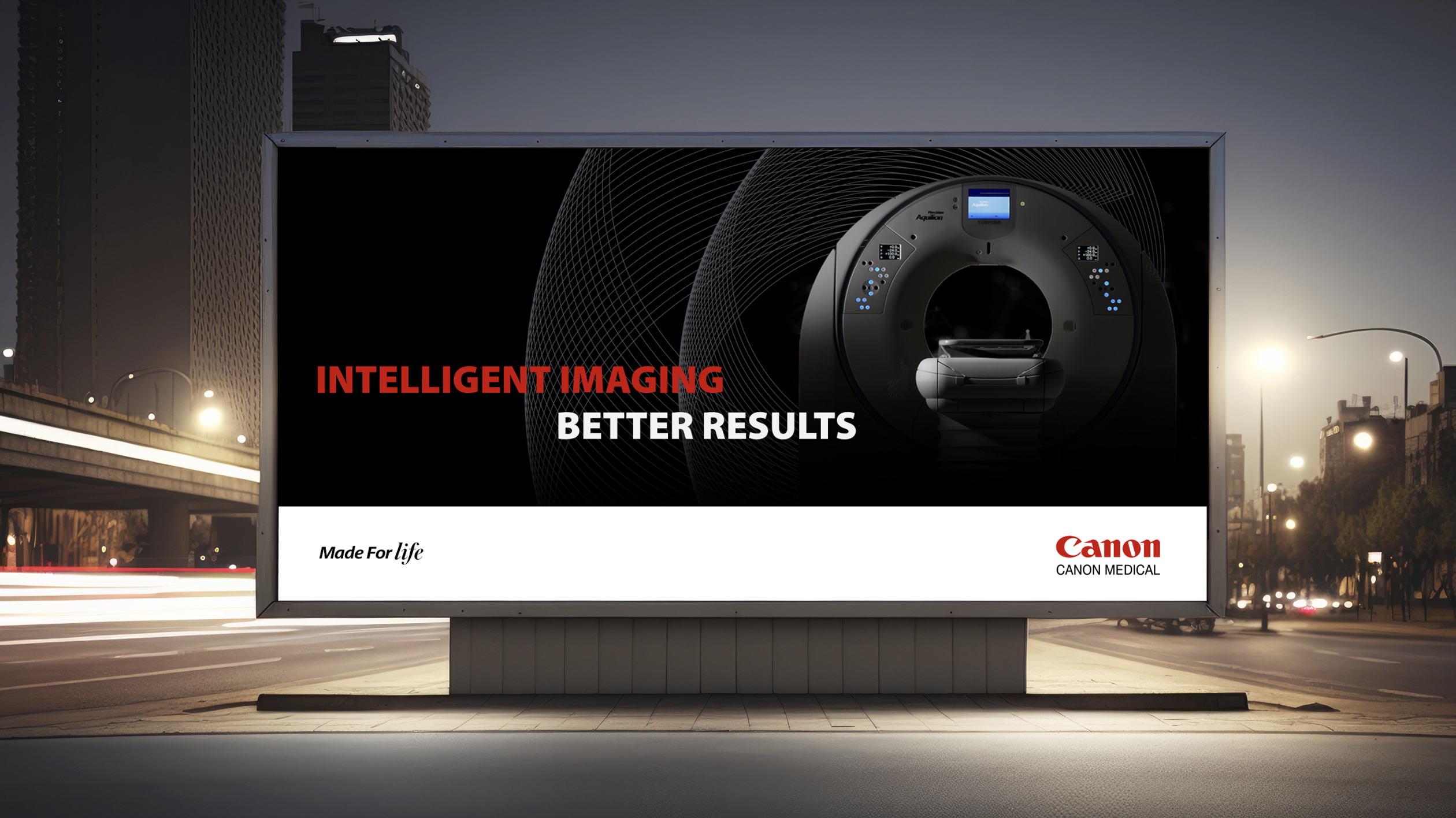
    electronic billboard with Canon ad
  • Fairtrade

    Fairtrade

    Fairtrade International is a non-governmental organization spearheading a global movement to change the way trade works through better prices, decent working conditions and a fairer deal for farmers and workers in developing countries.

    Fairtrade promotes its agenda through a system of certification marks on product packaging to help brands signal that they are part of a more sustainable, responsible worldwide economy, giving consumers assurance that they are making ethical purchase decisions. It was felt that this multifaceted system was too complex and difficult to understand.

    The organization saw the need to make the scheme more clear, but wanted to make sure any changes were driven by research and a sound brand strategy. Fairtrade came to Tenet Partners for help with streamlining its certification architecture to better communicate with the market.

    Building on extensive research, the Tenet team recommended a simplified approach based on use cases. The new system is straightforward, easily understood and modular, with a single certification mark that combines the two legacy marks and supplemental visual elements that can be added or removed based on the use case.

    The new approach makes identification of Fairtrade-certified products easier, while still allowing for the inclusion of relevant information. It also sparked valuable discussion and consensus-building within the organization.

    With clarity around adoption of the new architecture achieved, Fairtrade International is poised to move forward with a clean, flexible system that allows qualified businesses to better communicate with their customers—and for the organization itself to advance its vision.

  • APTA

    APTA

    The American Physical Therapy Association (APTA) is a professional organization that represents more than 100,000 member-physical therapists, physical therapist assistants and students of physical therapy nationwide.  

    While developing its 5-year strategic plan, APTA leadership determined that the association’s brand was not serving the needs of its membership. This was proved out as the 71 specialty sections, state chapters and major programs that comprise APTA were using their own branding, creating a highly fragmented face to the organization.  

    While national leadership desired a more consistent identity, it was concerned that developing a cohesion might also create friction—with most chapters wanting to maintain their individual identities.  

    Tenet research confirmed that the national association was underappreciated by its members, who were more connected with their local chapter or specialized member group than they were to the broader organization. 

    In parallel with visual identity work, Tenet strategists engaged APTA national and chapter leadership in collaborative exercises designed to build consensus around an evolved brand architecture that would establish a more prominent connection between the chapters and the association.  

    That process helped to shift the views of leaders and members, who agreed that a more cohesive branding approach would go a long way towards increasing the stature of the association, and of physical therapists in healthcare and among the public at large.  

    A new logo and visual system were also developed to express the end benefit physical therapists provide their patients: a notion of fluid activity and freedom of motion, driving forward and upward. The refreshed visual identity provides both consistency and flexibility, allowing APTA to build a cohesive brand while giving the 71 disparate groups the freedom to customize their own identity by choosing from a range of pre-designed options.  

    In a further endeavor toward consistency, Tenet also developed a messaging playbook—a key resource that APTA’s national staff had never had before—along with comprehensive brand guidelines, launch strategy and communications. 

    The national brand launch was timed to coincide with the association’s centennial celebration, featuring prominently in APTA’s new headquarters. By tying the launch to a major event, the refreshed brand generated considerable excitement and buy-in. With a solid architecture established, the individual member groups now have the tools to roll out their own refreshed brands.  

    The new brand approach quickly proved its worth. A prominent APTA group that had separately undertaken its own brand refresh hired Tenet to design its new brand. We demonstrated how the architecture solution, new identity and visual system could be used to create a powerful brand expression at all levels of the organization.

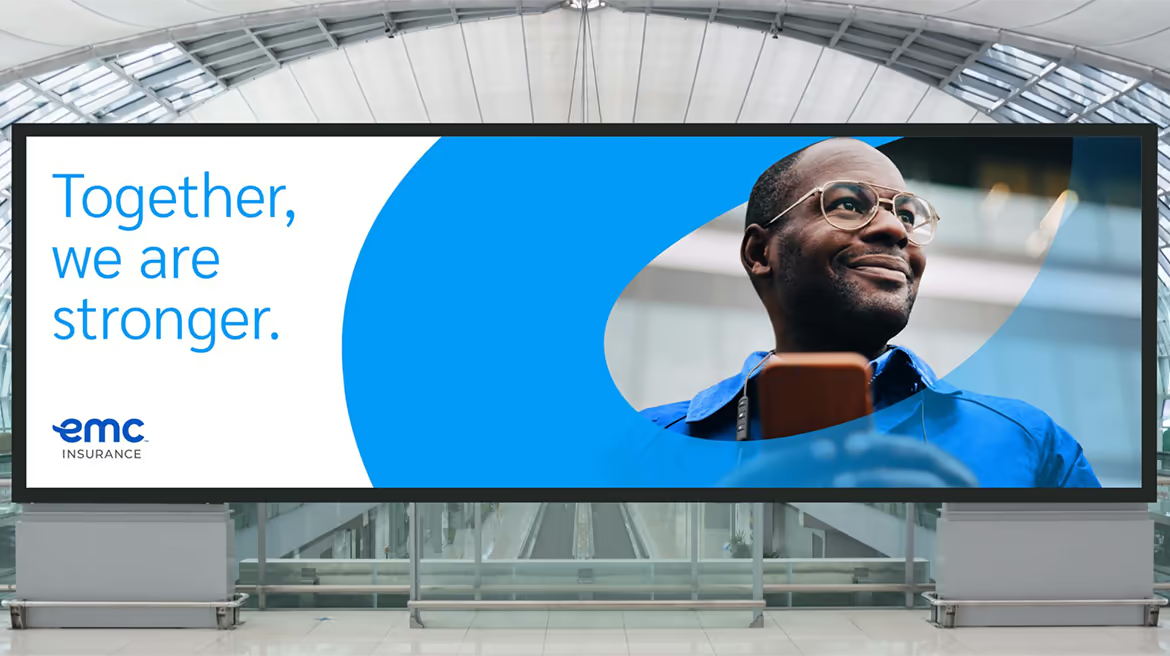
  • EMC Insurance

    EMC Insurance

    EMC Insurance is an Iowa-based carrier primarily focused on risk solutions for business. As a mutual company that relies heavily on independent agents, local presence and close relationships with communities and businesses, it has a powerful story to tell.

    EMC leaders knew they had a strong presence in the market, but felt that there was an opportunity to amplify the brand to better reflect the company’s strengths and distinct character.

    Starting with extensive internal and external research, Tenet strategists zeroed in on what makes EMC special: that at its core, it is a very human company.

    That ethos was captured in a revised brand platform as a foundational element: “The national carrier with a local heart.” This laddered up to a new brand promise: “Keeping insurance human.” In keeping with this, the platform and brand voice shifted away from a product-first approach to larger themes of partnership and prosperity.

    EMC’s existing look—hard-edged and dark, typical of the industry—felt dated and was not ideally suited to the company’s focus on working with agency partners to help policyholders and communities thrive. Tenet designers created a warmer, more engaging visual identity, using an in-person workshop to help the EMC team get up close with the creative process.

    As the amplified EMC brand was being prepared to launch externally, leadership understood that connecting with the internal audience was critically important, as they are the ones embodying the brand promise across all touchpoints.

    The Tenet team knew that the employee training program would be most effective if delivered by the employees themselves. A Tenet-crafted “Brand Ambassador” train-the-trainer program tapped 60 uniquely qualified individuals across various geographies and areas of expertise to be the faces and voices of employee engagement throughout the organization.

    It all came together at One EMC, an historic event at EMC headquarters. Through unique and memorable employee experiences, the team generated excitement, teamwork and a greater understanding of the amplified EMC brand.

    The new brand identity, Brand Ambassador program and One EMC event were hugely successful and popular with employees, serving to bring clarity about the company’s path forward and build genuine enthusiasm about EMC’s future.

    “The collaborative partnership we had with the Tenet team resulted in a highly creative and impactful visual identity that further enhanced our broad strategy,” said EMC’s vice president of customer experience & marketing.

  • Sparking a passion for science and technology

    Sparking a passion for science and technology

    FIRST

    A global nonprofit organization founded by well-known inventor Dean Kamen, For Inspiration and Recognition of Science and Technology (FIRST) is dedicated to improving education and interest in science. The company touches the lives of nearly 700,000 kids globally through its robotics programs. Kamen, holder of more than 1000 patents and founder of DEKA Research and Development, set a vision for the organization to “create a world where science and technology are celebrated…where young people dream of becoming science and technology heroes.”

    The identity of FIRST is an excellent example of a grass-roots creation that takes a life of its own through its application. Unlike regimented corporate programs, the company’s symbol is applied freely to just about everything imaginable inside and outside event venues – by FIRST staff, by the thousands of teams and fans, and by the many corporate sponsors and partners contributing time and resources.

    Tenet Partners donated its services and talents to helping FIRST create a new logo and signature system that updates its image, solves a range of application issues, and clarifies the structure of the growing nonprofit’s numerous offerings.