Designing for Crisis

Over the holiday season, I started noticing numerous year-in-review videos in my admittedly seldom-visited Facebook feed. At the end of 2013, when Facebook produced a similar offering, I recall being utterly impressed with the engineering effort — and the overall computing resources it must require — to create a customized video on demand for every one of their billion users.

Facebook, overall, does an extraordinarily good job with the production and presentation of these videos. They are personal, emotional and a great way to celebrate your year with your friends and loved ones.

However, let’s focus on that word “celebrate”. A problem with the way Facebook introduces these videos becomes crystal clear when you have a year that you don’t particularly want to celebrate. Eric Meyer, a long-time champion of web standards, tragically lost his little girl in 2014 and publicly journaled throughout the ordeal on his blog and on Twitter. The video preview that Facebook automatically set up for him, and forcibly showed itself in his feed, featured his daughter with her portrait on top of a celebratory background. I’m sure for anyone in his situation that would elicit a raw wave of emotions, the exact opposite of what Facebook would have liked to spark for you. He wrote about the experience in his brilliantly crafted article, Inadvertent Algorithmic Cruelty. The piece grew some legs and was picked up by major news outlets around the world. Eventually Facebook issued an apology.

What’s the lesson here for us software designers? Certainly Facebook didn’t mean to cause grief, and Eric was understanding and reasonable, knowing full well that this was not a result of malice, but of a use case not considered in the original design of the software.

I consider it a call for empathy. Let our humanity shine through the software we design. Empathize with not only your ideal user, but for the unexpected. Consider the different realities that your audience might be approaching you with.

For Facebook’s year-in-review, rather than automatically including it precompiled in your feed for you, they can simply ask whether you’d like to see your video. Perhaps next to the question they can include examples from your friends who have chosen to publish their videos already, so that expectations can be set.

There are all kinds of scenarios that designers cannot possibly know at the time a feature is being created, and they vary on the site or tool and the audience expected to visit. For example, if you’re a health care provider, the overwhelming majority of your audience may be there to learn about the services and benefits you provide. But, perhaps some consideration should also be made for people coming to your site who are in desperate need for information on a personal health emergency. Or, take a broader crisis with the snowstorm that hit the northeast this past week. In the event that all roads and public transit in New York City shut down in anticipation of the storm, a well considered city website would have an area to prominently display updated bus and subway schedules, and what to do if you found yourself stranded with no way to get home.

I think the most important takeaway for designers is to embrace our humanity, and design as if the software we build was human, too.

Eric Meyer expounded on the idea of designing for crisis in a recent podcast at The Web Ahead, which is well worth listening to.

Have you ever had any experience where technology or software made presumptions about you that just were off the mark? If so, what was this experience and did you do anything about it?

Mitigating the Decline of Your Facebook Organic Reach

It’s official: Facebook has become a pay-to-play platform.

For those of us in marketing, this certainly doesn’t come as much of a surprise. Facebook has been slowly turning down the organic reach of posts from our brand pages for years now. It’s likely that a promotional post published today will reach only a small fraction of the audience that has liked your brand page. In order to increase the exposure of a post from your page, you’ll have to purchase it through the Facebook ad platform.

It wasn’t always this way, and stands in stark contrast to the golden days for marketers on social media. Back then, Facebook sold itself to brands as a platform where publishers could amass large audiences to market to directly. The beauty was that there’d be no cost for it, aside from the campaigns that were built in order to draw those users in. In exchange, brands were all too happy to market Facebook in return, by encouraging their audiences to log onto the platform and “like” their pages.

But for reasons that vary – from maintaining a quality news feed for its users, to the fact that Facebook is a publicly traded company looking to make a profit – the free ride is over. If you haven’t started adjusting your social strategy to counter this, or if you’re running into problems doing so, the following post contains some ideas to help you move beyond the problem of declining organic reach.

Take time to review your content strategy
Facebook has set the expectation, with users and businesses alike, that promotional posts will primarily be the ones to have their organic reach cut. However, the definition of what constitutes promotional content is not clearly defined. For their part, Facebook’s user surveys have identified posts that pushed product purchases, app installs, contest entries and that reused content from ads as the worst offenders of promotional content.

In addition to that customer survey, you may want to consider the sheer volume of content that your post is a part of. According to Brian Boland, VP of Ads Product Marketing at Facebook, the News Feed only displays approximately 300 of the 1,500+ stories a person might see when they login to the platform. This makes the News Feed a highly competitive place, even before taking into account the decline in organic reach.

Taking both the user survey and the volume of posts into consideration, the tone of the organic posts on your Facebook page should shift out of a self-promotional style. The types of content that will have a better chance of ending up on a News Feed, as well as appeal to your followers, are the posts that provide value to your audience. Give your followers information they can take away or think about, rather than pushing a hard sell. Save that type of content for actual advertisements that you pay for on the platform. Also, craft content that encourages sharing, which will help to broaden your reach beyond the News Feeds of people who have liked your page.

Start balancing your channels
The decline of organic reach has been an excellent reminder to digital marketers that we should never rely on a single channel to deliver our message. Luckily for us, Facebook isn’t the only social network that our audience could be using. To find out where else your audience might be, start by taking a closer look at who they are and ask yourself two important questions. First, what are the characteristics of your audience? Second, what are the attributes of your brand? Use those answers to align yourself with new social networks that reflect the personality of the two.

If you’re concerned about selecting a new network, don’t. There are so many other spaces your audience and your brand could play in, and you shouldn’t pigeonhole yourself into only one. Really look at how each social network could be leveraged. For example, Pinterest is a no-brainer for any brand in the B2C space, as its a network all about discovery of objects and ideas. Instagram (owned by Facebook) is geared towards imagery and video content, which could be used in crafting an impactful visual message. The possibilities are only as limited as the number of networks available to you, but the key takeaway is that you should maintain a balanced and diverse group of social channels, rather than put all your marketing eggs in one basket.

Use paid to own your audience again
Your brand will have promotional content at some point that you’ll want to display to your social audience. In addition to having to pay for the privilege of broadcasting it to people who have already liked your page, you’ll still be forced to compete with other posts in an audience member’s timeline. Why not move away from the noise, as well as the control of Facebook, and further diversify your digital marketing channels? Use paid advertising to funnel them into more direct marketing channels, such as an email campaign. This will bring your audience onto another marketing channel that you hold the control over, and one that cuts through the noise that social media can create.

What Facebook has done by throttling down organic reach can be done on almost any other social network. It remains to be seen whether it was the right business decision for Facebook users, the company’s shareholders and marketers alike. Just keep in mind that Facebook is but one platform in a wide array of social networks and digital marketing methods at your disposal. Use it and other social channels alongside a balanced array of methods like SEO, paid search, content marketing and email, and you’ll be better prepared to adjust your strategy to business decisions like and you’ll be better prepared to adjust your strategy to business decisions like this in the future.

The “Brand Narrative” Pyramid

I’m a strong proponent of the brand narrative concept. I believe that any and every brand has a narrative behind it, to it and about it. The narrative behind a brand is all about the internal relevancy. How is this brand important to the company? The narrative to a brand is the external context. What’s the WiifM aspect for consumers, investors, clients, etc? And the narrative about the brand is the engagement with said external audiences, which then return to the company.

It’s a circular progression of communications. Or, as I envision it, a four-part triangle.

The lower left triangle represents Relevancy, while the lower right represents Engagement and the upper triangle represents Context. The inner triangle is a melding of the three, which when combined form an engaging Brand Narrative.

Building narrative through Relevancy: Find the connections between internal and external audiences
Building a narrative should start from within. I find Google to be a great example of this. I equate their philosophy with relevancy. One of their ten facts they focus on is: Focus on the user and all else will follow. The “user” includes employees. By building an engaging workspace internally, that mindset follows into their various products and services.

Their philosophy is built off 10 facts, which builds their framework to remain relevant to their employees and their users. Encouraging creativity, teamwork, and responsibility builds for a brand narrative that many can associate with. It’s probably why Google is now synonymous with searching for anything online. And I know that the concepts of creativity and teamwork show in their Google+ and Hangouts services, which I use on a weekly basis.

There’s also a plethora of stories out there, of how they encourage employees to balance work and play, to allow for creative time, to offer up ideas and watch as they’re tested out and implemented.

Building narrative through Context: Create connections between external audiences and society
I’ve found Apple’s brand narrative focuses on both form and function. Their current iOS slogan, “Every bit as powerful as it looks.” is a good example of a balance between form and function. I connect with Apple’s slogan — I see my apple products (Two MacBook Pros and an iPod nano) as streamlined, efficient and focused on creative endeavors. In those respects, their products are powerful and do everything I need it to do.

Microsoft’s Windows has always been about functionality to me. Due to the wide array of hardware it’s run on, functionality is a key factor in ensuring that the system runs smoothly across a wide variety of hardware set-ups. That said, when doing some digging, there are no clear examples of slogans, mottos, tag lines, or messages focused specifically on the operating system — with the exception of a recent push towards Windows 10 rather than 8.1 or 7. (I started with 3.1, skipping every other generation of OS and am currently holding onto 7)

I am however up for migrating to Windows 10, because their narrative does have me intrigued as to the changes and upgrades available since Windows 7 was released. And their logic behind the move from 8.1 to 10 makes sense to me.

(I can’t speak towards other OS developers as I’ve barely dabbled with Ubuntu, and have minimal experience with other Linux builds, or Android’s OS.)

Building narrative through Engagement: Connect with society and tie back into internal audiences
When it comes to Brand Narratives being built up by their audiences and expanded in engaging ways, I go straight to the gaming industry. They’re one of the clearest examples I know of how powerful brand narratives grow.

Not everyone pays attention to game developer brands. Most are at least familiar with the big names: EA, Activision Blizzard, Bungie, Ubisoft, Valve. There’s plenty of smaller ones just as active in the industry, and they all have one thing in common: Their audiences. For simplicity, let’s focus on two main groups: Let’s Players and Gamers. Let’s Players are the gamers recording their gameplay and engaging with the developers, generally encouraging the purchasing and playing of the games they record. Gamers are any consumer who plays games; simple as that.

There are communities like Rooster Teeth, the Yogscast, The Game Grumps, and individuals like Markiplier, Jessie Cox and Total Biscuit who are known for their discussions about game developers and dialogues with their viewers. They take a game developer’s brand narrative and product, build around it, and discuss with the general public to further the brand’s visibility. I can count a couple dozen games where I’ve purchased and played primarily because of the names above.

Relevance, context and engagement are all subjective; there is no one right method or tactic for building a powerful brand narrative. It really is customized for each company. I really do believe that actively incorporating all three aspects into your brand will make a difference.

Coca Cola iconic bottle turns 100

Customer experience might be all the buzz these days, but is it really anything new? Coca-Cola’s contour bottle has been creating the ultimate in customer experience for 100 years.

There is a lot of talk these days about customer experience and how in order for brands to be successful they must create the ultimate customer experience across all touchpoints. We all know that basic marketing has moved beyond the 4P’s product, price, place and promotion. While the 4P’s still serve as the marketing foundation, we have seen how the influence and the integration of technology and social media have significantly impacted how marketers think about the 4P’s.

Achieving the ultimate customer experience comes in all forms and is the best way for brands to keep their customers engaged throughout every step of the brand journey. And this holds true whether we are talking about B2B, B2C or CPG companies, brands, products and/or services. So what exactly do we mean by Customer Experience or (CX)? Wikipedia defines Customer Experience (CX) as: the sum of all experiences at various touchpoints a customer has with a supplier of goods and/or services over the duration of their relationship with that supplier, good and/or service. This can include awareness, discovery, attraction, interaction, purchase, use, cultivation and advocacy. It can also be used to mean an individual experience over one transaction; the distinction is usually clear in context.

But is all this talk about customer experience really anything new or is it just that we now have more touchpoints where brands can impact the customer experience as a result of technology and social media versus let’s say 100 years ago? Why 100 years you might ask? I just read an article where the classic and iconic contoured-shaped Coca-Cola bottle is celebrating its 100th birthday this year. While Coca-Cola is planning on celebrating throughout 2015, the official date has been designated as November 16, 2015.

The brand is planning on throwing a huge global birthday centennial celebration with ad campaigns featuring the likeness of Ray Charles, Marilyn Monroe and Elvis Presley—each drinking Coca-Cola straight from the contoured bottle. I immediately thought to myself WOW, how could this bottle possibly be 100 years old? What foresight the marketers and packaging engineers and designers had in creating such a bottle and to have it patented no less. Not only has this bottle shape became one of the most well-known global icons in branding history, but its shape has also created one of the most lasting and memorable customer experiences — an experience that provides Coca-Cola with a unique point-of-difference versus any other soda brand and every Coca-Cola customer with a personal experience with each purchase and consumption. After all, who doesn’t have a heightened experience drinking Coca-Cola from its 8 fl. oz. contoured bottle versus a can?

Personally, when I see Coke’s iconic bottle, I am immediately transported back in time to when I was a young boy putting change in the Coke machine waiting in anticipation to make my selection and listening for the bottle to quickly (and hopefully, safely without getting stuck) make its way down the channel for me to grab, pop open and take that first sip. For me, the customer experience started from the moment I shook quarters loose from my piggybank, rode my bike to the nearest convenience store, reached deep into my pockets and put quarters into the machine. Talk about the ultimate in customer experience. I can still envision this experience like it was yesterday even though it was actually over 40 years ago. I even have a Coca-Cola contoured bottle proudly displayed on a shelf of collectable packaging in my home office.

I want to wish a Happy 100th Birthday to Coca-Cola’s contour bottle. Thanks for the memories and the ultimate customer experience your bottle shape has bestowed upon millions around the globe and will undoubtedly continue to do so for many generations to follow. You should be applauded for being ahead of the times in designing a shape that resulted in one of the most memorable customer experiences in branding history.

Can you think of any other brands, products and/or services that may have been ahead of its time in creating a unique customer experience?

Apple Watch and the Mobile Web

The modern age of the mobile web was heralded by Apple in 2007 with the introduction of the iPhone. Apple set to redefine what a mobile phone could be, but what nobody expected was how it caused a paradigm shift in computing, one from our desktop to our pocket. With it came the invention of modern web techniques to cater to the growing mobile audience like responsive design and a renewed focus on performance. We began to take for granted the notion that the entire world wide web is accessible wherever we are. Today support for mobile is no longer a luxury, it’s an imperative.

Almost eight years later, another paradigm shift in computing is rapidly approaching: from our pocket to our wrist. Google introduced Android Wear last year, and Apple will be launching its Apple Watch on April 24th. Wearable computing opens up exciting new possibilities, but it also raises many questions about how we’ll be using them. What is the primary use for a smart watch? To tell time? To track health and fitness? How will it practically extend what is already available on our phones? We simply won’t know until we try them on and settle in.

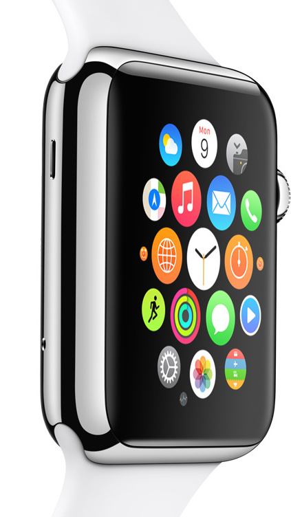
But what does a smart watch mean for the web specifically? Apple’s known to be an opinionated company, so let’s take a look at what they think a watch should do. Refer to this image showing the default apps loaded on the Apple Watch.

If you’re an iPhone or Mac user, and if you look closely enough, you might notice something missing. There’s no Safari icon. There’s no mention of the web at all on their page describing built-in functionality. Apple has predicted that browsing the web on a watch isn’t something people will be clamoring for. I agree wholeheartedly. With the largest Apple Watch having a screen size of 42mm, it’s hardly going to be a fun experience panning and zooming around your favorite site, let alone trying to type in the address of the site you’d like to visit.

If we agree that it would be less than optimal to browse the web on your wrist, what does this mean overall for the mobile web? Is it doomed as we gradually transition to wearable computing?

The Web is dead, long live the Web

Apple clearly believes that the future lies with apps. This has been a trend for many years since the introduction of the App Store for iOS, and with the Apple Watch it will be the only way to accomplish your favorite activities. What it means for the modern software designer is to think in terms of services and to ensure that service oriented architecture is baked in from the beginning.

Many of the apps you already know and love wouldn’t be possible without the web services and APIs that were built to support them. There are countless examples, but email and social media are ones that are ubiquitous. If you have a Gmail account you can access your email in a number of different ways. Open gmail.com in your browser, open up your mail client, install the Gmail app on your phone. All of these talk to the same service that Google provides behind the scenes. Facebook and Twitter are other examples. There are a number of Twitter apps that you can install or you can visit twitter.com in your browser. Any way you access will read from and write to the same set of core data.

At Tenet Partners the tools we build to help manage brands — whether it be online guidelines, a digital asset manager, or a brand review tool — are designed for the service enabled world.

Nowadays, the web is powered by these services, and they enrich our lives by the possibilities they enable on web sites and apps across all the devices we use. In that regard the Apple Watch will be no different. I’m excited for the potential of wearable computing, and can’t wait to see how it will change my daily life. I don’t think I’ll miss that Safari icon at all.

It’s all about the experience

Microsoft. Sony. Nintendo. Each one offers powerful brand experiences through their gaming divisions. What makes console entertainment so powerful that the XBox One, PlayStation 4, and Wii U combined account for 40.5 million consoles sold to date? Their community.

Entertainment is: Unique & Personal
There’s more to games than just button mashing to see what happens next. The soundtracks and special effects of games is, frankly, incredible. Mario, Sonic, Link they all have iconic theme music throughout their games. The Halo franchise’s music is balanced for action and awe. I still count Blizzard as one of the best cut-scene creators out there for their special effects and rendering. All of that builds upon the stories and creates unique experiences for each player.

The customizability of characters, weaponry, vehicles, and more has never been better. Being able to create a character, weapon and vehicle to your preferences is a gratifying experiences and a staple in most character-centered games now. I still consider Fallout: New Vegas my favorite customizable game, for its characters and weapons. There’s also an influx of “sandbox” and “open-world” games where there is no set path or plot you’re required to follow. You’re free to make of the game what you will, which allows for incredible feats of engineering, story crafting, and engagement.

And with the help of fundraising websites Kickstarter, Indiegogo and even GoFundMe one-person developers, and small indie companies are now capable of reaching out directly to the community to help fund and support smaller scale games. Steam’s Greenlight section is another method where gamers can learn about up and coming projects, and see alpha builds and sometimes obtain early access. The ability to see behind the curtain is a rewarding experience for many gamers.

Entertainment is: Long-lasting & Memorable
We are still a society built on the traditions of story telling. A well-written story, or fully developed character creates long-lasting connections. Taking the time to build up an experience users can watch develop and grow through their actions is why brands like GTA, Mass Effect, Fable and Dragon Age resonate with so many players.

Voice chatting with your team during a mission is integral for some games and allows human connections, regardless of actual distance. From local co-op (playing on the same console) to multiplayer (generally online), the experience of playing with friends or strangers either cooperatively or against each other in games has resulted in long-lasting experiences and resulted in entirely new ways for games to be experienced.

And, with resources like Twitch and other live-streaming services, we’re now capable of sharing our experiences with others, in real-time. It’s an incredibly bold move for games and consoles to allow and incorporate such abilities into their products. But, it allows for their audience to endorse, market, and promote games as never before. I’d rather not admit to just how large my gaming library is because of Let’s Players, live-streams, and community suggestions, but it’s allowed me to experience a greater diversity of content than I would have on my own.

Experiences are incredibly powerful and create long-lasting connections to brands. Building those connections, creating communities and leveraging experiences are what makes impactful brands capable of creating the good and surviving the bad.

What brands are memorable for you? Which ones have created emotional connections, provided unique experiences?

Thin-Slicing the Customer Experience

“I know there’s a problem. I just can’t tell exactly what it is.” Have you ever said this to yourself as you and your colleagues were working through a tough customer-experience challenge?

In Malcolm Gladwell’s book Blink, the author did a great job of showcasing research that reveals the incredible agility of our unconscious minds. His storyline is fairly simple. Humans make instinctive observations and associations in milliseconds. These observations, coined “thin-slicing” by psychologists in the early 1990s, have the power to inform rapid decision making. The second part of what Blink addresses is the danger of over thinking those immediate feelings and reactions. By trying too hard to explain or reconstruct the details, we do ourselves a disservice by distorting reality. Or, worse, we come to the wrong conclusions – and in turn, make bad decisions using built-up arguments to justify our thinking.

The concept of thin-slicing offers useful insight into the nuances of customer experience and areas for brand innovation. Extending this concept to journey mapping, we can see that a rapid, holistic view of customer touchpoints has a lot of merit. We need to pay attention to our first reactions – those moments when our instinct, gut, intuition – whatever you want to call it – tells us there is a problem.

One simple technique to help get to the heart of customer experience problems is the use of rapid word associations. As you sort through the finer touchpoints of the customer journey, don’t overthink or try to explain what is happening in that touchpoint. Just jot down a word or two that captures a key attribute of that experience. By accumulating impressions, patterns and themes begin to emerge.

Blink mentions a practice for handling this, which can be easily applied to the journey-mapping process. Have team members assign one or two words to a touchpoint, but without explaining what they are trying to say. Then, come back to those words as a group to see if there any themes or patterns that jump off the page. More often than not, key observations can be captured with tremendous clarity – and, surprisingly, with great accuracy.

In the field, we recommend that you be prepared to jot down immediate reactions at all times. Keep a paper journal with you, or use the notepad app on your phone. When you investigate a touchpoint, write down the first few words that jump into your mind. Then, take a few pictures if you can or draw a rough sketch that describes the problem without using any words. If you want, think of a solution right on the spot, describe it without any attention to what you can or can’t do. Focus on the intent, not the specifics. When you return to the office, put your notes into the journey map. Over time, you may find that by thin-slicing touchpoints, you get a deeper, richer view of the customer experience and inspiration for innovative, high-impact solutions.

As with any technique for gathering information and generating insights, applying the thin-slicing idea to journey mapping requires care. How teams are designed, facilitated and engaged does matter. Done incorrectly, you run the risk of introducing bias. That may lead to false assumptions about what is really happening to customers and how to create a better experience.

Done well, however, thin-slicing is a useful tool to unlock powerful insights that serve as the fuel for experience innovation – and, ultimately, more opportunities to win in the marketplace.

Political logos: The good. The bad. And the confusing.

What can I possibly add to the chorus of people (designers and non-designers alike) currently discussing the 2016 presidential candidate logos?

I’ll start by saying how much I love that so many people are talking about logos. On the subway yesterday, I overheard a grandmother say, “I would have gone with a serif for my logo, it’s just so much more friendly.” It made me smile that she actually knew the difference between serif and sans serif and could express the associated personalities of each. And, I appreciate that so many people are talking about the purpose of a logo and what it communicates. With that said, I find it unfortunate that the dialogue is often so mean spirited. It seems that logo bashing has become a sport these days and political logos just intensify online snarkiness — which I will do my best to avoid.

In the context of this particular competitive set, I believe that Hillary Clinton’s “H” is the most successful logo. Is it as inspirational and graceful as President Obama’s iconic “O”? No, but it does an impressive job of doing what a logo is meant to do. It clearly connotes an idea (Progression! Moving forward!) and is memorable in its bold simplicity. In addition, the absence of a waving flag or military star is unexpected. Designed by Michael Bierut at Pentagram, this logo clearly stands out in the crowded, boisterous world of politics. In my opinion, it will stand the test of time.

The other three logos are what you’d expect both visually and conceptually, with varying degrees of success.

I certainly give Rand Paul credit for the subtle “torch” in his logo and the lack of the usual red, white and blue. And, I appreciate the bold decision to go with “RAND” to convey that he’s approachable and just one of the guys. I personally would have avoided the heavy italic font that looks too much like a moving company’s logo from the 1970s.

Marco Rubio’s logo has some nice features and some real problems. The all-lowercase type is both modern and friendly, but the small American map dotting the “i” is really unfortunate. Not only does it look amateurish, but it also doesn’t translate at all in smaller applications. And, what about Hawaii and Alaska? I’m pretty sure they still get to vote, right?

That brings us to Ted Cruz and what appears to be an American flag on fire. The symbolism of this icon left me scratching my head. The most conservative of the group, I do think it was the right decision to go with a classic serif and an all-American color palette. Both of these elements clearly reinforce traditional values.

With the 2016 presidential campaign just getting started, I’m excited to see even more logos join the race. Who knows? Maybe the best is yet to come.

Apple Watch Next big thing or Tim Cook’s folly?

As Tenet Partner’s IT director, and as someone who has been involved with Apple in many capacities over the past 30 years, I can’t help but be amused by all the negative and often snarky predictions for the new Apple Watch.

As with any new Apple product, until it has been in the market for a year or more, no one can predict what role it will play in users day-to-day lives. However, the key to grasping its potential lies in the understanding that while Apple creates brilliantly engineered and beautifully designed devices, it’s the imagination and talent of third party developers that really make these devices “The next big thing”.

When the iPhone first shipped in 2007, we tech types were thrilled to have a phone with a real web browser, visual voice mail, standards based email, an iPod, and a handful of useful productivity apps. Moreover, all this goodness came wrapped in a sleek package with an brilliant touch based OS and a gorgeous display. As a groundbreaking phone, this was obviously going to be a very successful product, but the real revolution wouldn’t begin until Apple opened up the iPhone to third party developers.

When the app store eventually opened, I would check in every few days to see what new apps were available. Within a few weeks the trickle of apps became a stream, which in turn became a firehose. Who in those early days could have imagined today’s ecosystem of apps and accessories, and the sheer scope of the functionality now offered by this diminutive device. While ostensibly a “phone” it is more accurately understood as a connected and sensor-rich pocket computer, and a darn powerful one at that.

One example; my nephew, a cardiologist at Johns Hopkins Hospital in Baltimore, is on call a few nights a month for cardiac emergencies potentially requiring emergency stents. When he gets a call he can quickly log-in with his iPhone and review the patient’s EKG, transmitted live from the ambulance, as both he and the patient make their way to the hospital. By the time he arrives he knows exactly what he’s dealing with and is ready to scrub in. This one tool significantly reduces the time from heart attack to repair, a critical factor in preserving life and preventing damage. Again, who could have imagined?

When the iPad was announced many confidently stated it was a device too far, just an overgrown iPod, and sure to be a flop. While tablet sales in general have slumped of late, they have carved out a vital role in our connected world. In a few short years iPads have replaced the 30 pound chart cases carried by nearly all airline pilots. They can also be found showing Frozen in the back of the family mini-van, used for data collection at scientific field stations and are replacing hard bound (and often out of date) books in classrooms around the world. Outfitted with a host of accessories and specialized software they can also be found on stage, in hospitals, offices, laboratories, museums, factories, etc., replacing existing tools, or creating new ones that none of us could have conceived of a few short years ago.

As a guy who grew up with Dick Tracy and his wrist phone, I’m naturally predisposed towards the Apple Watch. Most of my technical colleagues at Tenet Partners are as well, but what about the mass market? Could the naysayers predictions of an impending flop be accurate? I can’t begin to guess how the Apple Watch will evolve, but as with previous offerings, Apple has delivered to us an innovative and beautiful, yet relatively blank slate. Once smart developers around the world (and right here at Tenet Partners) dive in and make it their own, I’m pretty sure this could indeed be “the next big thing”.

Bud Light – The Importance of Understanding Potential Minefields in your Messaging

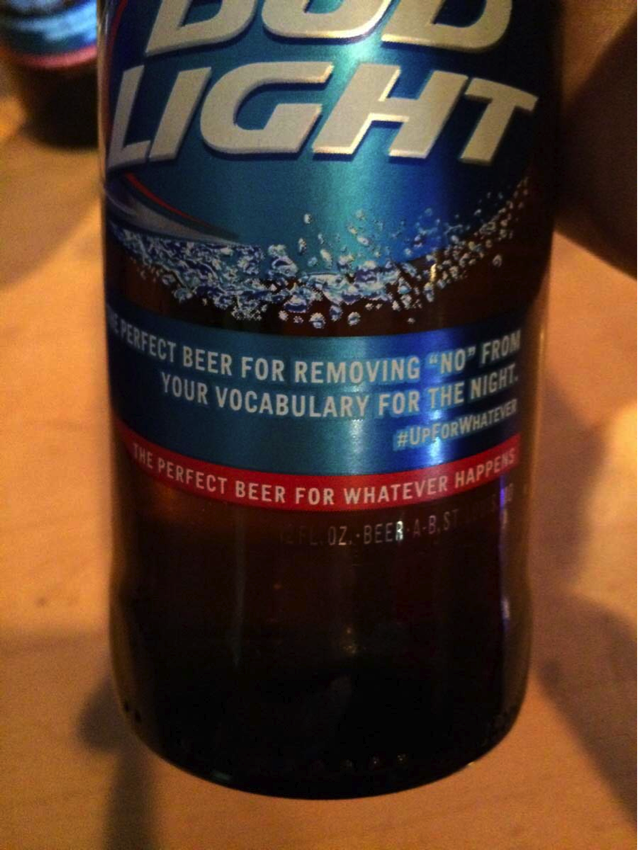
Bud Light recently ran in to some trouble with its “Up for Whatever” campaign. The issue highlights the importance of not getting too carried away when running a lighthearted and whimsical campaign that you could inadvertently become offensive or insensitive with. The campaign encourages people to be open-minded and go with the flow when it comes to a fun night out. They should realize that this could be dangerous water when promoting an alcoholic beverage. While not promoting irresponsible behavior, it is a fine line when you are promoting beer while telling people to be “Up for whatever”.

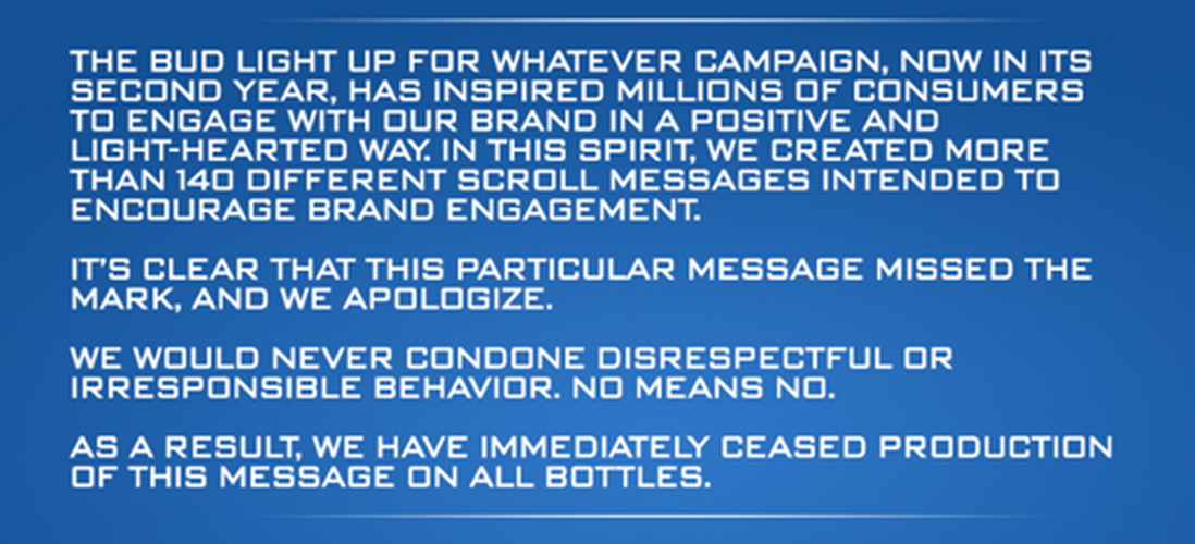
The controversy came when they put a tagline on their bottles that read, “The perfect beer for removing ‘no’ from your vocabulary for the night”. I don’t think that any reasonable person would look at that line and not have some concerns. Yet this same line allegedly went through five layers of approvals. This is astounding.

Anyone in a leadership position for such a prominent brand should be saying to himself, “I like this campaign, but we need to be careful that we don’t get carried away and go too far”. Apparently, that filter was not in place for the team at Bud Light.

As could be expected, the social media universe caught fire where users accused Bud Light of promoting a “rape culture”. I won’t go that far, I doubt that they consciously did that. However, at a minimum, they are guilty of horrible judgement and insensitivity. This episode highlights the need to have a filter in place and not get carried away. Communicators need to understand their product and intended message have the potential for creating a horrible misinterpretation if not communicated clearly and in proper context. The dangers in this campaign are clearly that alcohol consumption and bad decisions sometimes go hand in hand. With this message, they need to understand that there is a fine line between harmless fun and irresponsible behavior. Removing the word “no” from your vocabulary and consuming alcohol is a disaster waiting to happen.

Headquarters 11 West 42nd Street
Penthouse Floors 31/32
New York, NY 10036
212 329-3030

Boston
Columbus
Kansas City
San Francisco

A hexagon-shaped badge from Clutch, with the text 'Top Branding Company' on top and '2024' on the bottom