NPS Pharma – Putting science at work for the health of patients

Putting science at work for the health of patients

How NPS Pharma forged closer bonds with those with the largest stake in their success

Nancy has been suffering from hypoparathyroidism for nearly ten years, putting her at risk for calcification of her brain and heart, as well as for kidney failure. Nancy belongs to a fairly small community with only 60,000 people in the United States with hypoparathyroidism. There are no therapies or cures offered by pharmaceutical companies because the size of the afflicted population is so limited.

Enter NPS Pharmaceuticals

NPS Pharmaceuticals is not your average big pharma. Dedicated to the innovation and development of therapies that transform the lives of patients with rare diseases, the company has a distinct focus on populations not addressed by any other pharmaceutical company.

Patients first

In 2013, NPS introduced Gattex. This orphan drug to treat short bowel syndrome was the company’s first commercial endeavor. NPS is also working closely with people, like Nancy, who suffer from hypoparathyroidism with the hope of introducing a second therapy to treat that affliction.

With this product launch, NPS set out to turn the typical pharmaceutical model on its head, shifting its primary focus away from the medical community to the patients themselves. To reinforce this patient connection, NPS also built a support network to provide customized care to patients. This dedicated network helps patients locate, initiate and manage NPS therapies.

NPS reached out to Tenet Partners to communicate its mission through a compelling visual and verbal identity. Through interviews with various groups of stakeholders, as well as a competitive audit, Tenet confirmed that NPS’ primary focus on patients was indeed unique.

Our research further uncovered a remarkable emphasis on scientific rigor and innovation. Together with its approach to patient care, this earned NPS the right to stake its position at the intersection of science and humanity.

Giving meaning to a name and a brand

Such a bold approach required the right brand representation, one firmly anchored in four key attributes: transparency, humanity, connections and focus. Together, NPS and Tenet worked to develop a voice that rang true and a face that reflected the mission of the company and its evolving business strategy.

Tenet created a simple, yet compelling tagline: The Nexus of Patients and Science. This tagline speaks not only to the human patient connection, but also to the compelling science that underlies those relationships. Additionally, it offers meaning to the NPS name.

Tenet’s design team worked seamlessly with our strategists to make sure that the visual identity supported the strategy. The goal was to create a visual expression that emphasized patients’ radical transitions from sick to well and most importantly, the ability to get back to living. Using a calming blue hue, a gradient as a symbol for transition and people portraits, the NPS visual system became a compelling story, cementing the company’s commitment to putting patients first.

Extending the new brand to the digital space

Stepping up to this commitment also meant re-engineering the website. Where before the site was aimed at the medical community, the Tenet team of digital specialists worked at developing a site that would speak to patients first. Our primary focus was to create a vehicle that delivers the information patients need in a way that is easy to access and share.

Today, NPS’s website highlights those whose lives are improved by the work the company carries out. It also communicates the unflagging sense of urgency that drives NPS to continue pioneering and delivering, worldwide, innovative therapies that transform the lives of those suffering from rare diseases.

D&B – Highlighting insight and expertise

Highlighting insight and expertise

How D&B revitalized the business by investing in its brand

A look back at 1999 shows Dun & Bradstreet successfully extricating itself from a number of ill-fated acquisitions. Shortly thereafter, the Board hired a new CEO. His mandate was clear: turn the company around by refocusing on its core business. The firm was recognized as a leading global resource for essential business information. At the same time, however, new competitors were aggressively taking shares away.

The brand was mired in its paper-based, commodity-data past. The strength of the brand was further impacted by a complex and confusing family of product, service, discipline and business brands.

Refocusing the brand

The new CEO put brand revitalization at the center of the business strategy. He teamed up with Tenet Partners to accomplish the necessary transformation. Our team was tasked with one very important mission: develop and execute a new brand strategy in support of business goals.

Starting at the beginning, Tenet guided Dun & Bradstreet toward a name change that aligned with existing behavior. Customers were already using D&B as a shorthand when referring to the company. The transition from the full name to this abbreviated form was a natural next step. Onward to the next building block, Tenet proceeded to the development of a visual and verbal identity that would support the position of the company as a trusted and dependable partner. This led to the creation of a new “guide star” logo and brand promise – Decide with Confidence.

This was further supported by a visual system featuring a flexible and dynamic graphic system, giving D&B a distinctive voice in the market that would resonate with a new generation of business decision makers.

A view to the future with clarity of purpose

The upcoming launch of the new identity gave D&B the opportunity to clean house and simplify its brand architecture. Four customer-focused competencies with straightforward, descriptive names replaced a confusing array of offerings. This clear architecture fostered a better understanding in the marketplace for what D&B does and how it helps customers improve business performance.

D&B’s brand strategy has proven its flexibility to accommodate new offerings without leading to confusion. The brand umbrella was extended to include strategic cobranding and ingredient brand programs, as well as associations such as the D&B Worldwide Network, an alliance of regional market leaders who bring local expertise to D&B customers, worldwide.

The proof is in the results

In the end, D&B’s efforts to reinvigorate the business was met with outstanding success. Post-launch, the company’s stock value rose markedly, consistently and significantly outperforming the S&P 500 index.

Found Animals – Thinking big about small creatures

Thinking big about small creatures

Found Animals appeals to pet lovers

American attitudes towards pet ownership are changing, and for the better. More and more people are choosing to adopt homeless animals. Progress is being made in promoting humane treatment, along with programs to keep animal populations manageable.

This is the environment that Found Animals, an independent, privately funded nonprofit foundation, supports.

Finding a new way to tackle the issue of pet welfare

Established in 2005 by Dr. Gary Michelson as a result of the devastating impact Hurricane Katrina had on separating thousands of pets from their owners, Found Animals brings a clear and expansive vision to its mission of protecting the happiness and safety of animals.

Rather than focusing on just one thing, Found Animals has created a constantly evolving ecosystem of efforts. This spirit of ongoing innovation springs from the foundation’s tight focus on its goal of eliminating the need for animal euthanasia. For Found Animals, this is the only measure of success that matters. When new concepts are tested, only those that advance the cause significantly receive continued funding.

Successful Found Animals initiatives include:

  • Research funding for nonsurgical sterilization technology
  • Lost pet/owner reunification through microchip implants
  • Affordable spay/neuter initiatives
  • Education and support for owners who surrender their pets
  • Support of shelters both traditional and alternative
  • Facilities that reinvent the traditional concept of adoption centers

Given the complexity of the issues it is looking to solve, Found Animals fully understands the importance of reaching out to the pet community in a broad variety of ways to foster awareness, engagement and support. This understanding is at the heart of services like Found Animals’ Adopt & Shop, a self-funded, integrated adoption and retail center.

Adopt & Shop is a safe haven where prospective owners can meet adoptable animals in a cheerful environment very different from a traditional animal shelter. Adopt & Shop also offers retail sales of curated pet products, with all revenue funneled back into Found Animals. Pet owners know that every dollar they spend is going to support the foundation’s mission.

Found Animals’ other consumer-facing program, the Microchip Registry, adds to the foundation’s mosaic of no-kill initiatives. By helping to reunify lost pets with their owners, it keeps animals out of shelters and gets them back where they belong – at home, safe and sound. Every animal adopted through Adopt & Shop is chipped and registered, so owners are assured that their new pets are well protected. This Register extends to all chips no matter the manufacturer – and for free.

Placing animal lovers at the center of the experience

When Found Animals first came to Tenet Partners, it was looking for a new identity system for its Microchip Registry. Our strategists soon uncovered a much larger opportunity at hand – a way to not only grow the microchip program, but also bring everything that Found Animals does into the limelight to help the organization advance in its overall mission.

The key to gaining greater attention for Found Animals’ core mission was to focus the brand on the people it serves – the pet community at large and especially those who ultimately open their hearts and homes to animals. Tenet strategists and designers crafted a new master brand, messaging and supporting identity systems for each of the organization’s units. All are linked by a sense of playfulness and vibrant color, communicating the idea that Found Animals is on the animal’s side.

Keeping more tails wagging

Found Animals timed its moves perfectly to capture growing trends among American animal lovers. Today, people are willing to spend more money to keep their pets safe, healthy and happy. And, thanks to media coverage and social consciousness about ethical animal treatment, there’s more interest than ever before in adopting pets.

The results speak for themselves. With more cohesive messaging and stronger visual branding to support it, Found Animals has achieved:

  • 30% greater social media engagement
  • Twice the sales, three times the website visits and an increase of 169% in registrations for the microchip registry
  • The unique $5 million Adopt & Shop location in Culver City, California, exceeded its retail and adoption revenue goals by 23% in the first five months – and is seeing increasing store traffic

Found Animals is now well on its way to doing something all too seldom seen: bringing a good cause into the mainstream and making it part of people’s everyday lives. More than 15,000 shelter animals now have happy homes as a result – and that’s the kind of result that matters most.

When the business evolves, so must the brand

When the business evolves, so must the brand

How Amgen built and manages its worldwide brand

Amgen is the biggest biotechnology company in the world, with a global reach and 20,000 employees. However, the biotechnology pioneer’s origins were more modest. It began in 1980 as Applied Molecular Genetics, with all the characteristics of a Californian, tech-style start-up: millions in venture capital, remarkable talent and boundless ambition.

Success brought with it the challenges that many fast growing companies expanding into global markets face. The corporate brand was becoming less and less relevant to an increasingly diverse set of audiences. In addition, the brand itself was becoming unwieldy and difficult to manage.

A brand strategy to match aspirations

A start-up moving to the big leagues, Amgen needed to convey a sense of stature to establish trust. The old brand personality – formal, bold and communicative of leadership – served the company well at the time.

However, as the company began to push into the global markets, it recognized that the time was right to recast its image. Amgen reached out to Tenet Partners to help them redirect the brand. Our team of designers charted the course for a new direction, one that shifted Amgen’s position toward innovation and commitment to the discovery of breakthrough therapies that can change people’s lives. The revitalized visual personality expresses the essence of Amgen: its human mission, optimistic spirit and rigorous scientific discipline.

Putting technology at the service of the brand

While the company grew, so did the need to optimize its brand management process. With the company expanding globally, simple tasks, such as approving a logo to be used in a sponsorship or getting the legal language right on a piece of collateral, were eating up valuable time and resources. Given the importance of Amgen’s mission, it was vital to have a process that would be efficient, freeing people to turn to other pressing matters.

Brand Ensemble™, Tenet’s brand asset management technology, allows the team to streamline many of those tasks by using a single, worldwide repository of information, standards, resources and workflows. By moving away from manual management practices, the Amgen brand team has been able to improve consistency and efficiency on a global scale.

For Amgen, one of the biggest benefits that comes with Brand Ensemble is automated advertising. This tool allows communications specialists, anywhere in the world, to quickly produce a corporate ad. This process saves weeks of back and forth, legal time and lets Amgen be in the market faster.

Positioning for continued success

The challenges that Amgen faced as it grew into a global biotech powerhouse show how brands – and the way they’re managed – need to mature over time. Building an enduring, viable brand takes the kind of smart leadership and forward vision that has marked Amgen since the beginning.

CenterLight – Taking care of the caregivers

Taking care of the caregivers

How CenterLight Health Systems helped their employees embrace their brand

There’s a history of caring at CenterLight Health Systems that reaches back to 1920. Originally known as Beth Abraham, this institution has been an integral part of the diverse neighborhoods and ethnic communities in the New York metropolitan area.

With an unwavering commitment to providing quality managed care for the elderly, ill and disabled, the CenterLight parent company was operating in a challenging business environment, due to on-going regulatory changes in both the New York and federal health care policies. To stay ahead in this disruptive market, CenterLight has to continuously adapt and innovate. The leadership team and board saw that a single, unified brand for their individual long-term care companies, residential facilities and day centers would optimize resources, making the organization more competitive in the markets it serves.

The organization turned to Tenet Partners to help bring the new brand to life by enhancing, managing and implementing an institution-wide branding program. Over the course of six months, the Tenet team worked onsite to help CenterLight manage implementation of the program. This partnership resulted in a 20% increase in productivity for the CenterLight marketing team, an impressive number for a non-profit organization charged with doing more with less. Tenet also orchestrated a massive and exciting 24-hour Day One launch with simultaneous activities in facilities, a “countdown to launch” microsite that acted as a virtual brand gathering place, printed materials and live media events to introduce the brand to every employee and participants.

Shaping the CenterLight Culture for employees

Using the tools of service design, the Tenet team mapped the entire employee journey to find insights and innovations that would help instill the brand values from recruiting through onboarding and beyond. Tenet helped the Human Resources department rethink orientation by focusing on the importance of the CenterLight values and its culture of caring.

With over 4,500 employees who speak more than 75 languages, CenterLight also needed to share its values in a way that recognized the cultural and linguistic diversity of its workforce, those who care directly for members as well as those who interact only with their fellow employees.

Training to live the brand

Working with CenterLight’s senior leaders, Tenet developed realistic case studies to use as training tools in workshops with functional employee groups. Their personal experiences defined actionable behaviors that could bring the values of the brand to life. Tenet then used the employees’ definitions to inform headlines for a series of internal posters that champion the values in human ways using graphic humanistic illustrations that cut across all diversities. To insure that the values and behaviors would be communicated to all employees, Tenet next hosted train-the-trainer workshops and created a manager’s playbook that will help CenterLight keep their values relevant and present.

Citrix Systems

Citrix Systems

When a startup grows up, so must its brand.

2008 marked an important year in the growth of Citrix Systems. Having just broken the $1 billion revenue mark and completed numerous successful acquisitions, Citrix had earned its seat at the “big table” as a contender for leadership in desktop virtualization and cloud infrastructure solutions. Global companies, like Microsoft, were knocking at the door and looking for partnership opportunities. It quickly became obvious that something had to be done to give the brand the stature it deserved and to create the brand experience clients were looking for.

Now a strategic partner with Microsoft and a key competitor to big-league players like Cisco and Oracle, Citrix had to shed the ad-hoc branding practices of its days as a scrappy tech startup. Citrix reached out to Tenet Partners for help. Starting with a re-tuning of the brand positioning from functional-based (access) to a broader, benefit-driven strategy (infrastructure), Tenet’s team of strategists and designers worked together to translate the new direction into a brand identity that expressed openness, transparency and scale.

Now that it was playing in a decidedly different league and appealing to a much broader market, meaningful connections with their customers were going to be key for success for Citrix. To that end, it was vital to create a more robust and clearly defined partnership and ingredient branding program. Tenet helped rationalize, structure and communicate the expanded program. The program was recently voted one of the best channel programs in the market.

Citrix continues its growth trajectory, doubling their revenue to just under $3 billion in six years. When customer experience and business strategy align, the sky’s the limit.

Vantrix – Opening express lanes to quality mobile video experience

Opening express lanes to quality mobile video experience

Vantrix brings its vision and commitment to multi-screen content distribution

Looking beyond the challenge to the opportunity that laid ahead, Vantrix, a company born out of the alliance of two leading Canadian industry innovators in optimization technologies, saw how the customer experience in the mobile video arena was falling short of its full potential. Technology hurdles stood in the way of optimized content – mobile TV, video on demand, multimedia alerts and messaging, user-generated content and video share – being delivered in a seamless fashion to audiences everywhere and on every mobile devices.

Vantrix’s vision: change the paradigm by developing software that would enable content owners and service operators to optimize their media processing operations and give their customers the highest-quality media experiences on any device, at the lowest possible cost. Major corporations including ABC News, Orange, T-Mobile and The Weather Channel were ready for a solution.

The beginning of a new era in telecom

Vantrix was looking for a powerful way to signal its arrival and express the transformative nature of what the company was bringing the marketplace. Working with the executive leadership team and the organization’s investors, Tenet Partners repositioned Vantrix around its industry-leading technology and its ability to take something complex and reshape it into something simple. And this is where the Vantrix brand idea took root, in a simple yet almost revolutionary phrase: “We make mobile video work.”

A vision for everyone to see

Next, our design strategists explored a number of conceptual directions to support Vantrix’s future-focused strategy. The team quickly narrowed in on the human eye as a metaphor for what Vantrix delivered. The logo represents the impressive structure and function of the human eye. It alludes to both the end-user experience and the integrated, seamless way Vantrix works with its customers.

Launched at the CTIA Wireless Conference in San Francisco, the new brand helped Vantrix capture imaginations and mindshare. It set the stage for them to define how multimedia content should be processed and exchanged over wireless networks. Today, Vantrix’s technology is part of everyday life for millions of mobile content consumers, worldwide, a testament to its ability to continue to “shape how the world experiences media”.

Analytics: the confidence of fact-based decisions

Analytics: the confidence of fact-based decisions

How data and analytics measure the pulse of brand health

When you have a brand with as rich a history as Transamerica, the 100-year old private holding company for various life insurance companies and investment firms, maintaining and building value for that brand is vital. Reliable data on a brand’s performance relative to its industry, and over time, is essential for guiding sound investment decisions. For over a decade, Transamerica has turned to us as a trusted partner to help provide that data.

Transamerica counts on consistent measurement of brand health to assess the impact of current advertising campaigns, such as “Transform Tomorrow,” while ensuring that long-term brand and communication investments stay on course.

An audience that provides unique perspective and continuous benchmarking

Transamerica is able to continuously track brand health metrics for an audience aligned with its major consumer segments, utilizing our research panel of business leaders, affluent consumers, retail investors and opinion influencers. With our current actionable insights, Transamerica can identify trends, such as brand momentum, and consider investing to create additional brand value, when that opportunity matters. Similarly, Transamerica can keep a watchful eye on key competitors to identify disruptive forces and shifts in their competitive landscape.

Transamerica uses our BrandPower benchmarking database to gain a broad view of the financial services landscape, while keeping a bird’s-eye view on their direct competitors in their Life Insurance sector.

An accurate historical view provides vital intelligence for future decision making

To guide important decisions during both a healthy economic climate with growth opportunities, as well as during turbulent times, Transamerica can count on our reliable set of historical data to inform future decisions. For example, a clear understanding of past financial crises, and their impact on long-term brand health, helps Transamerica gauge the risk of disruptive trends that may surface at any time.

During a financial crisis, insurance industry leaders show greater brand resilience, while industry followers’ brand health suffers severely.

Understanding past financial crisis and time to recover provides valuable insights for current and future decisions

The data revealed that the perception of insurance companies, and their favorability – a key indicator of brand health – declined sharply both before and during the last crisis. As a whole, the insurance industry has yet to recognize a full recovery to brand health metrics, such as reputation.

Learning from the past – prepared for the future

Always aware, Transamerica is able to anticipate new opportunities and risks sooner so that their team can be prepared to safeguard its cherished brand for the next 100 years.

The Thermos® 360°: Still Hot

The Thermos® 360°: Still Hot

SERVICE OFFERINGS

  • Enhanced ethnography
  • User experience
  • Structural product design

What’s Brewing?

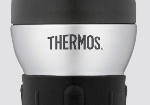
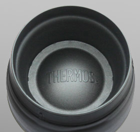
The Thermos® 360° commuter mug features a lid solution designed by the Verv team more than 10 years ago. And it’s still a hot item on the shelves at Target, Amazon and Walmart in several configurations. What is this innovation and why has it remained a category leader for over a decade?

Getting a Grip on the Problem

Thermos® challenged us by asking, “What’s next in our category?” It was a category that had seen little innovation beyond styling. No one had looked at the opportunities to truly delight users. But we did. After traveling to work with more than a dozen commuters, our consumer visits uncovered these three challenges:

Locking Down the Solution

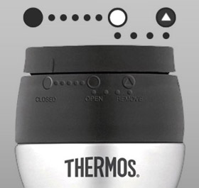
Our design thinking approach engaged designers with users to surface this initial concept early in the program. And it was a winner. A rotating lid that has three settings:

  • Locked down
  • Venting
  • 360° drinking

Problems Solved

  • The sunken cavity drinks like a cup… but never spills.

  • The “open” position allows the user to pick it up and drink any which way. Great for keeping eyes on the road!
  • The “vent” settings let the beverage cool a bit before the first sip.

The Road to Success

This innovation has profitably endured and proliferated for years. Here’s why:

  1. We were quick to identify the problems and define what we were solving for in a user-centric way.
  2. We leveraged users to inspire rather than direct iterative-concept ideation.
  3. We designed a single, efficient, intuitive and elegant solution that solved a bunch of real-life problems.
  4. As a modular unit, the lid could be grafted onto any cup body to transform it visually and functionally.

LG ELECTRONICS / DOOR-IN-DOOR REFRIGERATOR

LG ELECTRONICS / DOOR-IN-DOOR REFRIGERATOR

SERVICE OFFERINGS

  • Enhanced ethnography
  • Experience innovation workshop
  • Iterative prototyping
  • Concept optimization
  • Product design

Challenge

LG was seeking to gain share in the refrigerator category with a next generation 3-door offering that would surface and address unrecognized needs. Solutions involved features and functionality that would be intuitive to use and highly visible on showroom floors.

Methodology

Design thinking tools engaged target consumers with our design innovators and the client team to uncover fresh insights and inspire real-time preliminary sketched concepts. Our methodology included in-home observation and ideation, iterative concept generation sessions and interactive concept refinement.

Insights

“The stuff I need always migrates to the back of the fridge…lost or forgotten.”

“My kids just stand there with the door open letting all the cold air out.”

“I hate having to hunt for those everyday, go-to items.”

“I’d like my kids to know what’s off limits and what’s up for grabs.”

Impact

This work provided LG with several in-market innovations including Door-in-DoorTM feature, the Blast-ChillerTM Beverage Cooler, Tall Ice & Water Dispensing Bay, and LED Showcase Lighting, among several others.

Headquarters 11 West 42nd Street
Penthouse Floors 31/32
New York, NY 10036
212 329-3030

Boston
Columbus
Kansas City
San Francisco

A hexagon-shaped badge from Clutch, with the text 'Top Branding Company' on top and '2024' on the bottom