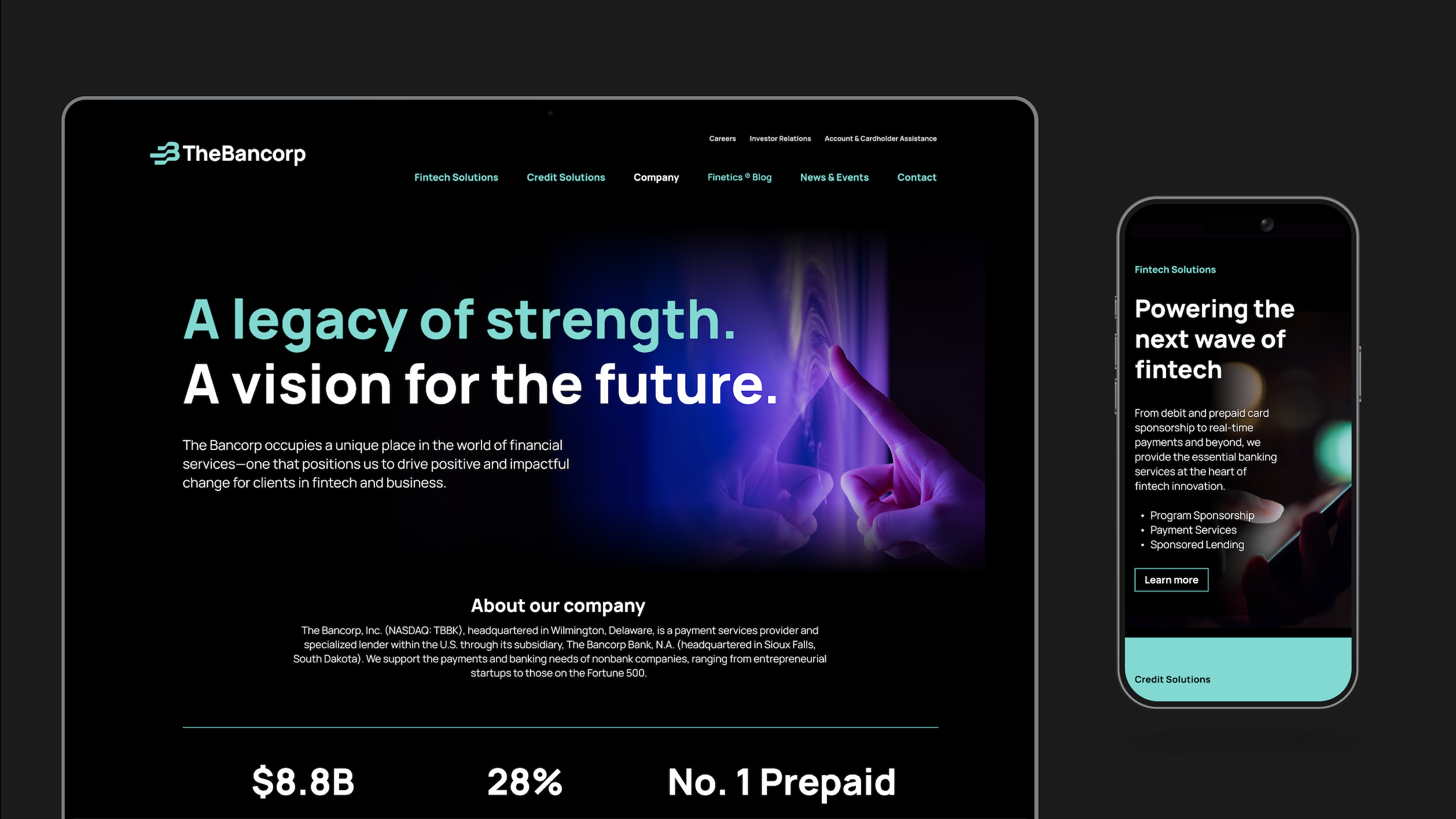
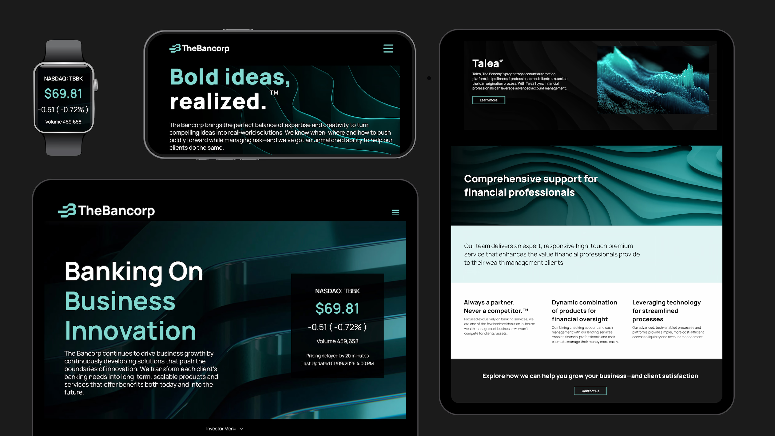
The Bancorp
Powering the world of fintech
Helping define the future of banking
The Bancorp is the engine powering many of the world’s leading fintech brands, from PayPal and Venmo to Chime and Betterment.
One of the first banks to embrace fintech, The Bancorp is a forward-looking organization with a unique mix of experience, expertise and creativity that give it the ability to help its partners turn compelling ideas into real-world solutions.
Tenet Partners helped to crystalize what makes The Bancorp stand out, in a wide-ranging brand evolution program that began in 2024.
Imagining a new future for The Bancorp
To help lay the foundation for The Bancorp’s future, the Tenet team saw an opportunity to elevate The Bancorp’s expression beyond the focus of its leading payment and lending services and technology—the offerings that had been the focus of the legacy brand.
Building on an extensive research and discovery effort, Tenet used our collaborative Brand Worlds methodology to explore future directions for The Bancorp. The experiential spaces and narratives helped the team see their brand as the market would, effectively capturing the dynamism and energy of the fast-moving fintech industry.
A brand built around a simple, powerful idea
The Bancorp is a leader in fintech and also provides a range of specialized banking services including institutional banking, fleet leasing and real estate bridge lending. Finding a common thread that could tie the entire organization together was crucial.
That idea became encapsulated in The Bancorp’s new tagline: Bold ideas, realized.™ This single concise statement speaks to what makes the bank different: a depth of experience and relationships that empowers customers to effectively bring their ideas and businesses to life. If a customer can envision it, The Bancorp can make it real.
A design-forward experience
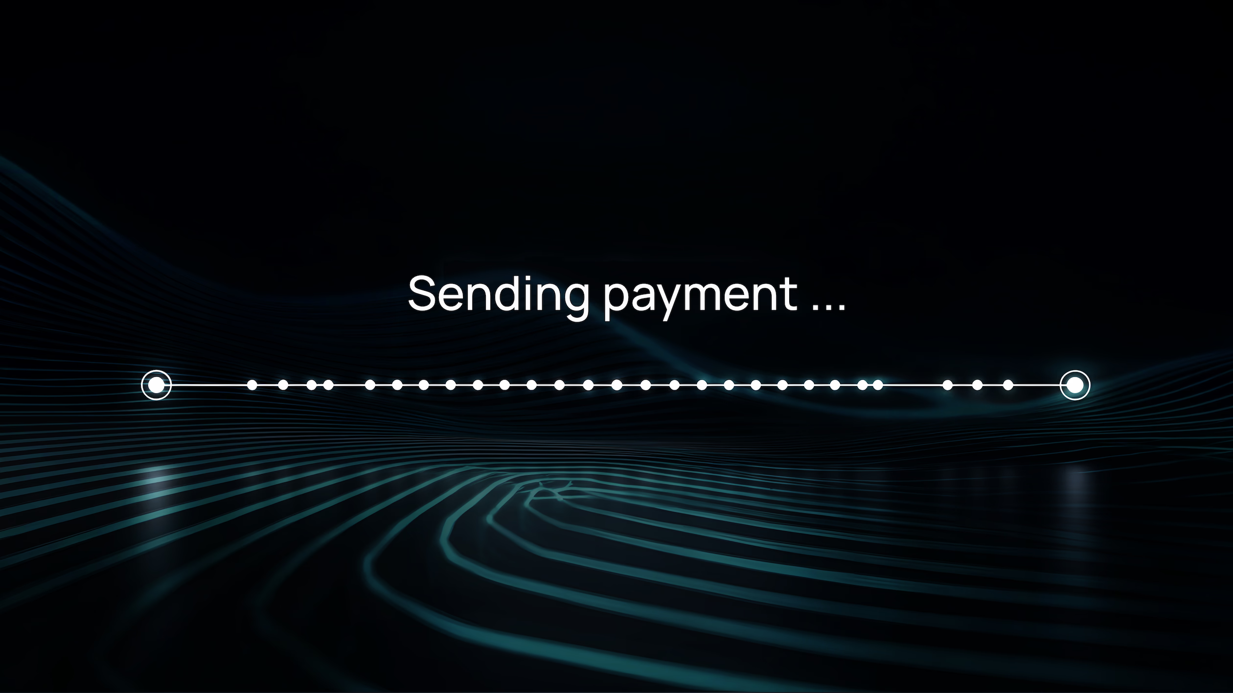
The refreshed brand came to life in a remarkably powerful way, through bold creative choices across the board from the striking black-and-teal color palette to the energetic sonic, graphic and typographical expression of the launch video.
The resulting brand identity places The Bancorp’s offerings and the value it brings in an entirely new context—a powerhouse brand for a powerhouse organization.
The Bancorp has evolved, and our brand should reflect that evolution.
Damian Kozlowski,
CEO, The Bancorp


Embracing the future of The Bancorp
The Bancorp’s revitalized brand has been enthusiastically welcomed across the organization, thanks to a robust employee engagement program and subsequent launch, culminating in ringing the opening bell at the Nasdaq exchange in New York in January 2026.
Damian Kozlowski, CEO of The Bancorp, had this to say: “In a rapidly changing financial landscape, The Bancorp has evolved, and our brand should reflect that evolution. Our rebrand captures who we are—a technology-forward financial institution with the expertise to see what’s ahead and the commitment to help our partners transform, innovate and grow.”