Legrand – United by design

United by design

How Legrand supercharged growth across its North American business portfolio

Legrand, a leading French supplier of electrical components and networking solutions, had acquired, over time, seven businesses in North America. Each one a storied commercial brand – names like Pass & Seymour, Wiremold and Ortronics. The seven units were discrete, not clearly tied to the Legrand parent.

While the company had achieved good returns on its investments, the CEO, John Selldorff, wanted to take the company Legrand to a new level. His vision: to improve its market position and fuel growth across multiple business units and product lines.

Centering on the customer

The journey, however, was a challenging one. Legrand faced structural issues in its brand portfolio, channels and sales. The Legrand brand itself was relatively weak in the North American market. From the outside, the various businesses looked and operated like different companies. The customer experience across channels was disjointed.

Tenet Partners was brought on board to help the company pursue its mission of building a new, customer-focused brand platform. That would involve optimizing the brand portfolio in the context of customer experience, positioning Legrand for the future and articulating new value propositions to sales channel partners, influencers and end customers.

Using a brand-led approach for framing Legrand’s business strategy and activating organizational change, our team of strategists acted as a catalyst to lead the transformation.

A 360° view of the brand

To uncover innovation opportunities, Tenet conducted extensive qualitative and quantitative research with external audiences. Our teams met with distributors, contractors, specifiers and end customers in commercial and retail markets. The goal: to fully understand perceptions, customer experiences and identify unmet needs. This provided a solid grasp of the brand.

The external research was paired with several months of internal collaboration. A series of co-creation workshops offered the opportunity to dive deep with Legrand teams, spanning all areas and levels of the company. These workshops helped craft and evaluate options, frame recommendations and define future projects.

The outcome was a simple but powerful strategic approach:

  • The company would unite under the Legrand master brand.
  • Five of the seven existing companies were de-branded and their names applied to their product lines.
  • The remaining two brands were retained as separate business units to address discrete specialty markets and customer segments.

Capturing the essence – and promise – of Legrand

Realigning the brand portfolio was a huge step forward for Legrand. Finding a way to telegraph its importance was next on the list.

A new brand promise, Designed to be better, served as the internal rallying cry and codified the value that employees deliver in all their efforts. This differentiated brand promise and Legrand’s emphasis on customer experience underscored how success was going to be achieved.

For customers, the promise encapsulated the value of Legrand products and solutions into a single expression. The company is positioned as the provider of highly functional technology and aesthetically pleasing design treatments for the office and home.

Success comes from clarity of purpose

Legrand’s customer experience-focused repositioning program illustrates how brand serves as a powerful leadership tool. It’s been lauded by management as instrumental to their remarkable accomplishments in the years following the launch.

Since the program went live, Legrand has taken significant market share in the commercial and residential construction markets. It has also gained the confidence to open up new markets focused on technology.

Being clear about who you are, what your company promises and guiding everyone towards a shared vision is what helped Legrand create competitive advantage, connect with customers and drive growth.
Mastercard® PayPass™ – Branding a simpler way to pay

Mastercard PayPass™

Branding a simpler way to pay

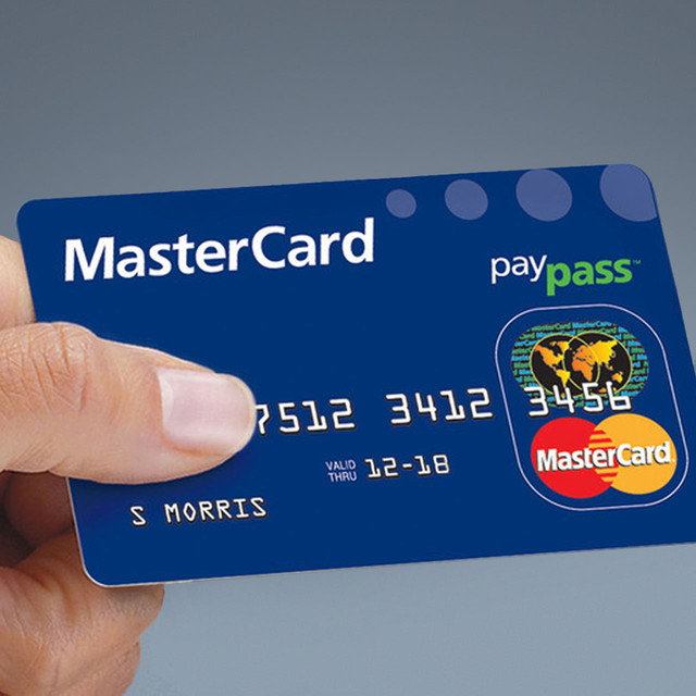
Arms full of groceries and goods, a shopper steps up in the checkout line with a Mastercard card in hand. But rather than swiping the card to pay for purchases, the shopper taps his card on a point-of-sale terminal reader. In 2003, this contactless payment represented a huge advance in payment technology. American Express and Visa were already in the market with their versions. Mastercard needed an identifier for their version of new contactless payment with an identity for its feature that provides cardholders with a simpler way to pay. By tapping the payment card on a point-of-sale reader rather than swiping or inserting the card, Mastercard was improving the overall shopping experience.

First and foremost, the identity had to say what the technology did. One way to do that was to use a globally understood icon: the four-line broadcasting wave that could indicate their payment card works as contactless, able to be read by simply waving it near a terminal with a matching symbol. Mastercard was not satisfied with simply fitting in the category. It wanted to stand out from the others.

The new identity also needed to work within the Mastercard Brand Architecture system. With Mastercard’s global reach, the company turned to Tenet Partners to develop tools for managing and implementing the new product brand.

Working with Mastercard management, Tenet successfully developed an identity for Mastercard PayPass that was thoroughly tested and launched in the summer of 2005. Testament to its success, the program is still in use today.

The number of merchants accepting and financial institutions participating in the Mastercard PayPass program has grown at a rapid pace. Through our Brand Center management, Mastercard can efficiently supply its partners with artwork and usage standards for the proper implementation and management of the Mastercard PayPass identity. The results: the power for Mastercard to maximize its visual presence to its targeted audiences.

Rockwell Collins – Soaring to new markets

Soaring to new markets

Rockwell Collins honors its heritage while looking to the future

Innovation marks a company’s ability to sustain competitive advantage and market leadership. Without question, Rockwell Collins enjoys a reputation as one of the most future-focused companies in the world. More precisely, Rockwell Collins is known for innovation that performs in the most demanding applications without fail. From its participation in the space program in the 1960s to designing the most advanced avionics and communication systems in use today, Rockwell Collins is the brand that customers charged with delivering critical missions count on.

Defining independence

While its history is worthy of celebration, it also presented an interesting dilemma for Rockwell Collins as it sought to clarify and strengthen its identity after spinning out of the conglomerate, Rockwell International. The Rockwell and Collins names are deeply embedded in the history of America’s aerospace and communications equipment industries – each with a powerful legacy and a source of great individual pride. Unfortunately, these strong brand names kept the combined Rockwell Collins from seeing itself as one entity.

When heritage meets innovation for the benefit of customers

Starting with a deep look at the business and research with customers, investors, employees and other key audiences, the Tenet team guided management as they made the choice to keep the name for the company, embark on a new strategic positioning and innovate its brand to achieve future growth ambitions.

Tenet reaffirmed and articulated the Rockwell Collins brand attributes: a heritage founded on reliability, a continuous drive toward innovation and a relentless commitment to building strong customer relationships. The brand promise, Building trust every day, conveyed a clear sense of purpose. Together with a bold new word-mark, dynamic visual and verbal identity, website, and brand engagement programs, the stage was set for a reinvigorated culture and market momentum.

With confidence and revitalized energy, Rockwell Collins was ready to move forward. That’s reflected by its rapid ascent as one of the most admired and best performing companies in America.

Preparing for the 2017 Paris Air Show

The bi-yearly Paris Air Show provides the biggest audience of OEM and manufacturers of commercial and military systems. In 2017, the show offered a prime opportunity to position Rockwell Collins as the leading provider of solutions that span the entire aircraft, given their recent acquisition of B/E Aerospace. It was an important venue to show the full cockpit-to- cabin expertise of Rockwell Collins, and to position the company as innovative and forward-thinking.

Tenet Partners created a common theme for all media surrounding the Paris Air Show that captured the spirit of innovation from Rockwell Collins: “See the future from here.”

To maximize the power of a consistent message, Tenet mapped visitors’ journey along the path of their potential media exposure bought by Rockwell Collins. Next, we produced digital ads to cover wraps and ads in aircraft industry magazines, air show billboards and ultimately the entire Rockwell Collins chalet, from inside video to outside signage. Rockwell Collins’ signature color identity and evocative skyscape imagery were used across all visuals.

Kelly Ortberg, CEO of Rockwell Collins, said, “It’s the best Rockwell Collins has ever looked.”

American Century – Bringing Wall Street to Main Street

Bringing Wall Street to Main Street

How American Century Investments stays connected to its customers

American Century Investments has grown from a small mutual fund manager in 1958 to a multi-disciplined, global asset management firm, managing over $140 billion in assets. With this evolution came the need to develop a corporate brand strategy that tied all of its business channels and diverse investment offerings together and communicate its combined value to a broad customer base. Each channel was managed independently, resulting in inconsistent visual identities and conflicting product and company information.

Consistency vs. differentiation: a balancing act

American Century worked with Tenet Partners to create a values-based, unifying brand platform. At the same time, given the varying needs of market segments American Century serves, we developed differentiated communications systems for each business channel, built upon a shared visual identity. This enabled the company to have a stronger corporate presence while allowing for some individual expression for its targeted offerings.

Part of this initiative was a name change and identity refinement. By adding “Investments” to the communicative name, we helped the company achieve clarity of message to all audiences. As web and mobile banking took off, we optimized the identity to create a consistent experience across all platforms and devices.

The new brand platform inspired a company-wide effort to integrate business processes, and product and company information across all channels. The firm comprehensively addressed every customer touchpoint, from print and television advertising, to the web, marketing communications and investor communications.

Pride Agenda – Brand strategy and identity to support a societal mission

The new face of pride

Empire State Pride Agenda renews its call for LGBT rights

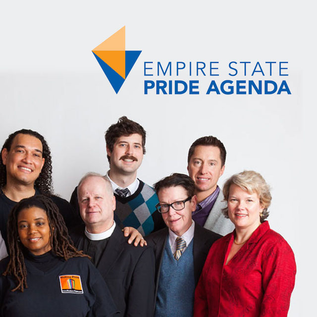
Tenet Partners worked to extend the reach of the organization to potential donors who make up the majority of the Pride Agenda’s audience. Appealing to them called for a brand that is human, that feels and acts more modern.

The Empire State Pride Agenda is New York’s statewide lesbian, gay, bisexual and transgender civil rights and advocacy group. Its mission is to win equality and justice for all LGBT New Yorkers and their families. Since its founding in 1990, the organization has won many victories at both the local and state level.

For years, the Pride Agenda had been at the forefront of efforts to pass legislation guaranteeing all New Yorkers the right to marry. While celebrating this milestone, the organization had to face new challenges. With marriage equality now legal in the state of New York, donation rates were falling off. This was especially true among smaller and midsized donors, who felt that their goals had been achieved despite a number of human rights issues yet to be addressed.

Borrowing a page from grassroots campaigns

In the world of nonprofits, 2008 was a landmark year. The Obama presidential campaign showed the power of grassroots support, especially when targeted at tech-savvy, issue-conscious people. That campaign changed the way many fundraising organizations view the world, shifting the emphasis towards broader engagement.

For the Pride Agenda, this trend pointed the way to a solution for its fundraising issue. A decision was made to revitalize the organization’s image and highlight its diversity, in order to better connect with the grassroots audience.

Creating a fresh, modern and relatable brand

Together, Pride Agenda leaders and our team of brand designers and digital strategists worked to extend the reach of the organization to potential donors who make up the majority of the Pride Agenda’s audience, people who are not used to being politically active. Appealing to them called for a brand that looks, feels and acts more modern – a departure for an organization that had been around a long time and was well known in political circles.

With new audiences come new channels of communication. A key aspect of the new engagement strategy was its emphasis on digital marketing and interaction. The grassroots audience relies heavily on mobile devices and the Internet to get information and interact, so the new brand had to work exceptionally well in that world.

Two entities, one seamless experience

The Empire State Pride Agenda has two arms – a 501c4 lobbying group, and a 501c3 nonprofit (the Empire State Pride Agenda Foundation). These must remain separate by law. However, the Pride Agenda’s new engagement strategy, which is based on a seamless, inclusive 360-degree experience, called for a way to show both equally.

Tenet worked with Pride Agenda executives and counsel to find a path that solved the strategic marketing challenge while being legally sound. The result is an innovative design approach where both groups of the organization share a brand expression, but are clearly distinguished through design, with separate color palettes for each.

The two-part tagline – Igniting Equality. Advancing Justice. – serves as wayfinding with one part leading to the nonprofit foundation, while the other acts as a path to the lobbying group.

By creating a discrete-yet-unified experience, visitors to the website understand the full breadth of the Pride Agenda, its goals and how they can get involved to support its mission.

The human faces of pride

To bring the new brand to life, the Pride Agenda also partnered with Tenet to create a diverse range of launch activities that put its constituents at the center of the new brand. And to prepare for the transformation about to happen, Tenet conducted brand behavior training for all Pride Agenda employees to empower them to live the new brand on day one.

Excitement started building with the “Faces of Pride” public relations campaign and photo shoots opened to the public in New York City as well as upstate New York. Professional photographers donated their time and talent to take portraits of members and supporters of the LGBT community. An invitation was broadcast via email and social media. The result was thousands of emotional images that highlight what the Pride Agenda is all about. The richly diverse portraits are all about the human connection – that elusive element of a successful brand that goes beyond strategy and design.

New momentum for the work still to come

The revitalized brand met the three main goals the Empire State Pride Agenda set when it began its rebranding journey. It boosted awareness of the organization, increased donations, and brought new energy to grassroots fundraising. It also accomplished something more far-reaching. The brand focuses the LGBT discussion on people, establishing the issues as human rights that deserve a place in mainstream political and social discourse.

The Arc – A single brand expression for an organization offering unwavering support for the caregiver community

Giving a powerful voice to people with intellectual and developmental disabilities

The Arc captures its spirit of inclusion and opportunity with a dynamic new brand

The Arc is the nation’s oldest and largest charitable organizations dedicated to the needs of people with intellectual and developmental disabilities (I/DD). With a 60-year history of advocacy promoting inclusion and opportunity, The Arc plays a key role in the lives of people with I/DD.

While The Arc has earned an enviable spot as one of the United States’ 10 largest charitable organizations, it is, at its heart, a community-based movement. It started as a small group of parents and concerned individuals, some of them with I/DD, coming together to change mindsets at a time when little was known about intellectual disability and institutionalization was common. In the years since, the organization has grown significantly and today is made up of more than 720 state and local chapters.

The power of a unifying idea

The Arc’s structure is one of its great strengths. Its focus on grassroots initiatives highlights the efforts and energy of members on the front lines – many of whom are family members personally touched by I/DD. With chapters being staunchly independent, the unplanned tradeoff was the absence of a core identity around which to rally the membership and build awareness with the general public.

The Arc called on Tenet Partners to craft a new brand that would help communicate the organization’s message more clearly and realize its full potential for societal change. Tenet brand strategists and designers worked with The Arc’s leaders to develop a new logo and tagline, along with brand guidelines. The team’s work yielded a dynamic brand expression reflective of The Arc’s embracing nature and passionate history. At the same time, the new brand brings a burst of energy that symbolizes independence and the spark of individuality.

Communicating the combined energy of The Arc

For an organization as widespread and diverse as The Arc, it was essential to involve chapters and members everywhere in the brand launch. To capture their spirit and promote the work they do at the local level, Tenet created a series of video testimonials featuring advocates and families affected by I/DD. The network of chapters was also invited to participate in an extensive series of webinars, national conferences and seminars, all designed to reaffirm the organization’s mission and bring people together around shared values.

Today, the entire organization has come together under one umbrella, building a strong presence nationwide. The broad adoption of the new, single identity unifies all of the chapters, amplifying their voice to communicate The Arc’s societal mission with more lasting impact than ever before.

Celebrating our partnership

In recognition of our support of their rebranding efforts, Tenet Partners was honored with The Arc’s President’s Award. This award, granted annually by the The Arc, allows the national charity to express its gratitude to those whose work made a positive impact upon the organization and its future.

Alaskan Brewing – Staying true to its roots while moving forward

Staying true to its roots while moving forward

How Alaskan Brewing Co. captures top-shelf attention

The story of Alaskan Brewing Co. really embodies the independent spirit and can-do attitude of a state that calls itself “The Last Frontier.” In the mid-80s, Marcy and Geoff Larson fell in love with the place, but had to find a way to support themselves – no small feat in Alaska. Geoff was a home brewer, and a friend suggested they start a brewery. “Other than the extreme financial and logistical challenges, we couldn’t think of why not,” the couple says.

While researching, Marcy found an eight-decade-old set of brewery records, listing ingredients and a recipe. That became Alaskan’s first product, Alaskan Amber. The start of the company was humble – Geoff, Marcy and 10 volunteers packing the first 253 cases in the winter of 1986. Since then, the spirit of Alaskan Brewing Co. has triumphed. The company has grown to become one of the most award-winning craft breweries in the history of the Great American Beer Festival, and now distributes to 17 states.

Success and growth brings change. That can sometimes dilute a strong brand like Alaskan’s. The evolution of the company’s products resulted in somewhat of a misalignment in brand expression as reflected in a wide array of logos, print communications and package designs.

Recognizing that its brand, packaging and marketing must reflect the consistency and quality of the beer in the bottle, Alaskan reached out to Tenet Partners to help strengthen its identity. The company sought to re-emphasize its origins – the core values of local community, quality and fun that led to its success. At the same time, the brand needed to stay relevant in today’s changing and expanding marketplace.

For a company like Alaskan, getting the total customer experience right is essential. Each touch point matters. Packaging, imagery, textures, voice… all are part of the brand expression and they leave a lasting impression.

As a starting point for in-depth strategic discussions, Tenet audited Alaskan’s existing communications and packaging to uncover areas for refinement. The way forward became clear: keep enough of the existing brand elements intact so that loyal customers would not be confused or deterred, yet modernize the brand enough to attract the younger target audience.

A clear, thoughtful strategic direction is critical to success when rebuilding an established brand. The leadership at Alaskan Brewing Co. knew that, in order to achieve its goals, it would have to do more than engage in a design exercise.

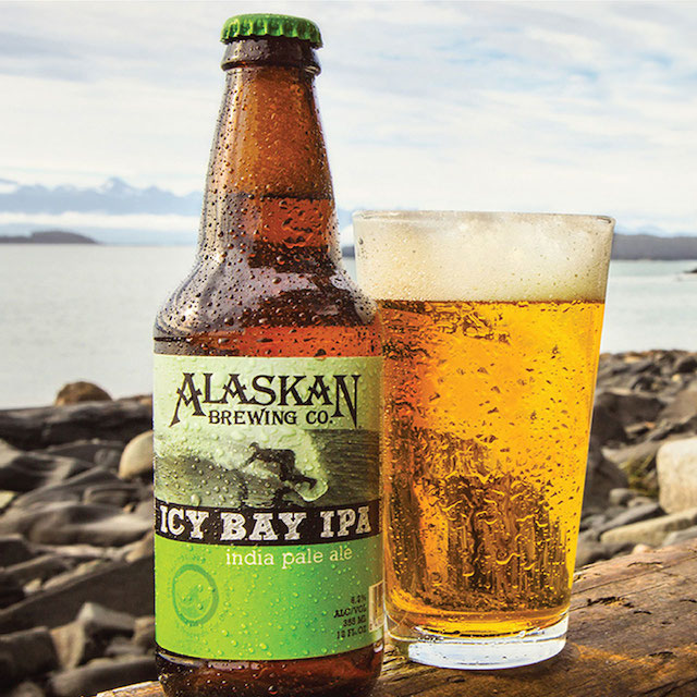
Extensive discussions helped Tenet and Alaskan fully understand and capture the essence of the brand. Together, the teams developed key strategic elements – positioning, personality attributes and brand promise – that would become the foundation of a revitalized expression. This strategy informed the work of the design strategists at Tenet and translated into a refreshed visual identity energized by a bold typographic language and a distinct combination of textural and product imagery.

Tenet’s design recommendations have a singular goal: generate greater brand recognition and shelf presence for Alaskan by unifying all touch points, from marketing materials to promotions to packaging.

The strategy-infused design proved highly successful and helped propel Alaskan Brewing Co. forward. It was also the start of what has become an ongoing, collaborative relationship. Today, Tenet continues to be Alaskan’s trusted advisor, helping the company fulfill its vision of becoming a market leader in the craft brewing industry.

NPS Pharma – Putting science at work for the health of patients

Putting science at work for the health of patients

How NPS Pharma forged closer bonds with those with the largest stake in their success

Nancy has been suffering from hypoparathyroidism for nearly ten years, putting her at risk for calcification of her brain and heart, as well as for kidney failure. Nancy belongs to a fairly small community with only 60,000 people in the United States with hypoparathyroidism. There are no therapies or cures offered by pharmaceutical companies because the size of the afflicted population is so limited.

Enter NPS Pharmaceuticals

NPS Pharmaceuticals is not your average big pharma. Dedicated to the innovation and development of therapies that transform the lives of patients with rare diseases, the company has a distinct focus on populations not addressed by any other pharmaceutical company.

Patients first

In 2013, NPS introduced Gattex. This orphan drug to treat short bowel syndrome was the company’s first commercial endeavor. NPS is also working closely with people, like Nancy, who suffer from hypoparathyroidism with the hope of introducing a second therapy to treat that affliction.

With this product launch, NPS set out to turn the typical pharmaceutical model on its head, shifting its primary focus away from the medical community to the patients themselves. To reinforce this patient connection, NPS also built a support network to provide customized care to patients. This dedicated network helps patients locate, initiate and manage NPS therapies.

NPS reached out to Tenet Partners to communicate its mission through a compelling visual and verbal identity. Through interviews with various groups of stakeholders, as well as a competitive audit, Tenet confirmed that NPS’ primary focus on patients was indeed unique.

Our research further uncovered a remarkable emphasis on scientific rigor and innovation. Together with its approach to patient care, this earned NPS the right to stake its position at the intersection of science and humanity.

Giving meaning to a name and a brand

Such a bold approach required the right brand representation, one firmly anchored in four key attributes: transparency, humanity, connections and focus. Together, NPS and Tenet worked to develop a voice that rang true and a face that reflected the mission of the company and its evolving business strategy.

Tenet created a simple, yet compelling tagline: The Nexus of Patients and Science. This tagline speaks not only to the human patient connection, but also to the compelling science that underlies those relationships. Additionally, it offers meaning to the NPS name.

Tenet’s design team worked seamlessly with our strategists to make sure that the visual identity supported the strategy. The goal was to create a visual expression that emphasized patients’ radical transitions from sick to well and most importantly, the ability to get back to living. Using a calming blue hue, a gradient as a symbol for transition and people portraits, the NPS visual system became a compelling story, cementing the company’s commitment to putting patients first.

Extending the new brand to the digital space

Stepping up to this commitment also meant re-engineering the website. Where before the site was aimed at the medical community, the Tenet team of digital specialists worked at developing a site that would speak to patients first. Our primary focus was to create a vehicle that delivers the information patients need in a way that is easy to access and share.

Today, NPS’s website highlights those whose lives are improved by the work the company carries out. It also communicates the unflagging sense of urgency that drives NPS to continue pioneering and delivering, worldwide, innovative therapies that transform the lives of those suffering from rare diseases.

D&B – Highlighting insight and expertise

Highlighting insight and expertise

How D&B revitalized the business by investing in its brand

A look back at 1999 shows Dun & Bradstreet successfully extricating itself from a number of ill-fated acquisitions. Shortly thereafter, the Board hired a new CEO. His mandate was clear: turn the company around by refocusing on its core business. The firm was recognized as a leading global resource for essential business information. At the same time, however, new competitors were aggressively taking shares away.

The brand was mired in its paper-based, commodity-data past. The strength of the brand was further impacted by a complex and confusing family of product, service, discipline and business brands.

Refocusing the brand

The new CEO put brand revitalization at the center of the business strategy. He teamed up with Tenet Partners to accomplish the necessary transformation. Our team was tasked with one very important mission: develop and execute a new brand strategy in support of business goals.

Starting at the beginning, Tenet guided Dun & Bradstreet toward a name change that aligned with existing behavior. Customers were already using D&B as a shorthand when referring to the company. The transition from the full name to this abbreviated form was a natural next step. Onward to the next building block, Tenet proceeded to the development of a visual and verbal identity that would support the position of the company as a trusted and dependable partner. This led to the creation of a new “guide star” logo and brand promise – Decide with Confidence.

This was further supported by a visual system featuring a flexible and dynamic graphic system, giving D&B a distinctive voice in the market that would resonate with a new generation of business decision makers.

A view to the future with clarity of purpose

The upcoming launch of the new identity gave D&B the opportunity to clean house and simplify its brand architecture. Four customer-focused competencies with straightforward, descriptive names replaced a confusing array of offerings. This clear architecture fostered a better understanding in the marketplace for what D&B does and how it helps customers improve business performance.

D&B’s brand strategy has proven its flexibility to accommodate new offerings without leading to confusion. The brand umbrella was extended to include strategic cobranding and ingredient brand programs, as well as associations such as the D&B Worldwide Network, an alliance of regional market leaders who bring local expertise to D&B customers, worldwide.

The proof is in the results

In the end, D&B’s efforts to reinvigorate the business was met with outstanding success. Post-launch, the company’s stock value rose markedly, consistently and significantly outperforming the S&P 500 index.

Found Animals – Thinking big about small creatures

Thinking big about small creatures

Found Animals appeals to pet lovers

American attitudes towards pet ownership are changing, and for the better. More and more people are choosing to adopt homeless animals. Progress is being made in promoting humane treatment, along with programs to keep animal populations manageable.

This is the environment that Found Animals, an independent, privately funded nonprofit foundation, supports.

Finding a new way to tackle the issue of pet welfare

Established in 2005 by Dr. Gary Michelson as a result of the devastating impact Hurricane Katrina had on separating thousands of pets from their owners, Found Animals brings a clear and expansive vision to its mission of protecting the happiness and safety of animals.

Rather than focusing on just one thing, Found Animals has created a constantly evolving ecosystem of efforts. This spirit of ongoing innovation springs from the foundation’s tight focus on its goal of eliminating the need for animal euthanasia. For Found Animals, this is the only measure of success that matters. When new concepts are tested, only those that advance the cause significantly receive continued funding.

Successful Found Animals initiatives include:

  • Research funding for nonsurgical sterilization technology
  • Lost pet/owner reunification through microchip implants
  • Affordable spay/neuter initiatives
  • Education and support for owners who surrender their pets
  • Support of shelters both traditional and alternative
  • Facilities that reinvent the traditional concept of adoption centers

Given the complexity of the issues it is looking to solve, Found Animals fully understands the importance of reaching out to the pet community in a broad variety of ways to foster awareness, engagement and support. This understanding is at the heart of services like Found Animals’ Adopt & Shop, a self-funded, integrated adoption and retail center.

Adopt & Shop is a safe haven where prospective owners can meet adoptable animals in a cheerful environment very different from a traditional animal shelter. Adopt & Shop also offers retail sales of curated pet products, with all revenue funneled back into Found Animals. Pet owners know that every dollar they spend is going to support the foundation’s mission.

Found Animals’ other consumer-facing program, the Microchip Registry, adds to the foundation’s mosaic of no-kill initiatives. By helping to reunify lost pets with their owners, it keeps animals out of shelters and gets them back where they belong – at home, safe and sound. Every animal adopted through Adopt & Shop is chipped and registered, so owners are assured that their new pets are well protected. This Register extends to all chips no matter the manufacturer – and for free.

Placing animal lovers at the center of the experience

When Found Animals first came to Tenet Partners, it was looking for a new identity system for its Microchip Registry. Our strategists soon uncovered a much larger opportunity at hand – a way to not only grow the microchip program, but also bring everything that Found Animals does into the limelight to help the organization advance in its overall mission.

The key to gaining greater attention for Found Animals’ core mission was to focus the brand on the people it serves – the pet community at large and especially those who ultimately open their hearts and homes to animals. Tenet strategists and designers crafted a new master brand, messaging and supporting identity systems for each of the organization’s units. All are linked by a sense of playfulness and vibrant color, communicating the idea that Found Animals is on the animal’s side.

Keeping more tails wagging

Found Animals timed its moves perfectly to capture growing trends among American animal lovers. Today, people are willing to spend more money to keep their pets safe, healthy and happy. And, thanks to media coverage and social consciousness about ethical animal treatment, there’s more interest than ever before in adopting pets.

The results speak for themselves. With more cohesive messaging and stronger visual branding to support it, Found Animals has achieved:

  • 30% greater social media engagement
  • Twice the sales, three times the website visits and an increase of 169% in registrations for the microchip registry
  • The unique $5 million Adopt & Shop location in Culver City, California, exceeded its retail and adoption revenue goals by 23% in the first five months – and is seeing increasing store traffic

Found Animals is now well on its way to doing something all too seldom seen: bringing a good cause into the mainstream and making it part of people’s everyday lives. More than 15,000 shelter animals now have happy homes as a result – and that’s the kind of result that matters most.

Headquarters 11 West 42nd Street
Penthouse Floors 31/32
New York, NY 10036
212 329-3030

Boston
Columbus
Kansas City
San Francisco

A hexagon-shaped badge from Clutch, with the text 'Top Branding Company' on top and '2024' on the bottom