Tag: Branding

  • Canon Medical

    Canon Medical

    Canon branded stationery

    Making a difference is in Canon Medical’s DNA

    From MRIs to X-ray equipment, the world of medical imaging is heavily dependent on advanced technology. That’s where many manufacturers concentrate their efforts.

    Canon Medical Systems USA has a different mindset. It’s a company that thinks about access, impact and the good that its solutions do for providers, health systems and patients. For Canon Medical, the outcome matters as much as the product.

    Tenet Partners helped Canon Medical bring that story to life with an award-winning brand refresh that set the company apart while honoring the global Canon brand.

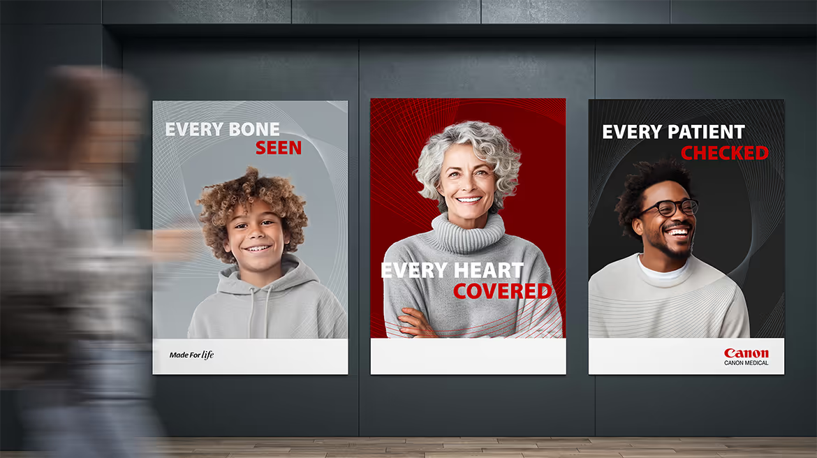
    three portrait Canon medical ads
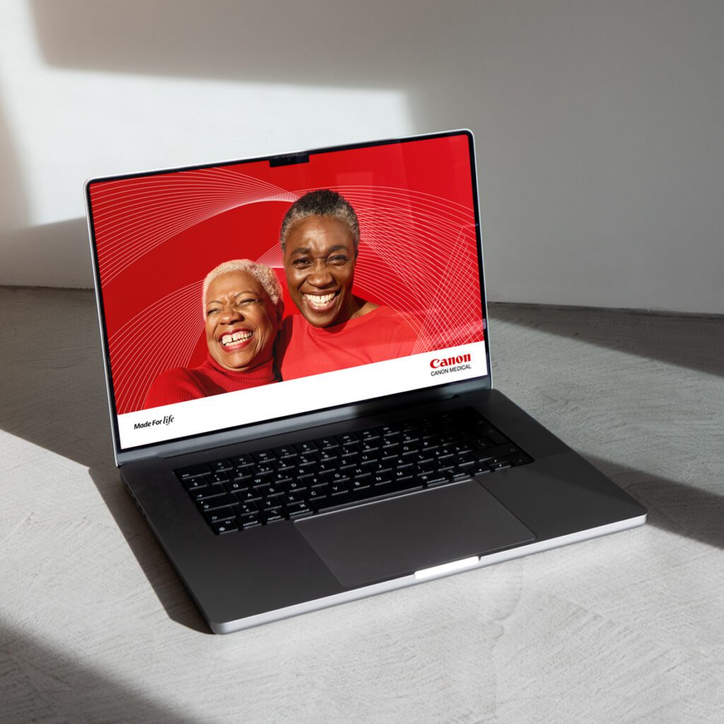
    laptop displaying Canon Medical brand
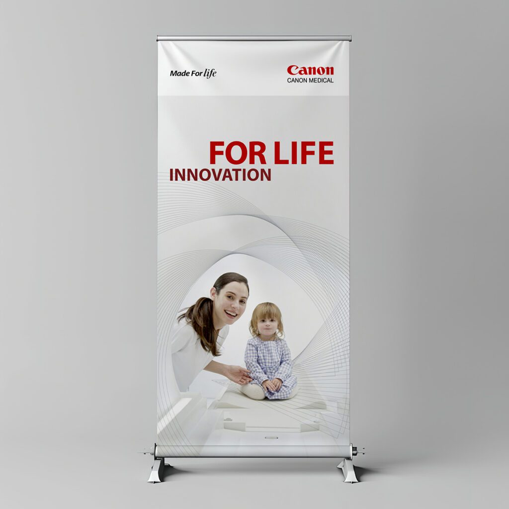
    tradeshow poster showing Canon Medical brand

    Targeting Canon Medical’s distinct advantages

    With the competition mainly focused on technology, Canon Medical saw an opportunity to leverage its emphasis on meaningful innovation, expertise, relationships and the positive impact it has on customers and patients as a way to stand out.

    A new brand promise, positioning and personality set the stage for messaging and tone of voice. The narrative highlighted the company’s humanity and strong customer orientation: Canon Medical is with customers all the way, solving problems, meeting them where they are and setting them up for success. All in the name of delivering what matters: better outcomes.

    Honoring the parent brand while exploring new directions

    The critical challenge for Tenet’s design team was to respect the power and value of the global Canon brand while enabling Canon Medical to stand out as a preferred partner for the medical community. The visual identity had to remain firmly rooted in the parent brand.

    The new design links to the global Canon brand in subtle ways, making good use of the corporate red along with gradients and geometric shapes, including the highly recognizable letter C that’s always been part of the Canon wordmark. The result is a rich texture that suggests technology without overwhelming the more human elements of imagery.

    A refreshed Canon Medical brand grabs attention

    In a crowded market where Canon Medical goes head-to-head against much larger competitors, the refreshed brand has done exactly what the company was looking to accomplish: elevate its profile. A few months after the updated brand launch, Canon Medical saw a 45% increase in engagement with its social media content, and response to PR at conferences tripled.

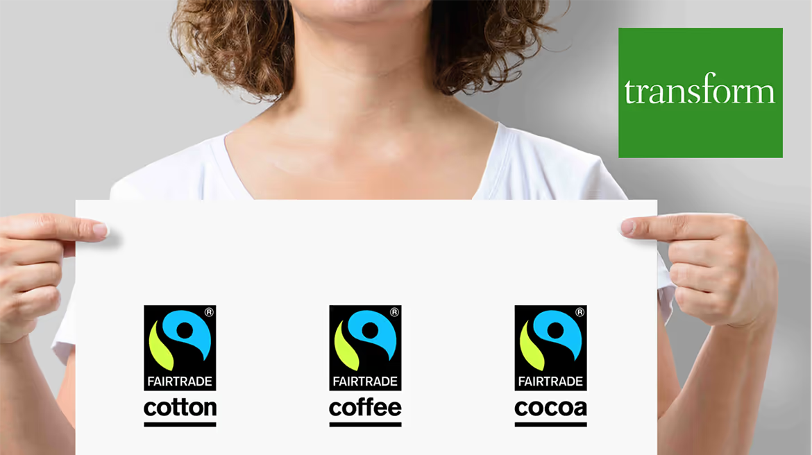
    The revitalized brand also won Bronze in the 2024 Transform Awards, for best creative strategy—evidence of the difference that collaborative engagement and design that’s firmly grounded in brand strategy can make.

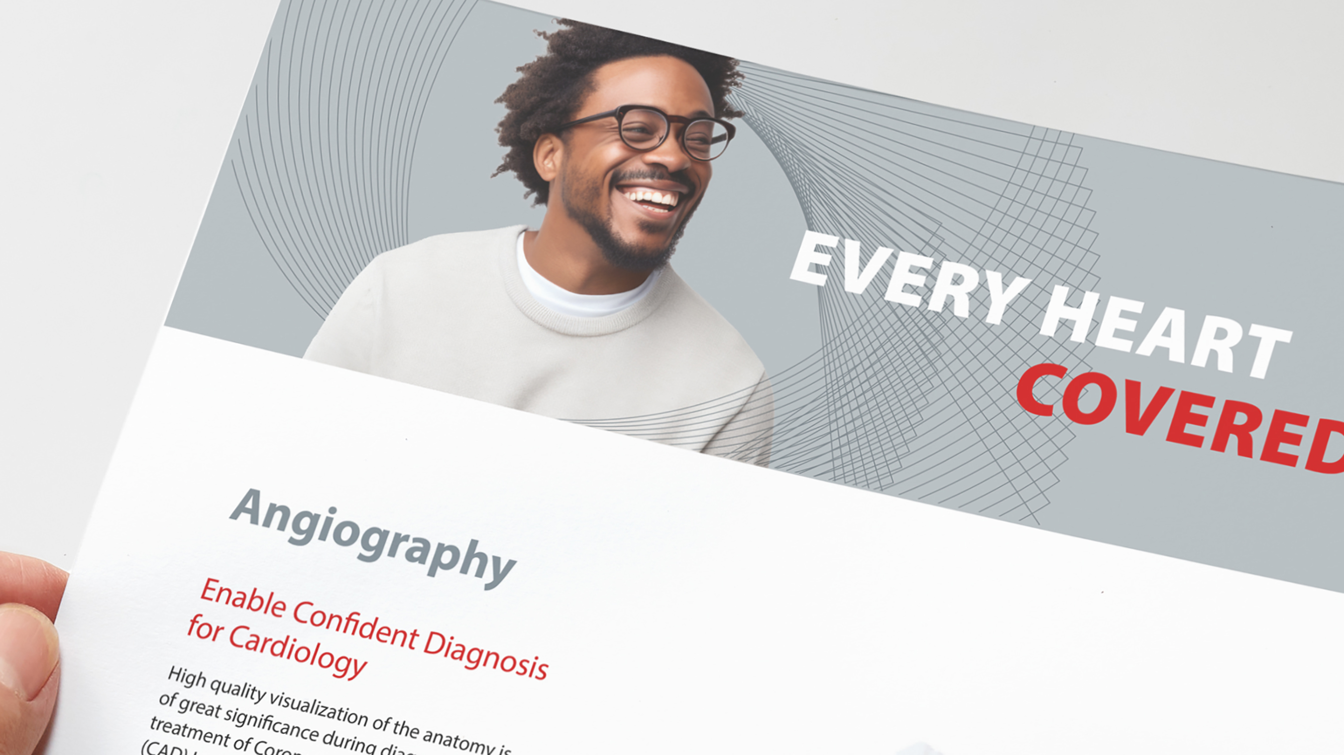
    Canon brochure
    “We’re impressed by Tenet Partners’ ability to listen and understand our business needs.”
Olivia Duarte, Director of Corporate Communications
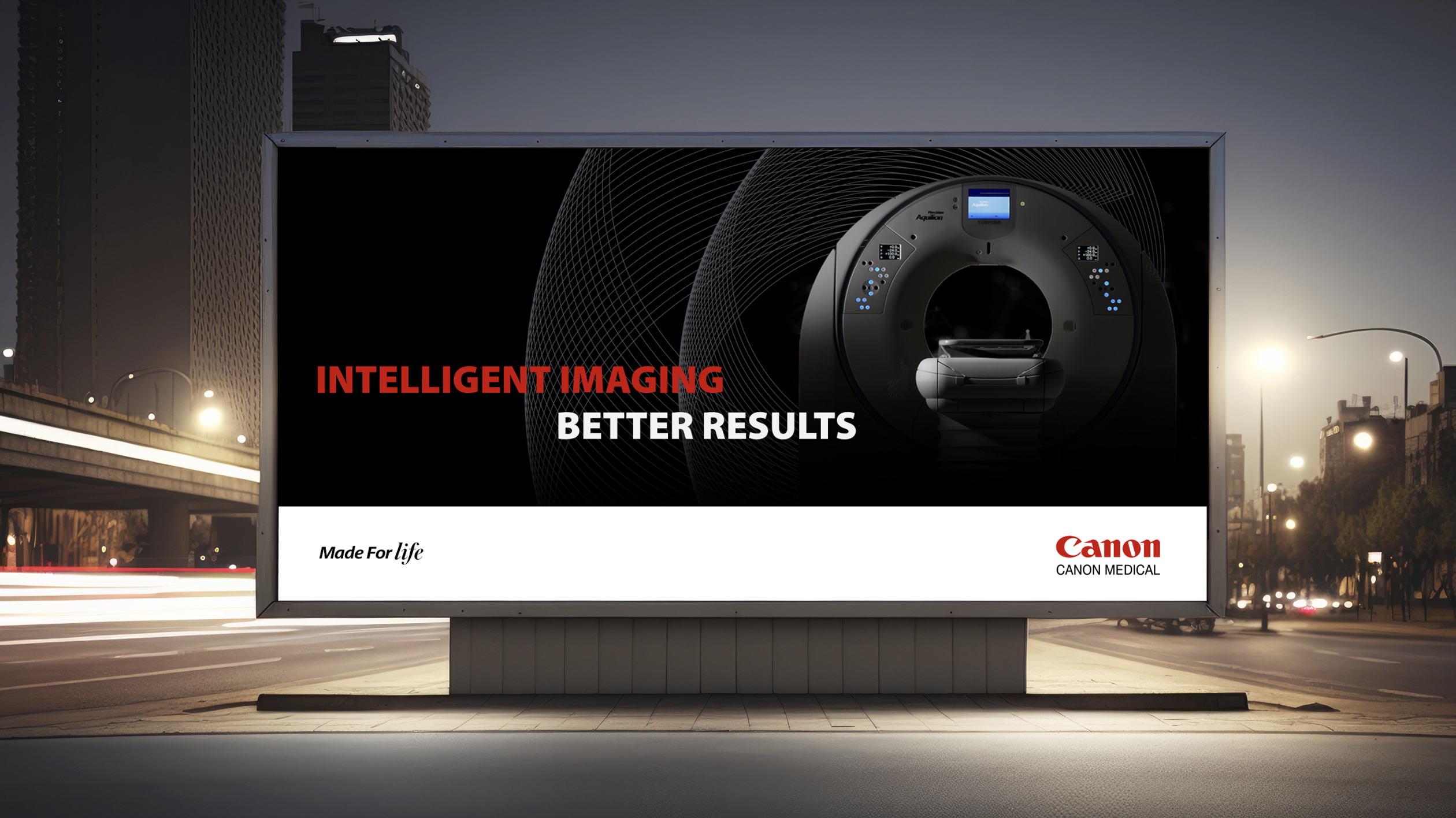
    electronic billboard with Canon ad
  • Fairtrade

    Fairtrade

    Fairtrade International is a non-governmental organization spearheading a global movement to change the way trade works through better prices, decent working conditions and a fairer deal for farmers and workers in developing countries.

    Fairtrade promotes its agenda through a system of certification marks on product packaging to help brands signal that they are part of a more sustainable, responsible worldwide economy, giving consumers assurance that they are making ethical purchase decisions. It was felt that this multifaceted system was too complex and difficult to understand.

    The organization saw the need to make the scheme more clear, but wanted to make sure any changes were driven by research and a sound brand strategy. Fairtrade came to Tenet Partners for help with streamlining its certification architecture to better communicate with the market.

    Building on extensive research, the Tenet team recommended a simplified approach based on use cases. The new system is straightforward, easily understood and modular, with a single certification mark that combines the two legacy marks and supplemental visual elements that can be added or removed based on the use case.

    The new approach makes identification of Fairtrade-certified products easier, while still allowing for the inclusion of relevant information. It also sparked valuable discussion and consensus-building within the organization.

    With clarity around adoption of the new architecture achieved, Fairtrade International is poised to move forward with a clean, flexible system that allows qualified businesses to better communicate with their customers—and for the organization itself to advance its vision.

  • APTA

    APTA

    The American Physical Therapy Association (APTA) is a professional organization that represents more than 100,000 member-physical therapists, physical therapist assistants and students of physical therapy nationwide.  

    While developing its 5-year strategic plan, APTA leadership determined that the association’s brand was not serving the needs of its membership. This was proved out as the 71 specialty sections, state chapters and major programs that comprise APTA were using their own branding, creating a highly fragmented face to the organization.  

    While national leadership desired a more consistent identity, it was concerned that developing a cohesion might also create friction—with most chapters wanting to maintain their individual identities.  

    Tenet research confirmed that the national association was underappreciated by its members, who were more connected with their local chapter or specialized member group than they were to the broader organization. 

    In parallel with visual identity work, Tenet strategists engaged APTA national and chapter leadership in collaborative exercises designed to build consensus around an evolved brand architecture that would establish a more prominent connection between the chapters and the association.  

    That process helped to shift the views of leaders and members, who agreed that a more cohesive branding approach would go a long way towards increasing the stature of the association, and of physical therapists in healthcare and among the public at large.  

    A new logo and visual system were also developed to express the end benefit physical therapists provide their patients: a notion of fluid activity and freedom of motion, driving forward and upward. The refreshed visual identity provides both consistency and flexibility, allowing APTA to build a cohesive brand while giving the 71 disparate groups the freedom to customize their own identity by choosing from a range of pre-designed options.  

    In a further endeavor toward consistency, Tenet also developed a messaging playbook—a key resource that APTA’s national staff had never had before—along with comprehensive brand guidelines, launch strategy and communications. 

    The national brand launch was timed to coincide with the association’s centennial celebration, featuring prominently in APTA’s new headquarters. By tying the launch to a major event, the refreshed brand generated considerable excitement and buy-in. With a solid architecture established, the individual member groups now have the tools to roll out their own refreshed brands.  

    The new brand approach quickly proved its worth. A prominent APTA group that had separately undertaken its own brand refresh hired Tenet to design its new brand. We demonstrated how the architecture solution, new identity and visual system could be used to create a powerful brand expression at all levels of the organization.

  • EMC Insurance

    EMC Insurance

    EMC Insurance is an Iowa-based carrier primarily focused on risk solutions for business. As a mutual company that relies heavily on independent agents, local presence and close relationships with communities and businesses, it has a powerful story to tell.

    EMC leaders knew they had a strong presence in the market, but felt that there was an opportunity to amplify the brand to better reflect the company’s strengths and distinct character.

    Starting with extensive internal and external research, Tenet strategists zeroed in on what makes EMC special: that at its core, it is a very human company.

    That ethos was captured in a revised brand platform as a foundational element: “The national carrier with a local heart.” This laddered up to a new brand promise: “Keeping insurance human.” In keeping with this, the platform and brand voice shifted away from a product-first approach to larger themes of partnership and prosperity.

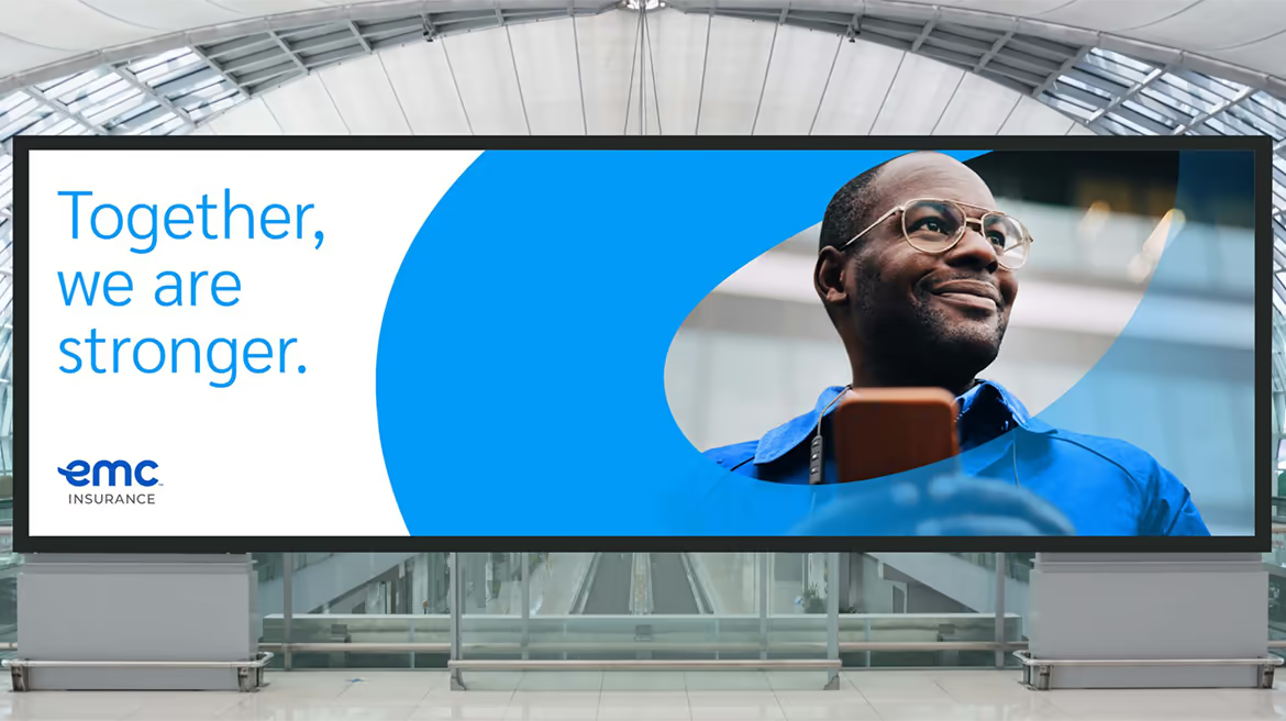
    EMC’s existing look—hard-edged and dark, typical of the industry—felt dated and was not ideally suited to the company’s focus on working with agency partners to help policyholders and communities thrive. Tenet designers created a warmer, more engaging visual identity, using an in-person workshop to help the EMC team get up close with the creative process.

    As the amplified EMC brand was being prepared to launch externally, leadership understood that connecting with the internal audience was critically important, as they are the ones embodying the brand promise across all touchpoints.

    The Tenet team knew that the employee training program would be most effective if delivered by the employees themselves. A Tenet-crafted “Brand Ambassador” train-the-trainer program tapped 60 uniquely qualified individuals across various geographies and areas of expertise to be the faces and voices of employee engagement throughout the organization.

    It all came together at One EMC, an historic event at EMC headquarters. Through unique and memorable employee experiences, the team generated excitement, teamwork and a greater understanding of the amplified EMC brand.

    The new brand identity, Brand Ambassador program and One EMC event were hugely successful and popular with employees, serving to bring clarity about the company’s path forward and build genuine enthusiasm about EMC’s future.

    “The collaborative partnership we had with the Tenet team resulted in a highly creative and impactful visual identity that further enhanced our broad strategy,” said EMC’s vice president of customer experience & marketing.

  • Sparking a passion for science and technology

    Sparking a passion for science and technology

    FIRST

    A global nonprofit organization founded by well-known inventor Dean Kamen, For Inspiration and Recognition of Science and Technology (FIRST) is dedicated to improving education and interest in science. The company touches the lives of nearly 700,000 kids globally through its robotics programs. Kamen, holder of more than 1000 patents and founder of DEKA Research and Development, set a vision for the organization to “create a world where science and technology are celebrated…where young people dream of becoming science and technology heroes.”

    The identity of FIRST is an excellent example of a grass-roots creation that takes a life of its own through its application. Unlike regimented corporate programs, the company’s symbol is applied freely to just about everything imaginable inside and outside event venues – by FIRST staff, by the thousands of teams and fans, and by the many corporate sponsors and partners contributing time and resources.

    Tenet Partners donated its services and talents to helping FIRST create a new logo and signature system that updates its image, solves a range of application issues, and clarifies the structure of the growing nonprofit’s numerous offerings.

  • Tenet Partners recognized in Gartner® Market Guide for Brand Consultancies

    Tenet Partners recognized in Gartner® Market Guide for Brand Consultancies

    New York, NY (February 5, 2024) – Tenet Partners has been recognized by Gartner® in its Market Guide for Brand Consultancies for the second year running, making specific mention of our focus on data-driven insights and forecasting. This recognition is a continued acknowledgement of the services, capabilities and insights that Tenet brings to brand leaders as they seek to elevate brand strategy, architecture, activation and visual identity.

    The Q4 2023 Market Guide notes that CMOs continue to recognize the links between brand investment and business value, resulting in prioritization of brand projects. This aligns with other recent Gartner research: According to the 2023 Gartner Brand Leaders Survey, 82% of brand leaders are pessimistic about the ongoing economic and business climate impact on their brands, but more than 50% would fight to keep their brand spending steady even when faced with the prospect of cutting performance marketing.

    Brand strategy and activation were among the top three areas where surveyed CMOs reported significant capability gaps that stand in the way of achieving business goals. 46% of respondents reported in increase in budgets for brand strategy and activation across marketing programs and operational areas.

    Turning to emerging trends that are transforming branding and marketing—and helping to address, at least in part, the capability gaps uncovered in the Brand Leaders Survey—the Market Guide encourages CMOs to “recognize the evolving and widespread capabilities of GenAI in order to best determine how the agencies are responsibly using GenAI internally and to support client deliverables.”

    In our opinion, this Gartner guide offers useful framework for key considerations and action items for CMOs as they begin a brand consultancy search. This includes critical AI capabilities across generative, machine learning, natural language processing and advanced forecasting needed for consumer insights, optimizing ROI and enhancing brand management.

    We believe that the statements in the guide accurately reflect Tenet’s own views on the role of brand consultancies. “The consumer climate is becoming more challenging for brand owners, and they will continue to need help developing and refining their brands to stay competitive. The importance of brand to attract and retain customers, potential employees and investors is growing.

    CMOs are increasingly responsible for managing brand and the role it plays in conveying an organization’s purpose and priorities, and recognizing that internal capabilities to deliver deep brand strategy work are lacking. Thus, reliance on brand strategy agencies should continue to grow.”

    Read the full Gartner report, Market Guide for Brand Consultancies, (accessible to Gartner subscribers ID G00770939).

    *Gartner, “Market Guide for Brand Consultancies”, By Analyst(s): Julie Reeves, Jay Wilson. Published 25 October 2023

    GARTNER is a registered trademark and service mark of Gartner, Inc. and/or its affiliates in the U.S. and internationally and is used herein with permission. All rights reserved. Gartner does not endorse any vendor, product or service depicted in its research publications and does not advise technology users to select only those vendors with the highest ratings or other designation. Gartner research publications consist of the opinions of Gartner’s Research & Advisory organization and should not be construed as statements of fact. Gartner disclaims all warranties, expressed or implied, with respect to this research, including any warranties of merchantability or fitness for a particular purpose.

    About Tenet Partners

    Tenet Partners is a brand innovation firm that transforms organizations through a blend of insights, strategy, design and AI technology. Our mission is to help companies create brand value and open possibilities in today’s digital-driven and customer-focused world.

    For more information

    Jessica McHie
    Photo of Jessica McHie Partner, Business Development
    Business Development and Marketing
    Tenet Partners
    11 West 42nd Street
    Penthouse Floors 31/32
    New York, NY 10036 US
    +1 212 329-3166
  • Cadence Bank

    Cadence Bank

    OVERVIEW

    After BancorpSouth and Cadence Bank – both leading financial institutions serving the southern United States – completed their merger in late 2021, a new corporate brand was needed to unify the company internally and signal the arrival of a new and stronger organization to customers and communities across the region.

    CHALLENGE

    The challenge for the new Cadence Bank brand was to communicate a value proposition that would capture the experience that made the organization stand out as something different.

    The brand also had to unify the organization while retaining the strong equity of both legacy brands in terms of visual identity, service and culture—and provide a springboard for the future.

    HOW WE HELPED

    Research quickly revealed common strengths across the two legacy organizations that differentiated them: deep expertise, a focus on listening first, personal service and strong relationships with customers, among employees and within communities. Taken together, these attributes helped both organizations provide guidance in the way that’s most meaningful and helpful to their customers.

    Tenet saw a warm, personal approach distinct from that of many larger financial services companies: an urge to meet people where they are on their financial journeys, develop and sustain long-term relationships, and provide the flexibility required to meet individual customer needs. It is not uncommon, for example, for customers to be greeted by name when they go to a branch.

    This shared culture and the personality attributes that shape it led to a new brand promise: “Ease your day. And your mind.” The concept of ease was central to positioning as well, providing a way to tell a rich and nuanced story that goes beyond “we make banking easy.” At Cadence, ease is as much a mindset as an operating principle. It’s as much about creating convenience as it is about putting customers’ minds at ease.

    The visual, sonic and verbal brand identity stands out in the marketplace as something fresh and new while being rooted in the proud history of both companies—showing how two leaders have joined under the new Cadence brand. Together, these elements evoke a strong sense of people and community that complements all aspects of the customer experience. It puts weight and credibility behind the new tagline: “Helping opportunity take shape.”

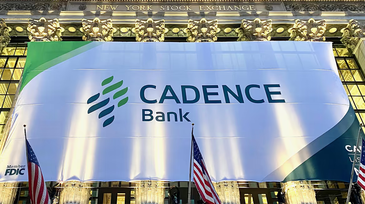
    Notably, Tenet designers found a way to echo the highly recognizable BancorpSouth gumtree logo with a completely new take on the iconic symbol. Since the Cadence name was retained, it was important for BancorpSouth employees and customers to see themselves reflected in the new logo. By evoking the gumtree through color and perfectly balanced shapes working in harmony to complement the name, the logo provides a clear link to the past while moving the brand forward.

    The brand rollout was supported by an extensive communications and employee engagement program, including regular communications on a dedicated internal microsite and the company intranet. Tenet and the Cadence team also implemented a “train the trainer” program for Cadence Bank brand ambassadors—selected individuals who went on to immerse thousands of employees in the new brand, focusing attention on the Cadence Bank culture and values, and the part that employees play in the customer experience.

    OUTCOME

    The resulting brand is a clear reflection of the very best of legacy BancorpSouth and Cadence, coming together to create a new, modern and human-centric financial services organization. According to the client, the brand has generated an overwhelmingly positive response from thousands of employees and customers, and has won awards for the bank.

    “One of the aspects we’ve liked most about Tenet Partners’ approach is their ability to effectively balance art and science when developing our new brand. They are exceptionally strong in both areas, which is rare for a branding agency.”
    – Jackie Hooper, SVP, Chief Marketing Officer, Cadence Bank

  • Dow

    Dow

    A business strategy built on sustainability

    Sustainability is about much more than being “green.” It’s become a vitally important part of business strategy for enterprises like Dow, one of the world’s most prominent materials science companies.

    Dow has long been a trendsetter in environmental, social and governance (ESG), the core tenets of sustainable business practices. The company worked with Tenet Partners to turn that leadership into market advantage, through a comprehensive sustainability-driven product brand framework and award-winning visual design system.

    elements of Dow's design
    Dow banner
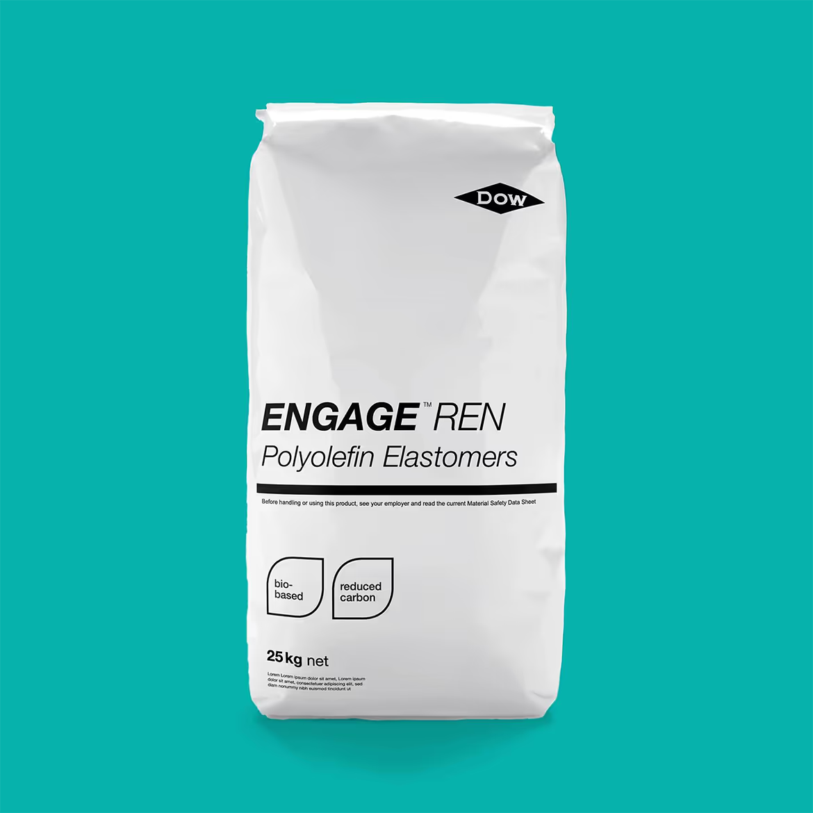
    Dow product bag

    Going deep on impact establishes credibility

    The practice of “greenwashing”—making sustainability claims without backing them up—has done more harm than good for many industrial brands. Dow knew it had to do more than put a sustainability spin on its existing portfolio. The company had to demonstrate impact: how its products contribute to sustainability for its customers and in turn, their customers.

    Brand expression that looks to the future

    Dow needed to telegraph its future direction, but there was an inherent tension: not all Dow products can be thought of as sustainable, and those that are don’t stand out. The solution was to give Dow’s sustainable brands a distinct identity, with a “Sustainability Science”-focused product brand architecture driven by key impact attributes such as carbon reduction and reduced resource use.

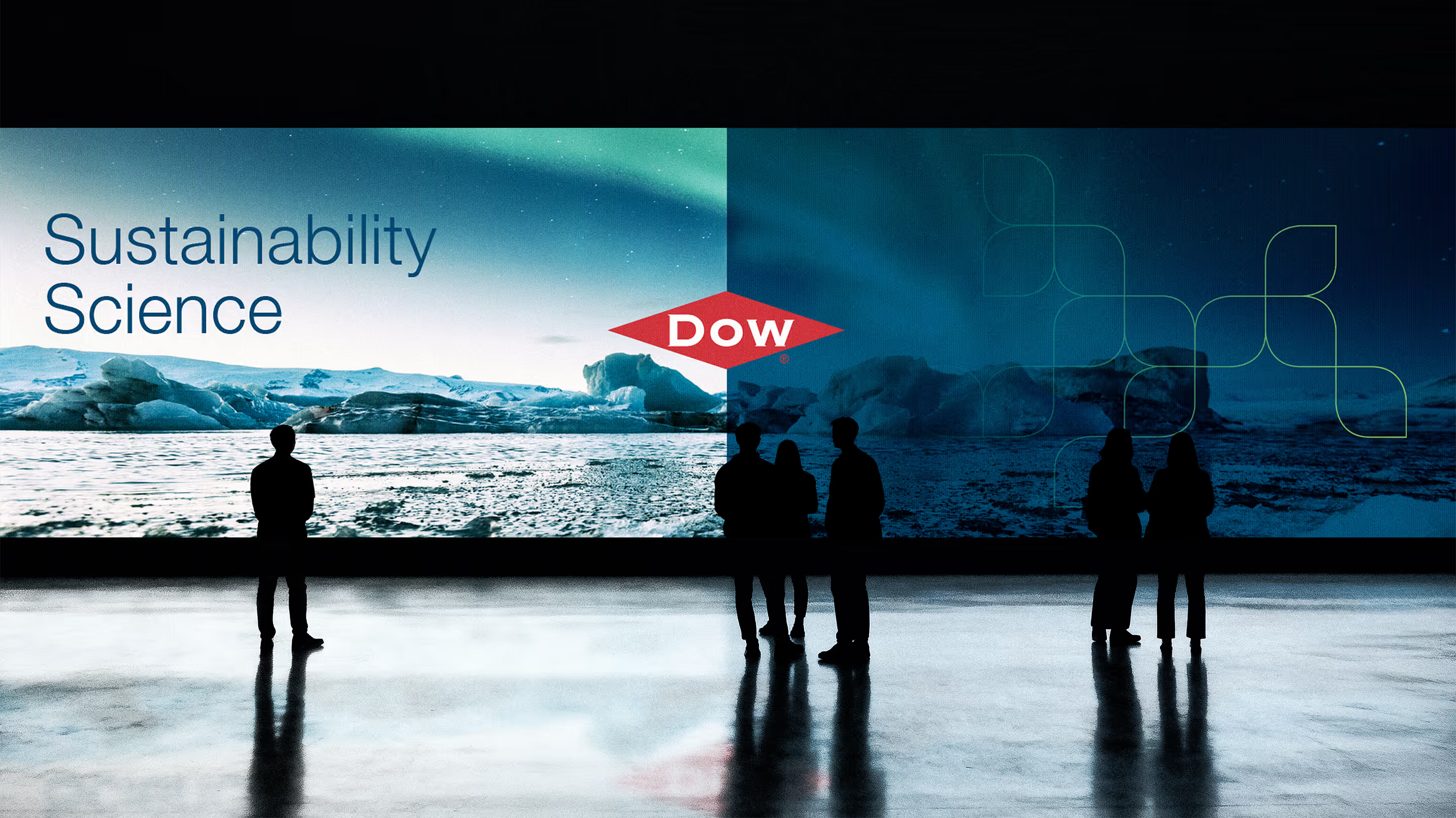
    Dow event

    Giving Dow’s sustainability brands a life of their own

    The new sustainability brands had to both fit within and complement the overall Dow brand: to be unmistakably “Dow” while having their own unique identity. Tenet designers solved the challenge by focusing on easily recognizable elements already present in Dow’s brand expression, such as color and shapes—creating a visual system-within-a-system that left the overall brand identity untouched.

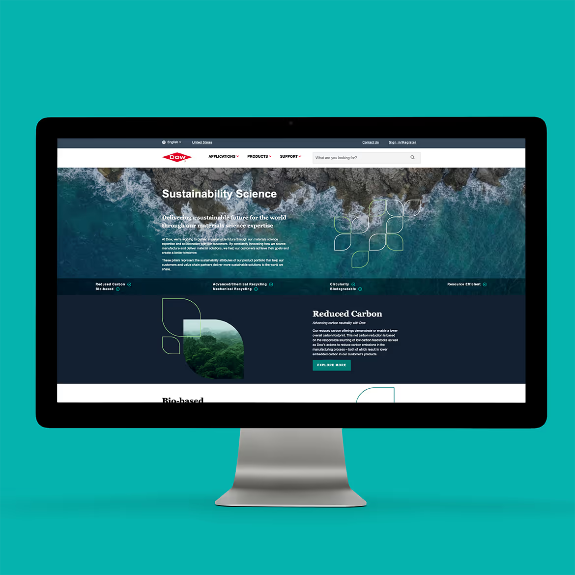
    Dow website on a monitor
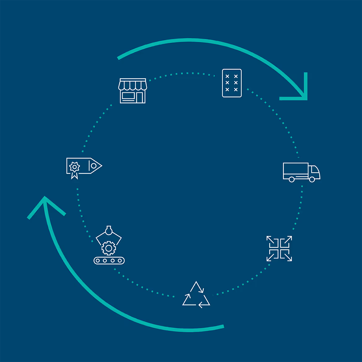
    circular diagram of Dow iconography
    three Dow brochure covers

    More than sustainable products—a sustainable direction

    By thoughtfully crafting a cohesive sustainability brand framework and bringing it to life while complementing the master Dow brand, the enterprise has the tools it needs to carry its focus on Sustainability Science into the future, without interfering with the core business.

    Tenet’s visual system work for Dow won Bronze in the 2023 Transform Awards, for best visual design in Dow’s sector—a reflection of well-crafted brand strategy made tangible.

    Dow-branded Smart car
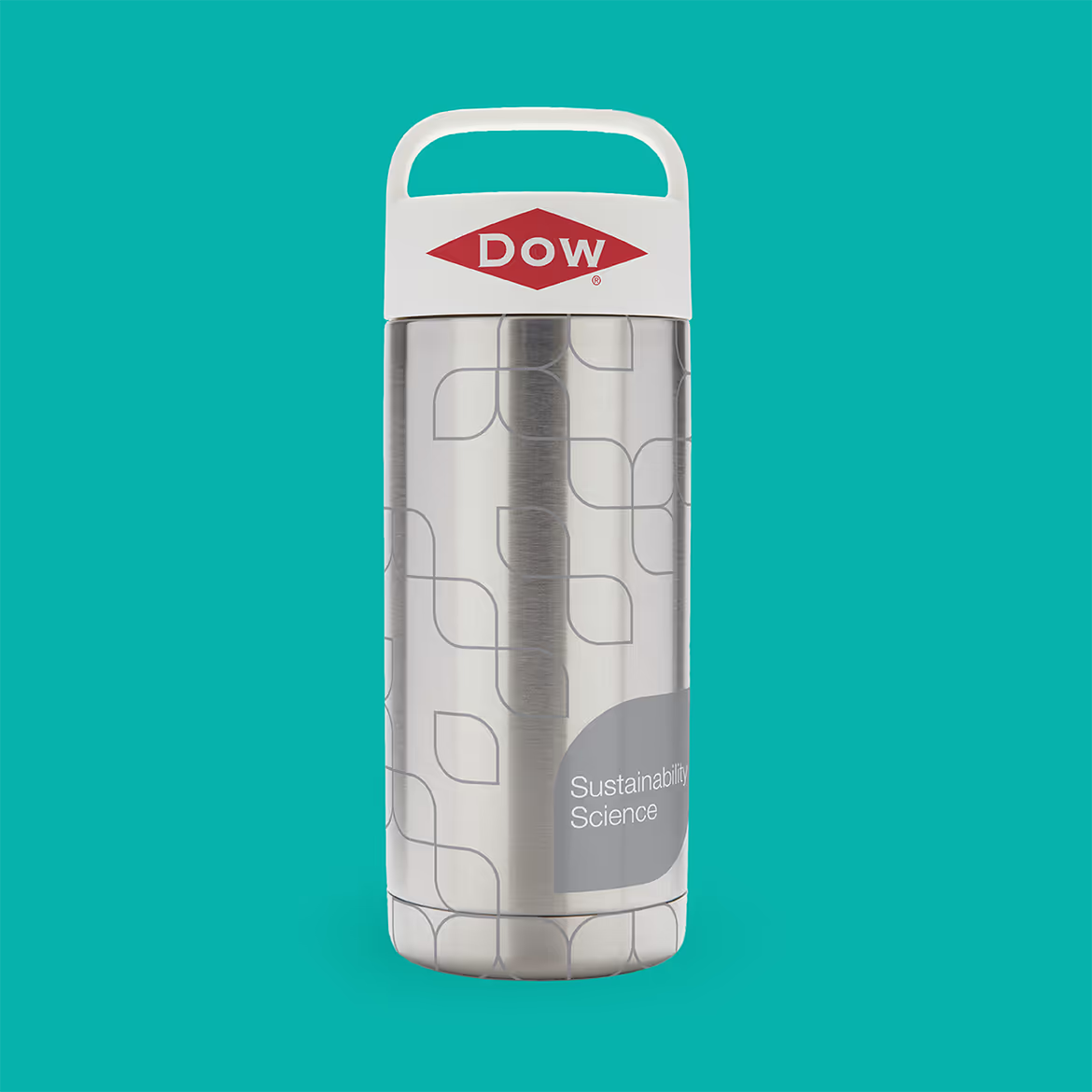
    Dow-branded insulated water bottle
  • Broadview

    Broadview

    Financial services that put people first

    Credit unions have a special place in the world of financial services. As mission-driven not-for-profit organizations, they answer to their members rather than shareholders. That inherent sense of purpose and service to individuals and local communities became the centerpiece of a bold new brand, ground-up digital strategy and marketing campaigns that Tenet created for the New York capital region’s largest financial institution.

    Broadview
    three broadview-branded business cards
    “Tenet Partners is the most thorough agency I've ever worked with—they leave no stone unturned..”
Christie O’ Toole, 
Chief Marketing and Communications Officer 

    Starting from a position of strength

    What is now Broadview Federal Credit Union was created in 2022, when two upstate New York credit unions joined forces to form a major financial force in the region, with more than $8 billion in assets and hundreds of thousands of members spanning a territory from Albany west to Buffalo.

    The match had strong synergy. The two organizations—the State Employees Federal Credit Union (SEFCU) and the Capital Communications Federal Credit Union (CAP COM)—had complementary offerings and footprints. But neither brand fully described the combined credit union, its membership or its strategic direction. It was time for a fresh start.

    Pivoting to a future-focused brand

    Tenet’s brand strategy team used interviews, competitive market research and AI tools to uncover what would become the foundation of the new institution’s brand platform: a shared ethos of putting members’ interests ahead of the organization was on display at every level, from service to interest rates.

    This combination of mission-driven culture, fairness, giving, future-focused high-touch service and anticipating what’s to come came together in a new brand promise: “Meeting people where they are and where they’re going.”

    A bold expression makes a big impact

    The Tenet creative team took the new name and brand platform and ran with it, creating a dynamic, versatile visual system and clear messaging that took Broadview in a new direction. The brand is very human-focused, capturing Broadview’s dedication to understanding the needs of its members and helping them achieve financial success, its community involvement and an optimistic focus on the future.

    a smart watch with a Broadview app
    laptop showing the Broadview site
    Broadview design guidelines
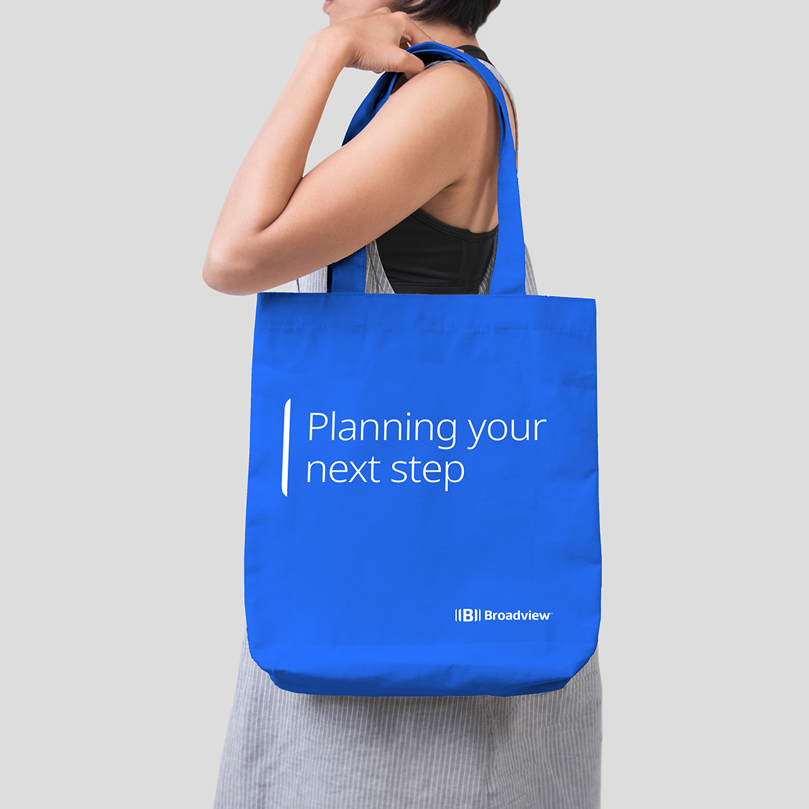
    Broadview branded tote bag that says "Planning your next step"
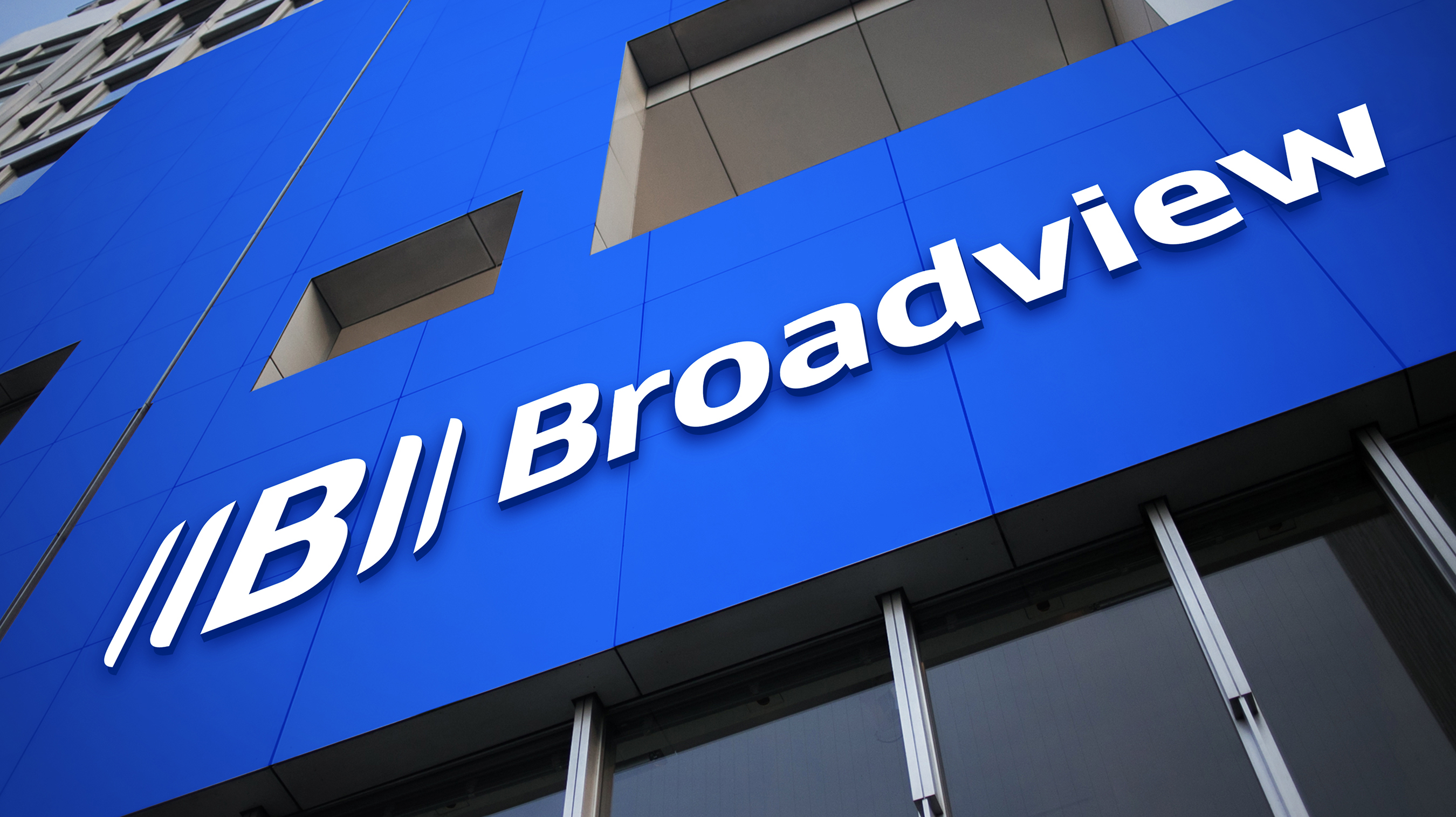
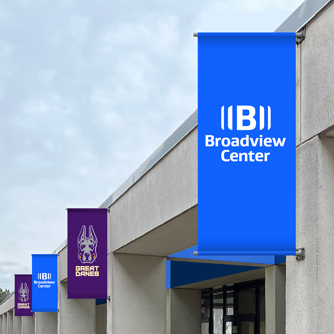
    Broadview branded banner on a building
    various Broadview branded designed

    Digging deeper into the world of Broadview

    Following the successful launch of the new Broadview, Tenet helped extend the brand to elevate, position and market Broadview Wealth Management, a key business unit and part of Broadview’s growth strategy. The core themes of the master brand were translated and honed to reach a higher net-worth audience, demonstrating the depth of Broadview’s capabilities.

    Broadview billboard that says "Look to the future with confidence"
    portrait oriented advertisement for Broadview that says "The confidence to... live"
    an electronic tablet with a Broadview article with the title "Confidence today. A brighter tomorrow."

    A new view of what credit unions can be

    The entire organization has welcomed the rebrand with enthusiasm, embracing and investing in the new identity by promoting it across all touchpoints from transformed branches and corporate environments to digital channels, marketing campaigns and sponsorships. The members, too, responded positively, with 100% customer retention and growth in deposits and transactions.

    Broadview branded tradeshow booth