Tag: Web

  • The Bancorp

    The Bancorp

    Helping define the future of banking

    The Bancorp is the engine powering many of the world’s leading fintech brands, from PayPal and Venmo to Chime and Betterment.

    One of the first banks to embrace fintech, The Bancorp is a forward-looking organization with a unique mix of experience, expertise and creativity that give it the ability to help its partners turn compelling ideas into real-world solutions.

    Tenet Partners helped to crystalize what makes The Bancorp stand out, in a wide-ranging brand evolution program that began in 2024.

    Imagining a new future for The Bancorp

    To help lay the foundation for The Bancorp’s future, the Tenet team saw an opportunity to elevate The Bancorp’s expression beyond the focus of its leading payment and lending services and technology—the offerings that had been the focus of the legacy brand.

    Building on an extensive research and discovery effort, Tenet used our collaborative Brand Worlds methodology to explore future directions for The Bancorp. The experiential spaces and narratives helped the team see their brand as the market would, effectively capturing the dynamism and energy of the fast-moving fintech industry.

    A brand built around a simple, powerful idea

    The Bancorp is a leader in fintech and also provides a range of specialized banking services including institutional banking, fleet leasing and real estate bridge lending. Finding a common thread that could tie the entire organization together was crucial.

    That idea became encapsulated in The Bancorp’s new tagline: Bold ideas, realized.™ This single concise statement speaks to what makes the bank different: a depth of experience and relationships that empowers customers to effectively bring their ideas and businesses to life. If a customer can envision it, The Bancorp can make it real.

    A design-forward experience

    The refreshed brand came to life in a remarkably powerful way, through bold creative choices across the board from the striking black-and-teal color palette to the energetic sonic, graphic and typographical expression of the launch video.

    The resulting brand identity places The Bancorp’s offerings and the value it brings in an entirely new context—a powerhouse brand for a powerhouse organization.
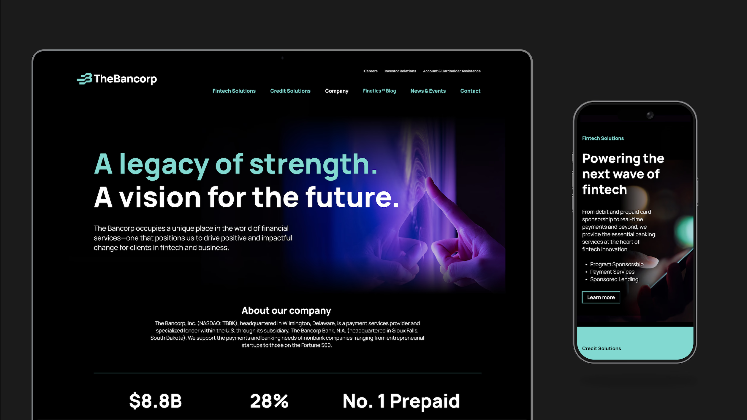
    A legacy of strength.
A vision for the future.
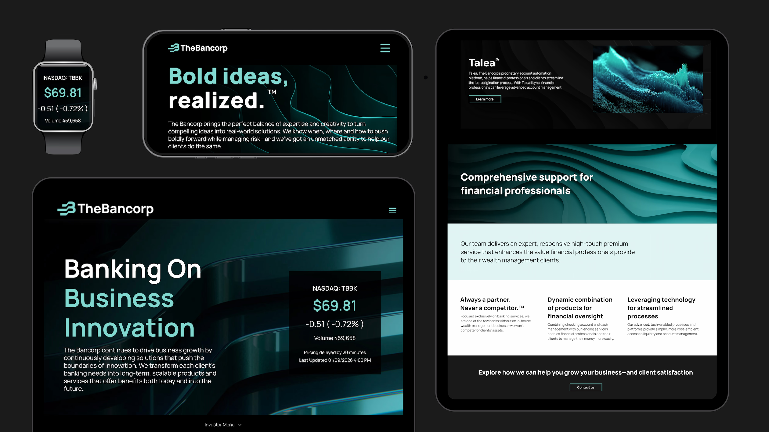
    various devices showing The Bancorp's brand: watch, phone, and two tablets
    "The Bancorp has evolved, and our brand should reflect that evolution.” - Damian Kozlowski, CEO, The Bancorp
    a mobile phone showing a post from The Bancorp that says: We're shaping the future of banking.
    Sending payment ...
    3 portfolios:
Your vision. Our expertise.
Why run the risk?
Where expertise meets purpose
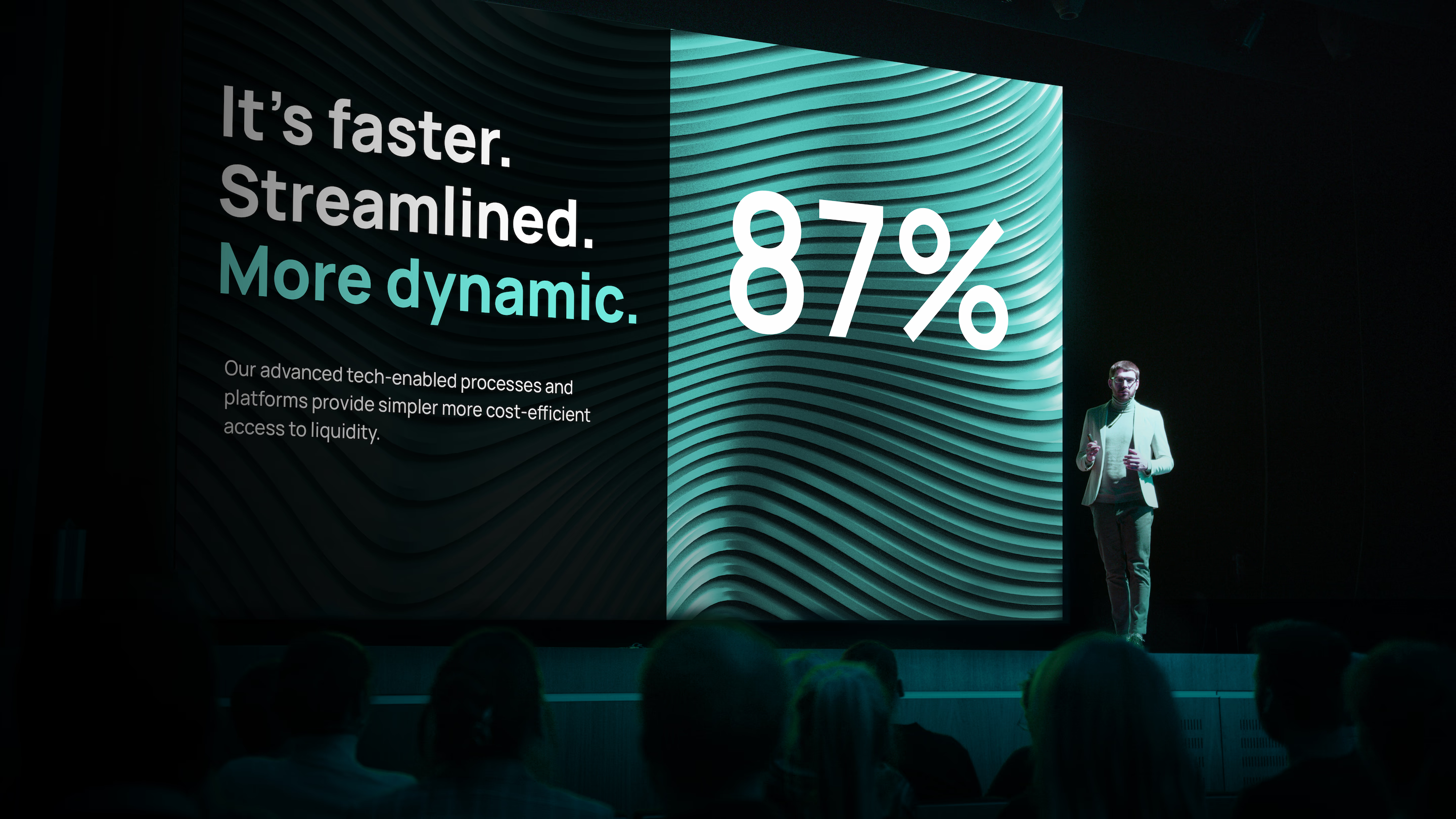
    It's faster. Streamlined. More dynamic.
87%
Our advanced tech-enabled processes and platforms provide simpler more cost-efficient access to liquidity.

    Embracing the future of The Bancorp

    The Bancorp’s revitalized brand has been enthusiastically welcomed across the organization, thanks to a robust employee engagement program and subsequent launch, culminating in ringing the opening bell at the Nasdaq exchange in New York in January 2026.

    Damian Kozlowski, CEO of The Bancorp, had this to say: “In a rapidly changing financial landscape, The Bancorp has evolved, and our brand should reflect that evolution. Our rebrand captures who we are—a technology-forward financial institution with the expertise to see what’s ahead and the commitment to help our partners transform, innovate and grow.”
    Home / Web
  • Greater clarity for Epiq

    Greater clarity for Epiq

    A pioneer and leader in the legal services and technology solutions space, Epiq recognized that their growing and complex array of business offerings was creating a challenge. After years of strong opportunistic growth, the company found itself presenting a fragmented, product-based image to the marketplace. In effect, the company’s successful expansion strategy had diluted the impact of its brand.

    Epiq began taking strategic steps to reposition the company and Tenet Partners was called on to help. The goal: to transition the brand from a technology-based document review company to a value-added service partner known for handling a wide range of highly complex legal challenges for corporations, law firms, financial institutions and government agencies.

    A new focus on what makes Epiq unique

    We began by refining Epiq’s purpose statement and core values to embody the principles and aspirations of the organization. The values were constructed to be meaningful and actionable across the company.

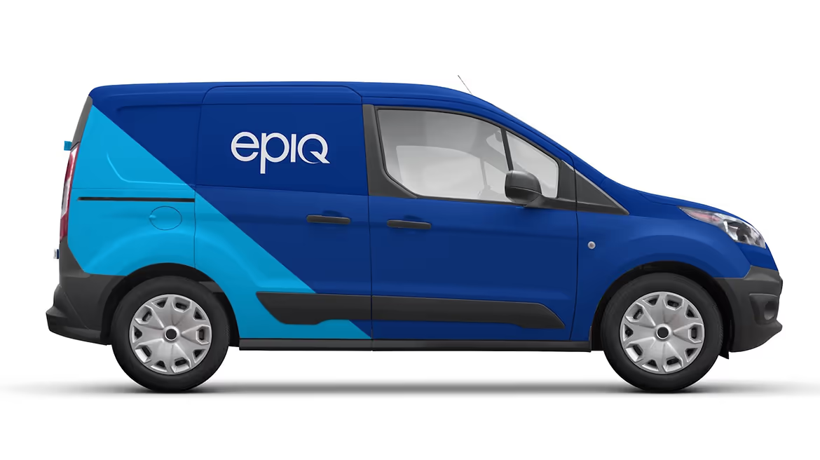
    Recasting the company’s purpose and values was key to powering internal change. Complementing that shift and telegraphing it to the marketplace called for a new visual identity, inspired by the differentiating nature of Epiq’s global scale, high-quality staff and service. Tenet contemporized the Epiq logo and developed new design elements, including a color palette, imagery style, typography and distinctive graphic elements, which brought together the company’s many and diverse business lines in a fresh, unique visual expression.

    Reconstructing the website to meet the needs of many

    Moving the Epiq brand away from its product-based image met a key competitive need. When law firms, corporations, financial institutions and government agencies search for a partner, they are looking for the one who can ease their burden, a partner who understands what they need, has the right expertise and can deliver the outcomes fast. Accordingly, Epiq’s online presence needed to communicate more powerfully.

    A central goal of Epiq’s new website was to allow users in different market segments to easily discover information and navigate the company’s complex offerings in a highly efficient and compelling way. To do this, Tenet conducted an interactive work session with managers across all business lines and functions to discover what the site should deliver to visitors. The task was challenging due to audience diversity: law firms and corporations using eDiscovery and document review services, law firms using bankruptcy case management software, and administrative services and trustees managing large-scale class action claims administration.

    With this insight in hand, Tenet created an information architecture based on solutions organized to align with user’s needs in different market segments. A library of visual icons was created to help differentiate product and service offerings, helping users to find information at a glance.

    Investment in the brand that drives results Epiq’s new positioning, coupled with the visual identity system and website, elevated the brand’s stature and enabled its designers and communicators around the globe to present a cohesive brand expression whether in the U.S., Europe or Asia.

    More importantly, the changes provided a strong platform that helped make Epiq an attractive acquisition opportunity for private equity firms. In 2016 Harvest Partners and OMERS took action resulting in the combination of Epiq with DTI Global to create the first billion-dollar global legal process outsourcing company just eleven months after the brand refresh was launched.