Unifying a leader in indirect supply
Two industrial supply leaders, uniting under a single brand
Keeping manufacturers and similar enterprises running smoothly is a multi-billion-dollar industry. The myriad products used every day as part of normal operations – everything from gloves, cutting tools and safety equipment to abrasives and lubricants – must be available when and where they’re needed. It’s a complex business, where efficiency, productivity and strong supplier relationships are critical.
To gain a premier position in this market, Sonepar, a privately held $25 billion global electrical supplier, purchased Hagemeyer North America and IDG. The opportunity lay in combining the two well-established and respected companies to create a single, North American supply solutions leader with unmatched geographic scope, scale and manufacturer partnerships. In 2014, that’s what Sonepar did.
A single name was only the beginning step to building a brand that brought together two organizations.
Creating a new brand identity
Hagemeyer / IDG had been operating under its two existing brands while working to integrate the company through operations, personnel and finance. But to demonstrate their intention of having one company to their customers—and send a message to associates of both companies—what was needed was a single defining name. Searching through the Sonepar portfolio, the company opted to use a name they already owned, a name that had strong recognition and reputation. The two companies now had the start of their brand identity and would be called Vallen.
As we’ve done for many merged companies, Tenet worked to forge unity for Vallen – one team, one company, across all levels, with shared strengths.
Discovering the power of unity
Leveraging earlier internal work to frame a brand platform for the combined companies, Tenet quickly became an integral part of the rebranding process. Tenet operated as a valued extension of the company’s internal resources, with the skills needed to fully develop and launch the new brand. Working with Vallen’s team, Tenet launched a robust, multi-front program that spanned everything from brand strategy extension and articulation, to customer journey mapping, service principles, brand personality, tagline development, brand launch planning and support, sales enablement and employee engagement. Many of these activities ran on parallel paths to get the brand launched on an aggressive timeline.
The process was highly collaborative, with multidisciplinary teams working closely together. This allowed findings and experiences to be shared and new ideas to be validated, which proved critical in creating a cohesive brand expression.
The common goal was to bring dimension and meaning to Vallen, both internally and externally. Tenet researchers engaged extensively with customers and executives spanning both legacy companies, in one-on-one interviews and workshops.
What the team found were areas of competitive advantage, a powerful set of emerging personality attributes and a core set of values in common. In addition, a deep understanding of customers based on listening and collaboration, an innovative, flexible, solutions-oriented approach, and an unmatched commitment to customer success marked the organization.
Innovating to build integration
One of the most important – and impactful – parts of the entire project was building employee engagement and excitement in the run-up to brand launch. This was seen as vitally important, because the rebranding project had been in the works for some time and Vallen associates were eager to see it completed.
To help educate and engage with all associates, Tenet worked closely with the management team to lead a spirit of unity in supporting the brand training. Tenet helped create a “train the trainer” approach, with live workshop training of a select cadre of Vallen associates who would then go on to train their colleagues. They were exposed to the personality attributes and asked to express how those attributes unfold as brand behaviors – making the training very “real” for each person’s job.
Those same attributes were the basis of a powerful set of service principles that also became part of the training and served as a guide for all Vallen associates going forward. To reinforce the brand behaviors and service principles – and thereby build the strength of the brand over time – there are plans to incorporate them into recognition and reward programs that will keep an ongoing focus on the brand into the future.
Revealing the new brand
Heralding the new brand in a dramatic announcement was made a bit difficult because the name had to be revealed well beforehand for legal reasons. That required careful coordination of brand communications, including informing the press, associates and suppliers of the new name without exposing the brand strategy and identity. The name announcement in August 2016 put a stake in the ground with an announcement from the CEO: “We are now Vallen.” With that, everyone knew the rebranding was finally real, and was coming soon.
This created a unique opportunity to build momentum. Learning the name and receiving brand training on the brand values and attributes were peeks behind the curtain, with the anticipation of much more to come.
To capture that sense of excitement and make it grow, Tenet created the Vallen Launchpad – an internal website that, week by week, unveiled more and more of the brand, with a clock counting down to the October 11, 2016 launch day.
The Launchpad featured interactive games, brand education, and communications from management. It also revealed, step-by-step, the vibrant and contemporary Vallen visual system, culminating in the logo, tagline and wordmark on launch day, all brought to life with a powerful corporate video and supported by well-orchestrated local events involving all associates and a National Leadership Conference addressing company managers and major suppliers.
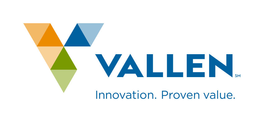
The new logo symbolizes several key Vallen characteristics. It is multi-faceted, representing breadth of products and solutions. The precision of the shapes speaks to being a perfect fit for our customers, and the creative way the shapes come to life in communications supports Vallen’s flexible and adaptable approach to tackling customers’ challenges.
Throughout the entire rebranding process, Tenet supported senior management’s wish to respectfully retire the legacy brands of Hagemeyer and IDG, so that all associates and management could move forward under the unified Vallen name. They became one company, one brand, moving forward together.
Partnering for the future
With a successful brand launch behind them, Vallen continues to partner with Tenet. We’re developing sales collateral that uses an approach not seen before to highlight the company’s unique approach to value, honing sales tools, building a messaging platform and exploring new opportunities to reinforce brand behaviors and empower Vallen’s sales force.