“Google is not a conventional company. We do not intend to become one.”
So says Larry Page, and for the most part Google has lived up to that idea to greater or lesser degrees of success. And now the universe is weighing in on Google’s new logo and its role in communicating the future direction of the company. Was it the right move?
To cut to the chase, I like it, as do most of the design-types out there that are publicizing their views. The move toward simplicity obviously makes sense, creating a stronger and more consistent experience across devices and platforms. Maintaining the primary colors and playfulness extends both visual and attitudinal aspects of the brand that we’ve come to know and expect. Some people are criticizing certain details of the typography (which is to be expected) but I for one am happy to see the last of the former awkward & fussy serif logotype.
But even amongst the typographic detractors, there is a universal agreement that the system borne out of the new identity is terrific… the ability for the brand to engage, guide, delight and surprise users as they move through a range of experiences and applications is truly “Googly”.
But there is one aspect of this that still leaves me a little… disappointed? Perhaps too strong a word, but given the quote that I used to open this piece, I was waiting for something a little more unexpected. I first heard that Google had changed its logo by someone popping into my office and telling me. I instantly got an image in my head, and when I looked it up, the real thing was remarkably close to what I envisioned. It was almost… obvious.
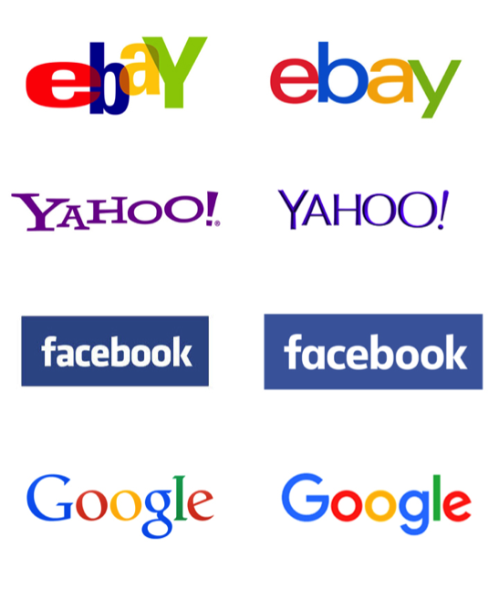
The move to simplification for tech brands is certainly not new, and many major players have been flattening, simplifying, “de-serif-ing” and moving away from distinctive typography for years now when it comes to logo evolution. Think eBay, Yahoo, Facebook, Dropbox, YouTube, etc. But when you look at them together, they are starting to become a bit homogenous. So while I can’t knock what they did (for all the reasons I outlined above) I was perhaps hoping that Google, of any brand, could find a way to check all the application optimization boxes and still surprise us. Maybe next time.