What can I possibly add to the chorus of people (designers and non-designers alike) currently discussing the 2016 presidential candidate logos?
I’ll start by saying how much I love that so many people are talking about logos. On the subway yesterday, I overheard a grandmother say, “I would have gone with a serif for my logo, it’s just so much more friendly.” It made me smile that she actually knew the difference between serif and sans serif and could express the associated personalities of each. And, I appreciate that so many people are talking about the purpose of a logo and what it communicates. With that said, I find it unfortunate that the dialogue is often so mean spirited. It seems that logo bashing has become a sport these days and political logos just intensify online snarkiness — which I will do my best to avoid.
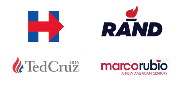
In the context of this particular competitive set, I believe that Hillary Clinton’s “H” is the most successful logo. Is it as inspirational and graceful as President Obama’s iconic “O”? No, but it does an impressive job of doing what a logo is meant to do. It clearly connotes an idea (Progression! Moving forward!) and is memorable in its bold simplicity. In addition, the absence of a waving flag or military star is unexpected. Designed by Michael Bierut at Pentagram, this logo clearly stands out in the crowded, boisterous world of politics. In my opinion, it will stand the test of time.
The other three logos are what you’d expect both visually and conceptually, with varying degrees of success.
I certainly give Rand Paul credit for the subtle “torch” in his logo and the lack of the usual red, white and blue. And, I appreciate the bold decision to go with “RAND” to convey that he’s approachable and just one of the guys. I personally would have avoided the heavy italic font that looks too much like a moving company’s logo from the 1970s.
Marco Rubio’s logo has some nice features and some real problems. The all-lowercase type is both modern and friendly, but the small American map dotting the “i” is really unfortunate. Not only does it look amateurish, but it also doesn’t translate at all in smaller applications. And, what about Hawaii and Alaska? I’m pretty sure they still get to vote, right?
That brings us to Ted Cruz and what appears to be an American flag on fire. The symbolism of this icon left me scratching my head. The most conservative of the group, I do think it was the right decision to go with a classic serif and an all-American color palette. Both of these elements clearly reinforce traditional values.
With the 2016 presidential campaign just getting started, I’m excited to see even more logos join the race. Who knows? Maybe the best is yet to come.